Assets
README
Going to the barnesfoundation.org and viewing the HTML source is the quickest way to download all the assets but we have linked to some here for convenience.
Please note: The CSS and JavaScript are minified, compiled and production ready.
Their source files e.g. the .scss Sass files and the smaller JavaScript files
are available in the main Github repo
which you will need to request access to.
- app.css - main CSS file
- html4.css - CSS file for older browsers
- app.js - main JS file
- head.js - a JS file that needs to run as soon as possible to show icons/logos
- icons.svg - icons/logos sprite
and some others:
favicons:
Base Styles
README

Applied to web interfaces, these base styles are for our HTML tags, such as a form label, an input or a button.
We also have some very small helper classes in this section.
There are also some more abstract elements like color palettes, typography and even more invisible aspects of an interface like accessibility features.
Basic Link
Basic Link
- Class name:
a-basic-link - Tags used on:
<a>
Most links on the Barnes website are grey and underlined - however there are occasions where we need to show a link that looks like it isn't a link.
Responsive:
Code
<a href="#">This link</a> is the default style whereas <br>
<a class="a-basic-link" href="#">this link</a>
is whatever colour its surrounding copy is
Copy
Brand Link
Brand Link
- Class name:
a-brand-link - Tags used on:
<a>
Most links on the Barnes website are grey and underlined - however there are occasions where we need to show a red, no-underlined link or what we call a branded link. Why branded? because it’s on-brand
Responsive:
Code
<a href="#">This link</a> is the default style whereas <a class="a-brand-link" href="#">this link</a> is Barnes brand colourCopy
Breadcrumb
Breadcrumb
- Class used:
a-breadcrumb - Tags used on:
<a>
Breadcrumb trail. Consists of an icon and a label.
For accessibilty reasons: Resist the urge to use the word Back as the label... no matter how tempting! Links must always make sense when they are isolated so the word Back on its own can be confusing to visually-impaired people who have links read out to them out of context.
Responsive:
Code
<a class="font-smallprint a-breadcrumb m-page-intro__breadcrumb" href="{{ backLink }}">
 <svg width="27" height="10" class="a-breadcrumb__icon">
    <use xlink:href="#icon--icon_arrow-back"></use>
 </svg>
 <span class="a-breadcrumb__label">Former page title</span>
</a>
Copy
Buttons
Buttons
- Class name:
btn - Modifier classes:
btn--primary,btn--disabled,btn--icon-only - Tags used on:
<a>,<button>
A button can be either a link or a button tag - but remember to use <a> tags
for links and <button> tags to perform actions like launch lightboxes/popups
or submit forms.
A good guideline here is: if your <a> tag has a href value of # then it
should probably be a <button> instead.
Button can also live inside a <div class="btn-group"> container for situations
where multiple buttons need to sit alongside each other.
Please note: the icons in these buttons use <SVG> which are referenced by an
SVG sprite file. This file is needed for any icons to display. This SVG sprite
file will be included via JavaScript if you use the
Structure files.
Responsive:
Code
<hr>
 <h2 class="font-zeta">Links styled to look like buttons</h2>
 <a class="btn" href="#">A white button</a>
 <a class="btn btn--primary" href="#">A red button</a>
 <a class="btn btn--disabled" href="#">An inactive button</a>

 <hr>
 <h2 class="font-zeta">Buttons which are button tags</h2>

 <button class="btn" type="button">Button</button>
 <button class="btn" type="submit">Submit button</button>
 <button class="btn btn--primary" type="submit">Submit button (red)</button>
 <button class="btn" type="submit" disabled>Submit button (disabled)</button>

 <hr>
 <h2 class="font-zeta">Icon only buttons</h2>
 <button class="btn btn--icon-only" type="submit">
    <span class="html4-label">Search</span>
    <svg width="26" height="26"><use xlink:href="#icon--icon_search"></use></svg>
 </button>
 <button class="btn btn--icon-only" type="button">
    <span class="html4-label">Close</span>
    <svg width="26" height="26"><use xlink:href="#icon--icon_close"></use></svg>
 </button>
 <button class="btn btn--icon-only" type="button">
    <span class="html4-label">Menu</span>
    <svg width="26" height="26"><use xlink:href="#icon--icon_menu"></use></svg>
 </button>
 <button class="btn btn--icon-only" type="button">
    <span class="html4-label">Back</span>
    <svg width="27" height="10"><use xlink:href="#icon--icon_arrow-back"></use></svg>
 </button>

 <hr>
 <h2 class="font-zeta">Buttons in a group</h2>

 <div class="m-btn-group">
    <a class="btn" href="#">Link button</a>
    <a class="btn" href="#">Link button</a>
 </div>
Copy
General Styles
General styles
Here are some basic stylings for copy.
Responsive:
Code
<p>This is a basic paragraph of copy.</p>
 <p>And here is another basic paragraph of copy <strong>some of which</strong> is bold.</p>
 <ol>
    <li>And here is a</li>
    <li>Numbered list</li>
 </ol>
 <ul>
    <li>And here is a</li>
    <li>bullet-pointed list</li>
 </ul>
 <p class="a-centered">And here is some centered copy.</p>
 <p>Suspendisse id leo porta, dignissim leo id, aliquet massa. Mauris ut mauris at dui laoreet interdum vel aliquam nunc. Nullam id felis purus. Vestibulum justo diam, dignissim in ex vel, iaculis aliquam nisi. Vivamus diam dolor, vestibulum a aliquet eget, congue congue enim. Donec rhoncus vitae odio quis volutpat. Pellentesque habitant morbi tristique senectus et netus et malesuada fames ac turpis egestas. Maecenas et rutrum metus. Nunc placerat eu nisl sit amet sollicitudin. <strong>Vestibulum ante ipsum primis</strong> in faucibus orci luctus et ultrices posuere cubilia Curae; </p>
 <p>Suspendisse id leo porta, dignissim leo id, aliquet massa. Mauris ut mauris at dui laoreet interdum vel aliquam nunc. Nullam id felis purus. Vestibulum justo diam, dignissim in ex vel, iaculis aliquam nisi. Vivamus diam dolor, vestibulum a aliquet eget, congue congue enim. Donec rhoncus vitae odio quis volutpat. Pellentesque habitant morbi tristique senectus et netus et malesuada fames ac turpis egestas. Maecenas et rutrum metus. Nunc placerat eu nisl sit amet sollicitudin. Vestibulum ante ipsum primis in faucibus orci luctus et ultrices posuere cubilia Curae; </p>
Copy
Logo
Logo
- Class name:
a-logo - Tags used on:
<h1><a><span><div>
For SEO reasons the logo is a <h1> tag on the homepage and an all others pages
it is an <a> tag that links back to the homepage.
On the homepage we do not want the logo to be a link because that could confuse users... Besides which, were would it link to - the same page that the user is already looking at?
Sidenote: We use an SVG for the logo because:
- SVGs have a small filesize (usually) and because
- SVGs look sharp on lots of different screen sizes e.g. smartphones, laptops and 4K screens
- JPG/GIFs/PNGs with red in them can sometimes render poorly on screen
Please note: this <SVG> references an SVG sprite file. This file is needed for
the logo to display. This SVG sprite file will be included via JavaScript if you
use the Structure files.
We use 4 different logos - to ensure the logo stays sharp on all screen sizes.
Responsive:
Code
<h1 class="a-logo">
    <span class="html4-label">Barnes</span>
    <svg class="a-logo__svg a-logo__svg--s" width="121" height="37" aria-labelledby="logo-title">
      <title id="logo-title">Barnes</title>
      <use xlink:href="#icon--logo-s"></use>
    </svg>
    <svg class="a-logo__svg a-logo__svg--m" width="146" height="45">
      <title>Barnes</title>
      <use xlink:href="#icon--logo-m"></use>
    </svg>
    <svg class="a-logo__svg a-logo__svg--l" width="164.958" height="50">
      <title>Barnes</title>
      <use xlink:href="#icon--logo-l"></use>
    </svg>
    <svg class="a-logo__svg a-logo__svg--xl" width="200" height="62">
      <title>Barnes</title>
      <use xlink:href="#icon--logo-xl"></use>
    </svg>
 </h1>
 <a class="a-logo" href="/">
    <span class="html4-label">Barnes</span>
    <svg class="a-logo__svg a-logo__svg--s" width="121" height="37" aria-labelledby="logo-title">
      <title id="logo-title">Barnes</title>
      <use xlink:href="#icon--logo-s"></use>
    </svg>
    <svg class="a-logo__svg a-logo__svg--m" width="146" height="45">
      <title>Barnes</title>
      <use xlink:href="#icon--logo-m"></use>
    </svg>
    <svg class="a-logo__svg a-logo__svg--l" width="164.958" height="50">
      <title>Barnes</title>
      <use xlink:href="#icon--logo-l"></use>
    </svg>
    <svg class="a-logo__svg a-logo__svg--xl" width="200" height="62">
      <title>Barnes</title>
      <use xlink:href="#icon--logo-xl"></use>
    </svg>
 </a>
Copy
Skip Link
Skip Link
- Class name:
a-skip - Tags used on:
a
Okay this is a really cool accessibility feature. Most people will never see this but keyboard users i.e. people who may have motor disabilities and rely upon their keyboard’s tab key instead of a mouse will see this link display when they first hit their tab key and it will allow them to skip to content of the page and avoid having to hit their tab key tens/hundreds of times on each page view to get past all the menu links.
Because skips links are hidden and only triggered by keyboard they may not appear in the box below:
Responsive:
Code
<a class="a-skip" href="#content">Skip to content</a>
 <a class="a-skip" href="#footer">Skip to footer</a>
Copy
Tag
Tag
- Class name:
a-tag - Modifier classes:
a-tag--black,a-tag--light - Tags used on:
<a>
Tags are links that look a little bit like buttons and are either:
- red
- black
- white (or light)
They have an active style determined by adding the accessibility-friendly aria-current="true" attribute.
If the tag is active then it will not have a hover state.
NOTE: Tags that are active below have a tick next to them - but a tick will not be present on the website. It is just for show here.
Responsive:
Code
<a class="a-tag" href="#">Tag</a>
<a class="a-tag" href="#" aria-current="true">Tag ✔</a>
<a class="a-tag a-tag--black" href="#">Dark tag</a>
<a class="a-tag a-tag--black" href="#" aria-current="true">Dark tag ✔</a>
<a class="a-tag a-tag--light" href="#">Light tag</a>
<a class="a-tag a-tag--light" href="#" aria-current="true">Light tag ✔</a>
<a class="a-tag a-tag--sale" href="#">SALE tag</a>Copy
Colors
Colors
Here are the colour combinations used by the site:
Accessibility tip: Contrast ratio:
Don't forget to run colour combinations of background color and text color against a contrast ratio checker. If the contrast ratio is too low, people will not be able to read it.
- WCAG level AA requires a contrast ratio of 4.5:1 for normal text and 3:1 for large text
- WCAG Level AAA requires a contrast ratio of 7:1 for normal text and 4.5:1 for large text
Large text is defined as 18px+ (if bold) and or 24px+ if not bold.
Responsive:
Code
<div class="color-box font-smallprint" style="background-color: #dcdcdc; border-color: #000">Background: #dcdcdc<br>Foreground: #282828<br>Contrast Ratio: 10.75:1</div>
 <div class="color-box font-smallprint" style="background-color: #8c8c8c; color: #fff">Background: #8c8c8c<br>Foreground: #ffffff<br>Contrast Ratio: 3.36:1</div>
 <div class="color-box font-smallprint" style="background-color: #282828; color: #ffffff;">Background: #282828<br>Foreground: #ffffff<br>Contrast Ratio: 14.74:1</div>
 <div class="color-box font-smallprint" style="background-color: #6e6e6e; color: #ffffff;">Background: #6e6e6e<br>Foreground: #ffffff<br>Contrast Ratio: 5.1:1</div>
 <div class="color-box font-smallprint" style="background-color: #f0f0f0;">Background: #f0f0f0<br>Foreground: #282828<br>Contrast Ratio: 12.94:1</div>
 <div class="color-box font-smallprint" style="background-color: #fafafa;">Background: #fafafa<br>Foreground: #282828<br>Contrast Ratio: 14.13:1</div>
 <div class="color-box font-smallprint" style="background-color: #D64220; color: #ffffff">Background: #D64220<br>Foreground: #ffffff<br>Contrast Ratio: 4.51:1</div>
 <div class="color-box font-smallprint" style="background-color: #000000; color: #ffffff;">Background: #000000<br>Foreground: #ffffff<br>Contrast Ratio: 21:1</div>
 <div class="color-box font-smallprint" style="background-color: #ffffff;">Background: #ffffff<br>Foreground: #282828<br>Contrast Ratio: 14.74:1</div>
 <div class="color-box font-smallprint color-brand" style="background-color: #ffffff;">Background: #ffffff<br>Foreground: #D64220<br>Contrast Ratio: 4.51:1</div>
 <div class="color-box font-smallprint color-light" style="background-color: #ffffff;">Background: #ffffff<br>Foreground: #8c8c8c<br>Contrast Ratio: 3.36:1</div>
Copy
Container
Container
- Class name:
container - Tags used on:
div
This helper class stops a block of content from going full-bleed e.g. touching the left/right edges of the screen.
In most cases we want the content to stop before it hits the edges but sometimes we need the be full-bleed e.g. if it has a background color.
Responsive:
Code
<div>
    <p>This content butts up against the edges of the screen</p>
 </div>
 <div style="background-color: black; color: white;">
    <p>This content butts up against the edges of the screen with a background color that goes edge to edge on the screen.</p>
 </div>
 <div class="container">
    <p>This content is inside a container</p>
 </div>
 <div style="background-color: black; color: white;">
    <div class="container">
      <p>This content is inside a container with a background color that goes edge to edge on the screen.</p>
    </div>
 </div>
Copy
Some Accessibility (a11y) Related Helper Classes
Some accessibility (a11y) related helper classes
- Class name:
visuallyhidden - Attribute name:
hidden - Tags used on: Any but especially
<div>and<span>
Hidden text:
Sometimes it is necessary to have content on your webpage that is hidden from view to:
- people who are not using screen-readers
- everyone
You may for instance have a page with multiple product cards showing: each with a title, an image and a button that says Click here to buy and for non-visually-impaired people that works well; they see a big button and they click it... but for visually-impaired people who use screen-readers (but who can't physically see the buttons) then for those people having a list of links read out aloud to them that all say click here will not make a lot of sense.
But what if you could read out to them something like Click here to buy (product X) or Click here to buy (product Y)
A better, more modern solution, would be to associate your link with its
repetitive link text with a id attribute on a relevant heading and an
aria-labelledby attribute that matches it.
Sadly, with a Content Management System this is not very easy to achieve.
Heading order:
Sometimes it is necessary to show headings (e.g. <h3> or <h4>) in one order
visually and another order programmatically i.e. for a screen-reader. Our
a-heading-order class on a div around a heading group allows us to do that.
Note:
Some of the content will not appear below so please take a look at the code box to learn how the classes/attrbutes work to hide content in the right context.
Responsive:
Code
<div class="m-btn-group">
    <a href="#" class="btn btn--primary">Click here to buy <span class="visuallyhidden">product X</span></a>
    <a href="#" class="btn btn--primary">Click here to buy <span class="visuallyhidden">product Y</span></a>
 </div>
 <div>
    <h2 class="font-zeta" id="a11y-heading">Product name 1</h2>
    <a href="#" class="btn btn--primary" aria-labelledby="a11y-heading1">Click here to buy</a>
 </div>
 <div>This text is visible to everyone <span class="visuallyhidden">This text is only visible to screen-readers</span></div>
 <div hidden>This text is hidden to everyone (well, in a modern browser anyway)</div>
 <div class="a-heading-order">
    <h3 class="font-delta"><a href="#">Visually this title is second</a></h3>
    <h4 class="font-zeta">Visually this title is first</h4>
 </div>
Copy
Typography
Typography
- Class names:
font-alpha,font-beta,font-delta,font-epsilon,font-zeta,font-smallprint,page-title,font-bold-heading - Modifier classes:
font-m-b,color-brand,color-light - Tags used on:
<h1-h6><div><span>,<p>
Set different font styles, weights and sizes to copy - specifically headings.
Please note: don’t set a heading’s HTML tag based upon how it looks. A <h4>
should follow on from a <h3> which in turn should follow on from a <h2>.
Further reading on headings and page structure
You can add a bottom margin to a heading by adding the font-m-b class.
Try to use classes to determine the size of fonts/headings:
Responsive:
Code
<h1 class="font-alpha">Heading 1</h1>
 <h1 class="font-alpha color-brand">Heading 1 (red)</h1>
 <h1 class="font-alpha color-light">Heading 1 (grey)</h1>
 <h1 class="font-beta">Heading 2</h1>
 <h1 class="font-gamma">Heading 3</h1>
 <h1 class="font-delta">Heading 4</h1>
 <h1 class="font-epsilon">Heading 5</h1>
 <h1 class="font-zeta">Heading 6 / Label</h1>
 <h1 class="font-smallprint">Smallprint</h1>
 <h1 class="font-chapo">Châpo</h1>
 <h1 class="page-title">Page title</h1>
 <h1 class="font-bold-heading">Bold heading</h1>
 <h1 class="font-simple-heading">Bold heading (same font-family as type as its parent)</h1>
 <div class="rte">
    <p>Sometimes we can't use our font classes :( e.g. if the user is using a Rich Text Editor in a CMS.</p>
    <h1>h1</h1>
    <h2>h2</h2>
    <h3>h3</h3>
    <h4>h4</h4>
    <h5>h5</h5>
    <h6>h6</h6>
 </div>
Copy
Video Player Embeds
Video Player Embeds
- Class name:
embed-responsive - Tags used on:
<div>
When including a YouTube/Vimeo etc video on your page it can look odd on
different devices e.g. by default if you include a YouTube <iframe> on a webpage
it can look too tall on a small-screen device - like an iPhone.
These helper classes allow you to preserve the aspect ratio of the video.
So use these classes as a wrapper for the <iframe> tag like so:
Responsive:
Code
<div class="embed-responsive" data-behavior="EmbedResponsive">
 <iframe width="560" height="315" src="https://www.youtube.com/embed/iwHsCXHT14c" frameborder="0" allowfullscreen></iframe>
</div>
Copy
Structure
Structure
Here is the basic structure of each page.
Take this code copy and paste it into a new HTML file.
Then find the component(s) you need and copy and paste them into the space where it says COMPONENTS in the order you want them to appear.
Note about assets:
Make sure all <link> and <script> tags href and src attributes point
to the correct path. They are all set to /dist/images/ or /dist/styles/
but if your assets aren't stored in a directory called dist at the root of
your website then please update these values.
Note about script tags:
This toolkit struggles with <script> tags in HTML so they have been modified
to use square insitead of angular brackets.
Please swap the 3 instances of [script src=""][/script] with
<script src=""></script>.
Finally:
Apologies for the appearance of the HTML in the code example below. It may be wise to run this HTML through a code beautifier before pasting it into your HTML file.
Responsive:
Code
<!DOCTYPE html>
<html dir="ltr" lang="en-US" class="no-js">
<head>
<meta charset="utf-8">
<meta name="viewport" content="width=device-width, initial-scale=1.0" />
<meta http-equiv="X-UA-Compatible" content="IE=Edge">
<title>Barnes Foundation</title>
[script]document.documentElement.className = document.documentElement.className.replace(/\bno-js\b/,'js');[/script]
<!-- CSS *before any blocking scripts -->
<link rel="stlyesheet" href="/dist/scripts/app.css">
<!-- Main Favicon -->
<link rel="shortcut icon" href="/dist/images/favicons/favicon.ico">
<!-- Apple Touch Icons (ipad/iphone standard+retina) -->
<link rel="apple-touch-icon" href="/dist/images/favicons/favicon-152.png">
<!-- General use iOS/Android icon, auto-downscaled by devices. -->
<link rel="apple-touch-icon" type="image/png" href="/dist/images/favicons/favicon-120.png" sizes="120x120">
<!-- iPhone retina touch icon -->
<link rel="apple-touch-icon" type="image/png" href="/dist/images/favicons/favicon-76.png" sizes="76x76">
<!-- iPad home screen icons -->
<!-- Favicon Fallbacks for old browsers that don't read .ico -->
<link rel="icon" type="image/png" href="/dist/images/favicons/favicon-32.png" sizes="32x32">
<link rel="icon" type="image/png" href="/dist/images/favicons/favicon-16.png" sizes="16x16">
<!-- Insert HTML5 shiv for older browsers like Internet Explorer 8,7 or 6 -->
<!--[if lt IE 9]>
[script src="https://cdnjs.cloudflare.com/ajax/libs/html5shiv/3.7.3/html5shiv.min.js"][/script]
<![endif]-->
<!-- insert head.js - ideally minified and inline and not linked like this -->
[script src="/dist/scripts/head.js"][/script]
</head>
<body>
<div id="a17">
<!-- Skip links for accessibility reasons (keyboard users need them) -->
<a class="a-skip" href="#content">Skip to content</a>
<a class="a-skip" href="#footer">Skip to footer</a>
<!--/ Skip links -->
<!-- Header -->
<header class="g-header" data-behavior="header">
<div class="container">
<!-- Logo -->
<!-- frontend/scss/structure/_structure.twig -->
<a class="a-logo g-header__logo" href="/">
<span class="html4-label">Barnes</span>
<svg class="a-logo__svg a-logo__svg--s" width="121" height="37" aria-labelledby="logo-title">
<title id="logo-title">Barnes</title>
<use xlink:href="#icon--logo-s"></use>
</svg>
<svg class="a-logo__svg a-logo__svg--m" width="146" height="45">
<title>Barnes</title>
<use xlink:href="#icon--logo-m"></use>
</svg>
<svg class="a-logo__svg a-logo__svg--l" width="164.958" height="50">
<title>Barnes</title>
<use xlink:href="#icon--logo-l"></use>
</svg>
<svg class="a-logo__svg a-logo__svg--xl" width="200" height="62">
<title>Barnes</title>
<use xlink:href="#icon--logo-xl"></use>
</svg>
</a>
<!--/ Logo -->
<!-- Mini-nav -->
<nav class="g-header__nav">
<a class="g-header__nav__link" href="#">What’s On</a>
<a class="g-header__nav__link" href="#" aria-current="true">Plan your Visit</a>
<a class="g-header__nav__link" href="#">Our Collection</a>
<a class="g-header__nav__link" href="/static/pages/class.php">Take a Class</a>
<button class="g-header__nav__btn btn btn--icon-only html4-hidden" data-nav-show type="button" aria-labelledby="search-open-title">
<svg width="26" height="26">
<title id="search-open-title">Search</title>
<use xlink:href="#icon--icon_search"></use>
</svg>
</button>
<button class="g-header__nav__btn btn btn--icon-only html4-hidden" data-search-hide type="button" aria-labelledby="search-hide-title">
<svg width="26" height="26">
<title id="search-hide-title">Hide Search</title>
<use xlink:href="#icon--icon_search"></use>
</svg>
</button>
<button class="g-header__nav__btn btn btn--icon-only html4-hidden" data-nav-show type="button" aria-labelledby="nav-open-title">
<svg width="26" height="26">
<title id="nav-open-title">Menu</title>
<use xlink:href="#icon--icon_menu"></use>
</svg>
</button>
</nav>
<!--/ Mini-nav -->
</div>
<!-- Search (off-canvas) -->
<div class="m-search-bar" data-behavior="SearchBar" aria-hidden="true">
<div class="container">
<form class="m-search-bar__form" action="/static/pages/search.php" method="get" novalidate data-behavior="FormValidate">
<div class="form-field__error form-field__error--summary hidden" tabindex="-1" aria-hidden="true">
<h3 class="font-bold-heading">Please correct your errors</h3>
</div>
<div class="form-field m-search-bar__form-field">
<label class="visuallyhidden" for="search">Search</label>
<input class="input" type="search" name="q" id="search" placeholder="Search" required aria-required="true" aria-describedby="searcherror1">
<button class="btn btn--primary" type="submit">
Search
</button>
<div aria-hidden="true" class="form-field__error hidden" tabindex="-1" id="searcherror1">Enter a search term</div>
</div>
</form>
<button class="m-search-bar__close btn btn--icon-only html4-hidden" type="button" data-search-hide aria-labelledby="search-close-title">
<svg class="icon--close" width="20" height="20">
<title id="search-close-title">Close search</title>
<use xlink:href="#icon--icon_close" />
</svg>
</button>
</div>
</div>
<!--/ Search -->
</header>
<div class="m-search-bar-overlay" data-search-overlay></div>
<!--/ Header -->
<!-- Nav (off-canvas) -->
<!-- Nav - hidden by default and shown by JS. tabindex set to allow focus for a11y -->
<div class="g-nav" data-behavior="nav" tabindex="-1">
<div class="g-nav__inner">
<button class="g-nav__close btn btn--icon-only html4-hidden" type="button" data-nav-hide aria-labelledby="nav-close-title">
<svg class="icon--close" width="20" height="20">
<title id="nav-close-title">Close menu</title>
<use xlink:href="#icon--icon_close" />
</svg>
</button>
<form class="g-nav__search" action="/static/pages/search.php" method="get" novalidate data-behavior="FormValidate">
<div class="form-field__error form-field__error--summary hidden" tabindex="-1" aria-hidden="true">
<h3 class="font-bold-heading visuallyhidden">Please correct your errors</h3>
</div>
<div class="form-field g-nav__search__form-field">
<label class="visuallyhidden" for="search">Search</label>
<input type="search" name="q" id="search" placeholder="Search" required aria-required="true" aria-describedby="searcherror1">
<button class="btn btn--icon-only" type="submit">
<span class="visuallyhidden">Go</span>
<svg width="26" height="26">
<use xlink:href="#icon--icon_search"></use>
</svg>
</button>
<div aria-hidden="true" class="form-field__error hidden" tabindex="-1" id="searcherror1">Please enter a search term</div>
</div>
</form>
<h2 class="visuallyhidden" id="g-nav__title">Main menu</h2>
<nav class="g-nav__links" aria-labelledby="g-nav__title">
<div class="g-nav__important-links">
<a class="g-nav__link g-nav__link--important" href="/static/pages/whats-on.php"><span>What’s On</span></a>
<a class="g-nav__link g-nav__link--important" aria-current="true" href="/static/pages/plan-your-visit.php"><span>Plan your Visit</span></a>
<a class="g-nav__link g-nav__link--important" href="#"><span>Our Collection</span></a>
<a class="g-nav__link g-nav__link--important" href="/static/pages/class.php"><span>Take a Class</span></a>
</div> <a class="g-nav__link" href="/static/pages/about.php"><span>About</span></a>
<a class="g-nav__link" href="/static/pages/support-individual.php"><span>Join</span></a>
<a class="g-nav__link" aria-current="true" href="#"><span>Give</span></a>
<a class="g-nav__link" href="/static/pages/teachers-landing.php"><span>Teachers</span></a>
<a class="g-nav__link" href="/static/pages/press-landing.php"><span>Press</span></a>
<a class="g-nav__link" href="#"><span>Shop</span></a>
<a class="g-nav__link" href="/static/pages/host-an-event.php"><span>Facility Rental</span></a>
<a class="g-nav__link" href="#"><span>Arboretum</span></a>
</nav>
</div>
</div>
<div class="g-nav-overlay" data-nav-overlay></div>
<!--/ Nav -->
<!--/ Nav -->
<!-- Mobile only quick nav -->
<!-- Map + Daily opening times (small screen only) -->
<div class="m-mobile-options font-smallprint">
<div class="container">
<div class="m-mobile-options__welcome">
Open today
</div>
<div class="m-mobile-options__links">
<a class="a-brand-link m-mobile-options__link" href="#">Buy tickets</a>
<a class="a-brand-link m-mobile-options__link" href="#">Visit</a>
</div>
</div>
</div>
<!--/ Map + Daily opening times (small screen only) -->
<!--/ Mobile only quick nav -->
<!--
Main
by setting tabindex="-1" on this we can ensure that users sent here via the Skip to content link
will have their :focus sent here too
-->
<main id="content" tabindex="-1">
[COMPONENTS]
</main>
<!--/ Main -->
<!--
Footer
by setting tabindex="-1" on this we can ensure that users sent here via the SKip to footer link
will have their :focus sent here too
-->
<footer id="footer" class="g-footer" tabindex="-1">
<div class="container">
<!-- Footer actions -->
<div class="g-footer__actions">
<div class="g-footer__col">
<div class="g-footer__cta">
<div class="font-delta g-footer__cta-title">Your support help research and conservation at Barnes, so we can present our exhibitions and events.</div>
<div class="m-btn-group">
<a class="btn" href="#">Donate</a>
<a class="btn" href="#">Become a Member</a>
</div>
</div>
</div>
<div class="g-footer__col g-footer__details">
<div class="vcard g-footer__address">
<h2 class="font-zeta">Location</h2>
<div>
<p class="adr">
<span class="street-address">2025 Benjamin Franklin Parkway</span>
<br>
<span class="locality">Philadelphia</span>, <span class="region">PA</span> <span class="postcode">19130</span>
<br>Phone: <span class="tel">215-278-7000</span>
</p>
</div>
<div class="g-footer__address__link">
<p><a href="https://www.google.com/maps?cid=5415126767940621792">Get directions</a>
</p>
</div>
</div>
<div class="g-footer__hours">
<h2 class="font-zeta">Hours</h2>
<p>Wed — Mon: 10am – 5pm
<br>First Friday: 6 – 9pm
<br>Tuesday closed</p>
</div>
<!-- Newsletter subscription form -->
<div class="g-footer__subscribe">
<h2 class="font-zeta">Newsletter</h2>
<form class="m-newsletter" action="//www.pages03.net/thebarnesfoundation/EmailPreferences/Opt-In?vs=YTg4NTA4MTAtNjcwZS00MjRmLTg2M2QtNDhlZjQ0OGUxN2ExOzsS1" method="post" novalidate data-behavior="Newsletter FormValidate">
<div class="m-newsletter__signup" aria-hidden="false">
<div class="form-field__error form-field__error--summary hidden" tabindex="-1" aria-hidden="true">
<h3 class="font-bold-heading visuallyhidden">Please correct your errors</h3>
</div>
<div class="form-field m-newsletter__field">
<label class="visuallyhidden" for="subscribe">Enter your email address</label>
<input class="m-newsletter__input" type="email" name="Email" id="subscribe" placeholder="Email address" required aria-required="true" aria-describedby="emailerror1">
<button class="m-newsletter__btn btn" type="submit">
<span class="m-newsletter__wording">Subscribe</span>
<span class="m-newsletter__icon">
<svg width="13" height="20" aria-label="Subscribe"><use xlink:href="#icon--icon_arrow-right"></use></svg>
</span>
</button>
<div aria-hidden="true" class="form-field__error hidden" role="alert" tabindex="-1" id="emailerror1">Enter a valid email address</div>
<input name="formSourceName" value="StandardForm" type="hidden">
<!-- DO NOT REMOVE HIDDEN FIELD sp_exp -->
<input type="hidden" name="sp_exp" value="yes">
</div>
</div>
<div aria-hidden="true" class="hidden font-delta m-newsletter__loading" role="alert">
Processing your request…
</div>
<div aria-hidden="true" class="hidden font-delta color-brand m-newsletter__success" role="alert">
Thanks for subscribing to our newsletter
</div>
</form>
</div>
<!--/ Newsletter subscription form -->
</div>
</div>
<!--/ Footer actions -->
<!-- Footer auxiliary -->
<div class="g-footer__auxiliary">
<nav class="g-footer__nav" aria-labelledby="footernav-heading">
<h2 id="footernav-heading" class="visuallyhidden">Useful links</h2>
<a class="g-footer__nav__link" href="#">© The Barnes Foundation</a>
<a class="g-footer__nav__link" href="#">Terms & Conditions</a>
<a class="g-footer__nav__link" href="#">Privacy Statement</a>
<a class="g-footer__nav__link" href="#">Accessibility</a>
<a class="g-footer__nav__link" href="#">Contact</a>
</nav>
<div class="g-footer__social-container">
<nav class="g-footer__social" aria-labelledby="socialnav-heading">
<h2 id="socialnav-heading" class="visuallyhidden">Find us on social media</h2>
<a class="g-footer__social__link" href="https://twitter.com/the_barnes">
<svg width="20" height="20">
<title>Twitter</title>
<use xlink:href="#icon--icon_twitter"></use>
</svg>
</a>
<a class="g-footer__social__link" href="http://www.facebook.com/barnesfoundation">
<svg width="20" height="20">
<title>Facebook</title>
<use xlink:href="#icon--icon_facebook"></use>
</svg>
</a>
<a class="g-footer__social__link" href="http://www.youtube.com/barnesfoundation">
<svg width="20" height="20">
<title>YouTube</title>
<use xlink:href="#icon--icon_youtube"></use>
</svg>
</a>
<a class="g-footer__social__link" href="https://instagram.com/barnesfoundation/">
<svg width="20" height="20">
<title>Instagram</title>
<use xlink:href="#icon--icon_instagram"></use>
</svg>
</a>
</nav>
<a class="g-footer__a17" href="http://area17.com/?utm_source=<?php echo urlencode('http://www.barnesfoundation.org/'); ?>&utm_medium=referral&utm_campaign=footer-credit-2016">Site by AREA 17</a>
</div>
</div>
<!--/ Footer auxiliary -->
</div>
</footer>
<!--/ Footer -->
</div>
<!-- insert app.js -->
[script src="/dist/scripts/app.js"][/script]
</body>
</html>Copy
Structure (Shopify)
Structure (Shopify)
Shopify sites have a slightly different structure. The header and the footer differ.
The class shopify-html on the HTML tag caters for the Shopify site having a
menu beneath the logo on large screens.
For Shopify sites without that menu add this class print-shop-html instead.
Note:
This HTML code is not meant to be copied and pasted to have an instant Shopify theme, it will still need integration work if used in a dynamic site like Shopify or Craft.
Responsive:
Code
<!DOCTYPE html>
<html dir="ltr" lang="en-US" class="shopify-html no-js">
<head>
<meta charset="utf-8">
<meta name="viewport" content="width=device-width, initial-scale=1.0" />
<meta http-equiv="X-UA-Compatible" content="IE=Edge">
<title>Barnes Foundation - Online Store (Shopify)</title>
[script]document.documentElement.className = document.documentElement.className.replace(/\bno-js\b/,'js');[/script]
<!-- CSS *before any blocking scripts -->
<link href="/dist/styles/app.css" rel="stylesheet">
<!-- Main Favicon -->
<link rel="shortcut icon" href="/dist/images/favicons/favicon.ico">
<!-- Apple Touch Icons (ipad/iphone standard+retina) -->
<link rel="apple-touch-icon" href="/dist/images/favicons/favicon-152.png">
<!-- General use iOS/Android icon, auto-downscaled by devices. -->
<link rel="apple-touch-icon" type="image/png" href="/dist/images/favicons/favicon-120.png" sizes="120x120">
<!-- iPhone retina touch icon -->
<link rel="apple-touch-icon" type="image/png" href="/dist/images/favicons/favicon-76.png" sizes="76x76">
<!-- iPad home screen icons -->
<!-- Favicon Fallbacks for old browsers that don't read .ico -->
<link rel="icon" type="image/png" href="/dist/images/favicons/favicon-32.png" sizes="32x32">
<link rel="icon" type="image/png" href="/dist/images/favicons/favicon-16.png" sizes="16x16">
<!-- Insert HTML5 shiv for older browsers like Internet Explorer 8,7 or 6 -->
<!--[if lt IE 9]>
[script src="https://cdnjs.cloudflare.com/ajax/libs/html5shiv/3.7.3/html5shiv.min.js"][/script]
<![endif]-->
<!-- insert head.js - ideally minified and inline and not linked like this -->
[script src="/dist/scripts/head.js"][/script]
</head>
<body>
<div id="a17">
<!-- Skip links for accessibility reasons (keyboard users need them) -->
<a class="a-skip" href="#content">Skip to content</a>
<a class="a-skip" href="#footer">Skip to footer</a>
<!--/ Skip links -->
<!-- Header -->
<header class="g-header g-header--shopify" data-behavior="header">
<div class="container g-header__top-bar">
<a class="g-header__home" href="#">BarnesFoundation.org</a>
<div class="g-header__auxiliary">
<div class="g-header__search">
<a href="#search"><span id="search-label" class="visuallyhidden">Search</span>
<svg width="18" height="18" aria-labelledby="search-label">
<use xlink:href="#icon--icon_search"></use>
</svg>
</a>
</div>
<div class="g-header__cart">
<a href="/cart" class="site-header__cart">
<span class="visuallyhidden" id="cart-label">Cart</span>
<div id="CartCount" class="site-header__cart-count site-header__cart-count--empty" aria-labelledby="cart-label">
<span>1</span>
</div>
</a>
</div>
<button class="g-header__nav__btn btn btn--icon-only html4-hidden" data-nav-show type="button" aria-labelledby="nav-open-title">
<svg width="26" height="26">
<title id="nav-open-title">Menu</title>
<use xlink:href="#icon--icon_menu"></use>
</svg>
</button>
</div>
</div>
<div class="container">
<!-- Logo -->
<a class="a-logo g-header__logo" href="/static/">
<span class="html4-label">Barnes</span>
<svg class="a-logo__svg a-logo__svg--s" width="121" height="37" aria-labelledby="logo-title">
<title id="logo-title">Barnes</title>
<use xlink:href="#icon--logo-s"></use>
</svg>
<svg class="a-logo__svg a-logo__svg--m" width="146" height="45">
<title>Barnes</title>
<use xlink:href="#icon--logo-m"></use>
</svg>
<svg class="a-logo__svg a-logo__svg--l" width="164.958" height="50">
<title>Barnes</title>
<use xlink:href="#icon--logo-l"></use>
</svg>
<svg class="a-logo__svg a-logo__svg--xl" width="200" height="62">
<title>Barnes</title>
<use xlink:href="#icon--logo-xl"></use>
</svg>
</a>
<!--/ Logo -->
<!-- Site title -->
<div class="g-header__site">
Online Shop
</div>
<!--/ Site title -->
</div>
<!-- Nav -->
<nav class="m-shopify-nav">
<a class="m-shopify-nav__link" href="#">Jewelry</a>
<a class="m-shopify-nav__link" href="#">Accessories & Apparel</a>
<a class="m-shopify-nav__link" href="#">Gifts & Home</a>
<a class="m-shopify-nav__link" href="#" aria-current="true">Books & Media</a>
<a class="m-shopify-nav__link" href="#">Barnes Kids</a>
<a class="m-shopify-nav__link" href="#">Paper & Stationery</a>
<a class="m-shopify-nav__link" href="#">Gift Cards</a> <a class="m-shopify-nav__link m-shopify-nav__link--print" href="#">Print shop
<svg width="17" height="10">
<use xlink:href="#icon--icon_external"></use>
</svg>
</a>
</nav>
<!--/ Nav -->
</header>
<!--/ Header -->
<!-- Nav (off-canvas) -->
<!-- Nav - hidden by default and shown by JS. tabindex set to allow focus for a11y -->
<div class="g-nav" data-behavior="nav" tabindex="-1">
<button class="g-nav__close btn btn--icon-only html4-hidden" type="button" data-nav-hide aria-labelledby="nav-close-title">
<svg class="icon--close" width="26" height="26">
<title id="nav-close-title">Close</title>
<use xlink:href="#icon--icon_close" />
</svg>
</button>
<div class="g-nav__inner">
<form class="g-nav__search" action="/search/" method="get">
<div>
<label class="visuallyhidden" for="search">Shop search</label>
<input class="" type="search" name="q" id="search" placeholder="Search" required>
<button class="btn btn--icon-only" type="submit">
<span class="visuallyhidden">Go</span>
<svg width="26" height="26">
<use xlink:href="#icon--icon_search"></use>
</svg>
</button>
</div>
</form>
<h2 class="visuallyhidden" id="g-nav__title">Main menu</h2>
<nav class="g-nav__links" aria-labelledby="g-nav__title">
<div class="g-nav__important-links">
<a class="g-nav__link g-nav__link--important" href="/collections/x"><span>Collection</span></a>
<a class="g-nav__link g-nav__link--important" href="/collections/x" aria-current="true"><span>Collection</span></a>
<a class="g-nav__link g-nav__link--important" href="/collections/x"><span>Collection</span></a>
<a class="g-nav__link g-nav__link--important" href="/collections/x"><span>Collection</span></a>
</div>
<div class="g-nav__important-links">
<a class="g-nav__link" href="#">barnesfoundation.org</a>
</div>
<div class="g-nav__important-links">
<a class="g-nav__link" href="#">Log in</a>
</div>
</nav>
</div>
</div>
<div class="g-nav-overlay" data-nav-overlay></div>
<!--/ Nav -->
<!--/ Nav -->
<!--
Main
by setting tabindex="-1" on this we can ensure that users sent here via the Skip to content link
will have their :focus sent here too
-->
<main id="content" tabindex="-1">
[COMPONENTS]
</main>
<!--/ Main -->
<!--
Footer
by setting tabindex="-1" on this we can ensure that users sent here via the SKip to footer link
will have their :focus sent here too
-->
<footer id="footer" class="g-footer g-footer--shopify" tabindex="-1">
<div class="container">
<!-- Footer actions -->
<div class="g-footer__actions">
<div class="g-footer__col g-footer__details">
<div class="vcard g-footer__address">
<h2 class="font-zeta">Location</h2>
<p class="adr">
<span class="street-address">2025 Benjamin Franklin Parkway</span>
<br>
<span class="locality">Philadelphia</span>, <span class="region">PA</span> <span class="postcode">19130</span>
<br>Phone: <span class="tel">215-278-7000</span>
<a class="a-brand-link g-footer__address__link" href="https://www.google.com/maps?cid=5415126767940621792">Map <span class="visuallyhidden"> of Barnes</span></a>
</p>
</div>
<div class="g-footer__hours">
<h2 class="font-zeta">Hours</h2>
<p>Wed — Mon: 10am – 5pm
<br>First Friday: 6 – 9pm
<br>Tuesday closed</p>
</div>
</div>
<div class="g-footer__col">
<!-- Footer info link -->
<div class="g-footer__subscribe">
<h2 class="font-zeta" id="footer-nav-title">Info</h2>
<nav class="g-footer__info-links" aria-labelledby="footer-nav-title">
<a href="#" class="g-footer__info-links__item">Link items</a>
<a href="#" class="g-footer__info-links__item">are managed</a>
<a href="#" class="g-footer__info-links__item">By Shopify's</a>
<a href="#" class="g-footer__info-links__item">Navigation feature</a>
</nav>
</div>
<!--/ Footer info link -->
</div>
</div>
<!--/ Footer actions -->
<!-- Footer auxiliary -->
<div class="g-footer__auxiliary">
<div class="g-footer__social-container">
<div class="">
©2017 The Barnes Foundation
</div>
<nav class="g-footer__social" aria-labelledby="socialnav-heading">
<h2 id="socialnav-heading" class="visuallyhidden">Find us on social media</h2>
<a class="g-footer__social__link" href="https://twitter.com/the_barnes">
<svg width="20" height="20">
<title>Twitter</title>
<use xlink:href="#icon--icon_twitter"></use>
</svg>
</a>
<a class="g-footer__social__link" href="http://www.facebook.com/barnesfoundation">
<svg width="20" height="20">
<title>Facebook</title>
<use xlink:href="#icon--icon_facebook"></use>
</svg>
</a>
<a class="g-footer__social__link" href="http://www.youtube.com/barnesfoundation">
<svg width="20" height="20">
<title>YouTube</title>
<use xlink:href="#icon--icon_youtube"></use>
</svg>
</a>
<a class="g-footer__social__link" href="https://instagram.com/barnesfoundation/">
<svg width="20" height="20">
<title>Instagram</title>
<use xlink:href="#icon--icon_instagram"></use>
</svg>
</a>
</nav>
</div>
</div>
<!--/ Footer auxiliary -->
</div>
</footer>
<!--/ Footer -->
</div>
[script src="/dist/scripts/app.js"][/script]
</body>
</html>Copy
Components
README

Templates are built from multiple components.
A component could be a full block of content spanning the entire width of the screen like a hero component with a full-bleed image and its call to action OR it might be a newsletter sign-up form which itself can sit inside of another component. Yes that’s right - the newsletter component usually lives in the footer but, in theory, you could put it another place too and it should. just. work.
Full-width components:
When a component spans the full screen width then it is usually constructed from a <div class="container"> and maybe a <div class="m-block"> too. Full-width components usually have one or many other smaller components inside them.
Usage:
With the components below, you should be able to be copy the HTML code and paste it into your webpage in-between the <main id="content" tabindex="-1">{components go here}</main> tags.
In some cases, you may be able to modify them slightly - especially the m-block component but in 90% of cases a simple copy and paste job will work.
Accordion Tabs
Accordion Tabs
- Class name:
m-accordion-tabs - Tags used on:
<div>
Expanding/Collapsing content
Dev note:
The [role="tab"] div must match the values in the [role="tabcontent"] and these must be unique too.
If you have 2 sets of tabs on the same page e.g.
<div id="accordion1" aria-labelledby="accordion1"> can't appear multiple times
Responsive:
Code
<div class="m-accordion-tabs" data-behavior="Accordion" role="tablist" data-close-others="true">
<button type="button" class="m-accordion-tabs__title font-delta" aria-selected="false" role="tab" tabindex="0" aria-controls="accordion0" aria-expanded="false">
Basic WYSIWYG content
<span class="m-accordion-tabs__icon"><svg height="20" width="20"><use xlink:href="#icon--icon_arrow_down"></use></svg></span>
</button>
<div id="accordion0" class="m-accordion-tabs__body" aria-labelledby="accordion0" aria-hidden="true" role="tabpanel">
<div class="m-accordion-tabs__inner">
<p>Basic content in this tab. Just a sentence or two - <a href="#">Maybe a link too</a>
</p>
</div>
</div>
<button type="button" class="m-accordion-tabs__title font-delta" aria-selected="false" role="tab" tabindex="0" aria-controls="accordion1253" aria-expanded="false">
Listing cards with image
<span class="m-accordion-tabs__icon"><svg height="20" width="20"><use xlink:href="#icon--icon_arrow_down"></use></svg></span>
</button>
<div id="accordion1253" class="m-accordion-tabs__body" aria-labelledby="accordion1253" aria-hidden="true" role="tabpanel">
<div class="m-accordion-tabs__inner">
<div class="m-card-listing">
<div class="m-card-listing__header">
<a class="m-card-listing__media-link" href="#">
<img class="m-card-listing__media" src="//placehold.it/170x112" alt="Listing title 1">
</a>
</div>
<div class="m-card-listing__body">
<h3 class="font-delta m-card-listing__title">Listing title 1</h3>
<div class="font-epsilon m-card-listing__date">Friday, Mar 1</div>
<div class="m-card-listing__summary">
<p>Summary will sit here.</p>
</div>
<div class="m-card-listing__link">
<a class="a-brand-link" href="#">Learn more<span class="visuallyhidden"> about Listing title 1</span></a>
</div>
</div>
</div>
<div class="m-card-listing">
<div class="m-card-listing__header">
<a class="m-card-listing__media-link" href="#">
<img class="m-card-listing__media" src="//placehold.it/170x112" alt="Listing title 2 - that is actually quite long and spans 2-3 lines">
</a>
</div>
<div class="m-card-listing__body">
<h3 class="font-delta m-card-listing__title">Listing title 2 - that is actually quite long and spans 2-3 lines</h3>
<div class="font-epsilon m-card-listing__date">Friday, Mar 1</div>
<div class="m-card-listing__summary">
<p>Summary will sit here.</p>
</div>
<div class="m-card-listing__link">
<a class="a-brand-link" href="#">Learn more<span class="visuallyhidden"> about Listing title 2 - that is actually quite long and spans 2-3 lines</span></a>
</div>
</div>
</div>
<div class="m-card-listing">
<div class="m-card-listing__header">
<a class="m-card-listing__media-link" href="#">
<img class="m-card-listing__media" src="//placehold.it/170x112" alt="Listing title 3">
</a>
</div>
<div class="m-card-listing__body">
<h3 class="font-delta m-card-listing__title">Listing title 3</h3>
<div class="font-epsilon m-card-listing__date">Friday, Mar 1</div>
<div class="m-card-listing__summary">
<p>Summary will sit here.</p>
</div>
<div class="m-card-listing__link">
<a class="a-brand-link" href="#">Learn more<span class="visuallyhidden"> about Listing title 3</span></a>
</div>
</div>
</div>
</div>
</div>
<button type="button" class="m-accordion-tabs__title font-delta" aria-selected="false" role="tab" tabindex="0" aria-controls="accordion1065" aria-expanded="false">
Listing cards no image
<span class="m-accordion-tabs__icon"><svg height="20" width="20"><use xlink:href="#icon--icon_arrow_down"></use></svg></span>
</button>
<div id="accordion1065" class="m-accordion-tabs__body" aria-labelledby="accordion1065" aria-hidden="true" role="tabpanel">
<div class="m-accordion-tabs__inner">
<div class="m-card-listing m-card-listing--no-image">
<div class="m-card-listing__body">
<h3 class="font-delta m-card-listing__title">Listing title 1</h3>
<div class="font-epsilon m-card-listing__date">Friday, Mar 1</div>
<div class="m-card-listing__summary">
<p>Summary will sit here.</p>
</div>
<div class="m-card-listing__link">
<a class="a-brand-link" href="#">Learn more<span class="visuallyhidden"> about Listing title 1</span></a>
</div>
</div>
</div>
<div class="m-card-listing m-card-listing--no-image">
<div class="m-card-listing__body">
<h3 class="font-delta m-card-listing__title">Listing title 2 - that is actually quite long and spans 2-3 lines</h3>
<div class="font-epsilon m-card-listing__date">Friday, Mar 1</div>
<div class="m-card-listing__summary">
<p>Summary will sit here.</p>
</div>
<div class="m-card-listing__link">
<a class="a-brand-link" href="#">Learn more<span class="visuallyhidden"> about Listing title 2 - that is actually quite long and spans 2-3 lines</span></a>
</div>
</div>
</div>
<div class="m-card-listing m-card-listing--no-image">
<div class="m-card-listing__body">
<h3 class="font-delta m-card-listing__title">Listing title 3</h3>
<div class="font-epsilon m-card-listing__date">Friday, Mar 1</div>
<div class="m-card-listing__summary">
<p>Summary will sit here.</p>
</div>
<div class="m-card-listing__link">
<a class="a-brand-link" href="#">Learn more<span class="visuallyhidden"> about Listing title 3</span></a>
</div>
</div>
</div>
</div>
</div>
<button type="button" class="m-accordion-tabs__title font-delta" aria-selected="false" role="tab" tabindex="0" aria-controls="accordion1877" aria-expanded="false">
Event cards
<span class="m-accordion-tabs__icon"><svg height="20" width="20"><use xlink:href="#icon--icon_arrow_down"></use></svg></span>
</button>
<div id="accordion1877" class="m-accordion-tabs__body" aria-labelledby="accordion1877" aria-hidden="true" role="tabpanel">
<div class="m-accordion-tabs__inner">
<div class="m-card-event vevent">
<div class="m-card-event__header">
<div class="m-card-event__tag a-tag a-tag--black">Exhibition</div>
<a class="m-card-event__media-link" href="/static/pages/event.php">
<img class="m-card-event__media" src="/dist/images/card-event_01.jpg" alt="Event title 1">
</a>
</div>
<div class="m-card-event__body">
<div class="font-zeta m-card-event__type">Exhibition</div>
<h3 class="font-delta m-card-event__title"><a href="/static/pages/event.php">Event title 1</a></h3>
<div class="dtstart font-delta m-card-event__date">Friday, Mar 1</div>
<div class="summary m-card-event__summary">
<p>Summary will sit here.</p>
</div>
</div>
</div>
<div class="m-card-event vevent">
<div class="m-card-event__header">
<div class="m-card-event__tag a-tag a-tag--black">New</div>
<a class="m-card-event__media-link" href="/static/pages/event.php">
<img class="m-card-event__media" src="/dist/images/card-event_01.jpg" alt="Event title 2 - that is actually quite long and spans 2-3 lines">
</a>
</div>
<div class="m-card-event__body">
<div class="font-zeta m-card-event__type">Performance</div>
<h3 class="font-delta m-card-event__title"><a href="/static/pages/event.php">Event title 2 - that is actually quite long and spans 2-3 lines</a></h3>
<div class="dtstart font-delta m-card-event__date">Friday, Mar 1</div>
<div class="summary m-card-event__summary">
<p>Summary will sit here.</p>
</div>
</div>
</div>
<div class="m-card-event vevent">
<div class="m-card-event__header">
<div class="m-card-event__tag a-tag a-tag--black">Event tag</div>
<a class="m-card-event__media-link" href="/static/pages/event.php">
<img class="m-card-event__media" src="/dist/images/card-event_01.jpg" alt="Event title 3">
</a>
</div>
<div class="m-card-event__body">
<div class="font-zeta m-card-event__type">Event type</div>
<h3 class="font-delta m-card-event__title"><a href="/static/pages/event.php">Event title 3</a></h3>
<div class="dtstart font-delta m-card-event__date">Friday, Mar 1</div>
<div class="summary m-card-event__summary">
<p>Summary will sit here.</p>
</div>
</div>
</div>
</div>
</div>
<button type="button" class="m-accordion-tabs__title font-delta" aria-selected="false" role="tab" tabindex="0" aria-controls="accordion1581" aria-expanded="false">
Cycling Map
<span class="m-accordion-tabs__icon"><svg height="20" width="20"><use xlink:href="#icon--icon_arrow_down"></use></svg></span>
</button>
<div id="accordion1581" class="m-accordion-tabs__body" aria-labelledby="accordion1581" aria-hidden="true" role="tabpanel">
<div class="m-accordion-tabs__inner">
<p>An intro paragraph before we show the map.</p>
<div data-behavior="InteractiveMap" class="" data-directions="BICYCLING" data-latitude="39.9606433" data-longitude="-75.1750015">
<img src="https://maps.googleapis.com/maps/api/staticmap?center=39.9606433,-75.1750015&zoom=4&size=740x480&key=AIzaSyB0AYFpwKKoAreACPxfvL52r3VRWYRdWko" alt="" height="480" width="740">
</div>
</div>
</div>
<button type="button" class="m-accordion-tabs__title font-delta" aria-selected="false" role="tab" tabindex="0" aria-controls="accordion680" aria-expanded="false">
Map - no directions
<span class="m-accordion-tabs__icon"><svg height="20" width="20"><use xlink:href="#icon--icon_arrow_down"></use></svg></span>
</button>
<div id="accordion680" class="m-accordion-tabs__body" aria-labelledby="accordion680" aria-hidden="true" role="tabpanel">
<div class="m-accordion-tabs__inner">
<p>An intro paragraph before we show the map.</p>
<div data-behavior="InteractiveMap" class="" data-latitude="39.9606433" data-longitude="-75.1750015">
<img src="https://maps.googleapis.com/maps/api/staticmap?center=39.9606433,-75.1750015&zoom=4&size=740x480&key=AIzaSyB0AYFpwKKoAreACPxfvL52r3VRWYRdWko" alt="" height="480" width="740">
</div>
</div>
</div>
</div>Copy
Alert
Alert
- Class name:
m-alert - Modifier classes:
m-alert--muted - Tags used on:
<div>
An optional full-width red banner that sits at the bottom of the page and is read out first by a screen-reader.
This is an important message. We could use it to say the museum is closed today.
Note:
This may not appear below as it would be anchored to the bottom of the screen on the website.
Responsive:
Code
<div class="m-alert font-smallprint" data-behavior="Alert" role="alert">
  <div class="container">
    <div class="m-alert__copy">
      An optional alert can be displayed on the page
    </div>
    <button class="m-alert__btn btn btn--icon-only html4-hidden" type="button" aria-hidden="true">
      <svg class="icon--close" width="15" height="15">
        <use xlink:href="#icon--icon_close" />
      </svg>
    </button>
  </div>
</div>
Copy
Block
Block
- Class name:
m-block - Modifier classes:
m-block--alt,m-block--brand,m-block--flush-top,m-block--flush-bottom,m-block--flush,m-block--no-border,m-block--shallow,m-block--up - Tags used on:
<div><section><article>
A block is a container for a row of content/a component. It is usually white with black copy with a light grey border above it. However, it can also be grey with black copy or red with white copy, it can have the border removed and it can have its spacing reduced or removed altogether at the top and/or bottom.
It is pretty flexible and it has to be because most other components sit inside
of an .m-block div.
Modifiers explained:
- m-block--no-border: removes border-top
- m-block--flush: removes padding-top and padding-bottom
- m-block--flush-bottom: removes padding-bottom only
- m-block--flush-top: removes padding-top
- m-block--shallow: reduces the padding-bottom and padding-top 1
- m-block--up: add a negative margin-top to 'move up' the block
- m-block--brand: makes the block white copy on a red background 2
- m-block--alt: gives the block a grey background 2
1 see the if statement below on the title in the code sample
2 if you use these - make sure there is <div class="container"> inside the component - not around it
Finally, you can also reverse the direct of the columns inside a block by adding
the modifier class m-block__columns--reverse next to m-block__columns e.g.
<div class="m-block__columns m-block__columns--reverse">
That allows for a left-aligned column system as opposed to the usually right-aligned system.
Responsive:
Code
<div class="m-block m-block--shallow m-block__columns">
<div class="m-block__column">
<h2 class="font-delta m-block__shallow-title">
Shallow block
</h2>
</div>
<div class="m-block__column">
<p>Content</p>
</div>
</div>
<div class="container">
<div class="m-block">
<div class="m-block__columns m-block__columns--reverse">
<div class="m-block__column">
<h2 class="font-gamma m-block__title">A block in reverse</h2>
</div>
<div class="m-block__column">
<p>And a keyline above it</p>
</div>
</div>
</div>
</div>
<div class="container">
<div class="m-block m-block--shallow m-block__columns">
<div class="m-block__column">
<h2 class="font-delta m-block__shallow-title">
<a class="m-block__link" href="#">A linked shallow block</a>
</h2>
</div>
<div class="m-block__column">
<p>Some blocks have shallower padding and a link. Used in press releases</p>
</div>
</div>
</div>
<div class="container">
<div class="m-block m-block--shallow m-block__columns">
<div class="m-block__column">
<h2 class="font-delta m-block__shallow-title">
<a class="m-block__link" href="#">A linked shallow block</a>
</h2>
<div class="font-delta color-light m-block__subtitle">February 2, 2017</div>
</div>
<div class="m-block__column">
<p>Some blocks have shallower padding, a link, and a date. Used in press releases</p>
</div>
</div>
</div>
<div class="container">
<div class="m-block">
<div class="m-block__columns">
<div class="m-block__column m-block__column--one-third">
<h2 class="font-gamma m-block__title">A block with 1/3 and 2/3 width columns</h2>
</div>
<div class="m-block__column m-block__column--two-thirds">
<p>And a keyline above it</p>
</div>
</div>
</div>
</div>
<div class="m-block m-block--alt">
<div class="container">
<div class="m-block__columns">
<div class="m-block__column">
<h2 class="font-gamma m-block__title">An off-white block with columns</h2>
</div>
<div class="m-block__column">
<p>And a keyline above it. Note how the .container is inside the .m-block - not outside it</p>
</div>
</div>
</div>
</div>
<div class="m-block m-block--brand m-block--no-border">
<div class="container">
<div class="m-block__columns">
<div class="m-block__column">
<h2 class="font-gamma m-block__title">An red block with columns</h2>
</div>
<div class="m-block__column">
<p>No keyline above it. Note how the .container is inside the .m-block - not outside it</p>
</div>
</div>
</div>
</div>
<div class="container">
<div class="m-block m-block--no-border">
<div class="m-block__columns">
<div class="m-block__column">
<h2 class="font-gamma m-block__title">A block with no keyline above it</h2>
</div>
<div class="m-block__column">
<p>but still has columns</p>
</div>
</div>
</div>
</div>
<div class="container">
<div class="m-block m-block--no-border m-block--flush-top">
<div class="m-block__columns">
<div class="m-block__column">
<h2 class="font-gamma m-block__title">A block with a no keyline above it</h2>
</div>
<div class="m-block__column">
<p>and no padding at the top… You can see how one block can flow into another</p>
</div>
</div>
</div>
</div>
<div class="container">
<div class="m-block">
<h2 class="font-gamma m-block__title">A block with a keyline above it</h2>
<p>but no columns</p>
</div>
</div>
<div class="m-block m-block--shallow">
<div class="m-block__columns">
<div class="m-block__column m-block__columns">
<div class="m-block__column">
<img class="m-block__image" src="//placehold.it/276x180" alt="">
</div>
<div class="m-block__column">
<h2 class="font-delta m-block__shallow-title">Image block with sponsors</h2>
</div>
</div>
<div class="m-block__column">
<p>Content</p>
<div class="m-sponsor-list">
<div class="m-sponsor">
<div class="m-sponsor__media">
<img src="//placehold.it/130x90" alt="">
</div>
<div class="m-sponsor__summary">
<p>
<p>Sponsor name 1</p>
</p>
</div>
</div>
<div class="m-sponsor">
<div class="m-sponsor__media">
<img src="//placehold.it/220x150" alt="">
</div>
<div class="m-sponsor__summary">
<p>
<p>A slightly longer sponsor name #CMS</p>
</p>
</div>
</div>
<div class="m-sponsor">
<div class="m-sponsor__media">
<img src="//placehold.it/220x150" alt="">
</div>
<div class="m-sponsor__summary">
<p>
<p>Sponsor name 3</p>
</p>
</div>
</div>
</div>
</div>
</div>
</div>
<div class="m-block m-block--shallow">
<div class="m-block__columns">
<div class="m-block__column m-block__columns">
<div class="m-block__column">
<img class="m-block__image" src="//placehold.it/276x180" alt="">
</div>
<div class="m-block__column">
<h2 class="font-delta m-block__shallow-title">
Image block
</h2>
</div>
</div>
<div class="m-block__column">
<p>Content</p>
</div>
</div>
</div>
<div class="m-block">
<div class="m-block__columns">
<div class="m-block__column">
<h2 class="font-gamma m-block__title">
A block with 50% width columns
</h2>
</div>
<div class="m-block__column">
<p>And a keyline above it</p>
</div>
</div>
</div>Copy
Card (Artwork)
Card (Artwork)
- Class name:
m-card-artwork - Modifier classes:
m-card-artwork__media--100pc - Tags used on:
<div><article>
A card for displaying a piece of artwork e.g. an image with a title, a summary and a copyright notice.
The card usually takes up the full width of its parent container which is
usually 50% of the website width but m-card-artwork__media--100pc breaks out
of its 50% width container to be full width.
Multiple cards:
Multiple cards should be wrapped in a <div class="m-card-artwork-list"></div>
container which will place the cards into a grid like structure on
medium-to-large width screens.
The cards in these containers also have extra padding at the bottom to stop them touching each other if they span multiple rows.
Responsive:
Code
<div class="m-card-artwork">
<div class="m-card-artwork__header">
<a href="/static/pages/exhibition.php">
<img class="m-card-artwork__media m-card-artwork__media--100pc" src="//placehold.it/1440x580" alt="Artwork title - 100% width">
</a>
</div>
<div class="m-card-artwork__body">
<h3 class="font-bold-heading m-card-artwork__title"><a href="/static/pages/exhibition.php">Artwork title - 100% width</a></h3>
<div class="m-card-artwork__summary">
<p>Summary will sit here.</p>
</div>
<div class="m-card-artwork__copyright">© 2017 Name of someone</div>
</div>
</div>
<div class="m-card-artwork-list">
<div class="m-card-artwork">
<div class="m-card-artwork__header">
<a href="/static/pages/exhibition.php">
<img class="m-card-artwork__media" src="//placehold.it/410x300" alt="Artwork title">
</a>
</div>
<div class="m-card-artwork__body">
<h3 class="font-bold-heading m-card-artwork__title">
<a href="/static/pages/exhibition.php">Artwork title</a>
</h3>
<div class="m-card-artwork__summary font-smallprint">
<p>Summary will sit here.</p>
<p>Summary will sit here.</p>
</div>
<div class="m-card-artwork__copyright font-smallprint">© © 2017 Name of someone</div>
</div>
</div>
</div>
<div class="m-card-artwork">
<div class="m-card-artwork__header">
<a href="/static/pages/exhibition.php">
<img class="m-card-artwork__media" src="//placehold.it/410x300" alt="Artwork title">
</a>
</div>
<div class="m-card-artwork__body">
<h3 class="font-bold-heading m-card-artwork__title">
<a href="/static/pages/exhibition.php">Artwork title</a>
</h3>
<div class="m-card-artwork__summary font-smallprint">
<p>Summary will sit here.</p>
<p>Summary will sit here.</p>
</div>
<div class="m-card-artwork__copyright font-smallprint">© © 2017 Name of someone</div>
</div>
</div>Copy
Card (Event)
Card (Event)
- Class name:
m-card-event - Tags used on:
<div><article>
A card for displaying an event e.g. an image with a title, a summary and a link
An event can double as a card for a class. When it is a class then the event tag is not shown.
Note:
Multiple cards should be wrapped in a <div class="m-card-event-list"></div>
container which will place the cards into a grid like structure on
medium-to-large width screens.
The cards in these containers also have extra padding at the bottom to stop them touching each other if they span multiple rows.
Event images should be 406x300
Responsive:
Code
<div class="m-card-event-list">
  <div class="m-card-event vevent">
    <div class="m-card-event__header">
      <div class="m-card-event__tag a-tag a-tag--black">Event tag</div>
      <a class="m-card-event__media-link" href="/static/pages/event.php">
        <img class="m-card-event__media" src="/dist/images/card-event_01.jpg" alt="The name of the event">
      </a>
    </div>
    <div class="m-card-event__body">
      <div class="font-zeta m-card-event__type">Event type</div>
      <h3 class="font-delta m-card-event__title"><a href="/static/pages/event.php">The name of the event</a></h3>
      <div class="dtstart font-delta m-card-event__date">Friday, Mar 1</div>
      <div class="summary m-card-event__summary">
        <p>Summary will sit here.</p>
      </div>
    </div>
  </div>
</div>
<div class="m-card-event-list m-card-event-list--4">
  <div class="m-card-event vevent">
    <div class="m-card-event__header">
      <div class="m-card-event__tag a-tag a-tag--black">Event tag</div>
      <a class="m-card-event__media-link" href="/static/pages/event.php">
        <img class="m-card-event__media" src="/dist/images/card-event_01.jpg" alt="The name of the event">
      </a>
    </div>
    <div class="m-card-event__body">
      <div class="font-zeta m-card-event__type">Event type</div>
      <h3 class="font-delta m-card-event__title"><a href="/static/pages/event.php">The name of the event</a></h3>
      <div class="dtstart font-delta m-card-event__date">Friday, Mar 1</div>
      <div class="summary m-card-event__summary">
        <p>Summary will sit here.</p>
      </div>
    </div>
  </div>
</div>
<div class="m-card-event vevent">
  <div class="m-card-event__header">
    <div class="m-card-event__tag a-tag a-tag--black">Event tag</div>
    <a class="m-card-event__media-link" href="/static/pages/event.php">
      <img class="m-card-event__media" src="/dist/images/card-event_01.jpg" alt="The name of the event">
    </a>
  </div>
  <div class="m-card-event__body">
    <div class="font-zeta m-card-event__type">Event type</div>
    <h3 class="font-delta m-card-event__title"><a href="/static/pages/event.php">The name of the event</a></h3>
    <div class="dtstart font-delta m-card-event__date">Friday, Mar 1</div>
    <div class="summary m-card-event__summary">
      <p>Summary will sit here.</p>
    </div>
  </div>
</div>
Copy
Card (Listing)
Card (Listing)
- Class name:
m-card-listing - Modifier classes:
m-card-listing--no-image - Tags used on:
<div><article>
A listing card has an image on the left, copy on the right. They sit one per row.
The m-card-listing--no-image modifier class is used for listings that do not
require an image.
Both date and summary are optional on the image-less version of the card.
Accessibility note:
The cards below all have a Learn more link. For screen-reader users it is
important that these links are differentiated so they have a span tag with a
class of visuallyhidden in there with extra copy to give users a little more
context.
Responsive:
Code
<div class="m-card-listing m-card-listing--no-image">
  <div class="m-card-listing__body">
    <h3 class="font-delta m-card-listing__title">Listing title</h3>
    <div class="font-epsilon m-card-listing__date">Friday, Mar 1</div>
    <div class="m-card-listing__summary">
      <p>Summary will sit here.</p>
    </div>
    <div class="m-card-listing__link">
      <a class="a-brand-link" href="#">Learn more<span class="visuallyhidden"> about Listing title</span></a>
    </div>
  </div>
</div>
<div class="m-card-listing">
  <div class="m-card-listing__header">
    <a class="m-card-listing__media-link" href="#">
      <img class="m-card-listing__media" src="//placehold.it/170x112" alt="Listing title">
    </a>
  </div>
  <div class="m-card-listing__body">
    <h3 class="font-delta m-card-listing__title">Listing title</h3>
    <div class="font-epsilon m-card-listing__date">Friday, Mar 1</div>
    <div class="m-card-listing__summary">
      <p>Summary will sit here.</p>
    </div>
    <div class="m-card-listing__link">
      <a class="a-brand-link" href="#">Learn more<span class="visuallyhidden"> about Listing title</span></a>
    </div>
  </div>
</div>
Copy
Centered Paragraph
Centered paragraph
- Class name:
m-centered-paragraph - Tags used on:
<div>
A simple centralised block of content. Usually just a paragraph but could be lists, headings etc.
This is the system's attempt to control the measure on simple pages.
Measure (or sometimes "The Measure") in typography is the length of a line of text. For a single-column design measure should ideally lie between 40 and 80 characters. Many typographers consider the perfect measure to be 65 characters.
Responsive:
Code
<div class="m-block m-centered-paragraph">
  <div class="m-centered-paragraph__container">
    <h2 class="font-gamma m-block__title">Centralised block of copy</h2>
    <p>Lorem Ipsum is simply dummy text of the printing and typesetting industry. Lorem Ipsum has been the industry’s standard dummy text ever since the 1500s, when an unknown printer took a galley of type and scrambled it to make a type specimen book. It
      has survived not only five centuries, but also the leap into electronic typesetting, remaining essentially unchanged.</p>
  </div>
</div>
Copy
Chapter
Chapter
- Class name:
m-chapter - Tags used on:
<div>
A chapter has a title and a pre-title along with a background image. This background image needs to be set inline in the HTML - without doing this the component will just appear with a black background and white copy.
Note:
When adding a background image, please remember that this component is self-tinting; meaning that we add a semi-transculent black layer over the top of the image automatically which allows the white copy above the image to be legible.
So do not make your image darker in Photoshop/Sketch/Illustrator as then the CSS will make it too dark.
Responsive:
Code
<div class="m-block m-chapter" style="background-image: url(//placehold.it/1440x550);">
  <div class="container">
    <div class=" m-block__columns">
      <div class="m-block__column"></div>
      <div class="m-block__column m-chapter__copy">
        <div class="font-zeta m-chapter__pre-title">Chapter 01</div>
        <h2 class="font-alpha m-chapter__title">Chapter title</h2>
      </div>
    </div>
  </div>
</div>
Copy
Example
Example
- Class name:
-m-example - Modifier classes:
-m-example-- - Tags used on:
<div>
This component exists for the UI Engineer only.
It allows the engineer to copy and paste the directory it is in and rename from example to my-component-name and quickly create a new component.
There is a gulp task that uses this. If you do not know what gulp is then you can safely ignore this component :)
Responsive:
Code
<div class="m-example">
  Example
</div>
Copy
Exhibition Detail
Exhibition detail
- Class used:
m-exhibition-detail - Modifier classes:
m-exhibition-detail--less - Tags used on:
<div>
Underneath the o-exhibition-hero (or o-hero--event) sits a details block
with prices, metadata and a couple of call to action buttons.
If may contain a red 'Buy' button or a greyed-out button to indicate the show is
sold out or free. A greyed out button should be a <span> tag and not an <a>
tag as that would be clickable.
It may also omit the second column's copy - although its HTML structure will stay in place.
Responsive:
Code
<div class="m-block m-block--no-border m-block__columns m-block__columns--sm-linear m-exhibition-detail">
<div class="m-block__column m-block__columns">
<!-- Prices -->
<div class="m-block__column m-exhibition-detail__prices font-smallprint">
Free drop-in for all ages
</div>
<!--/ Prices -->
<!-- Meta -->
<div class="m-block__column m-exhibition-detail__meta font-smallprint"></div>
<!--/ Meta -->
</div>
<!-- CTAs -->
<div class="m-block__column m-exhibition-detail__cta">
<a class="btn" href="#">Become a Member</a>
<span class="btn btn--disabled">No Advance Booking</span>
</div>
<!--/ CTAs -->
</div>
<div class="m-block m-block--no-border m-block__columns m-block__columns--sm-linear m-exhibition-detail">
<div class="m-block__column m-block__columns">
<!-- Prices -->
<div class="m-block__column m-exhibition-detail__prices font-smallprint">
Adults $25 - Students $10 - Members $0 - <a href="#">More prices</a>
</div>
<!--/ Prices -->
<!-- Meta -->
<div class="m-block__column m-exhibition-detail__meta font-smallprint">
Most busy 10am–2pm
<br><span>10 days left</span>
</div>
<!--/ Meta -->
</div>
<!-- CTAs -->
<div class="m-block__column m-exhibition-detail__cta">
<a class="btn" href="#">Become a Member</a>
<a class="btn btn--primary" href="#">Buy Tickets</a>
</div>
<!--/ CTAs -->
</div>Copy
Exhibition Hero
Exhibition hero
- Class name:
o-exhibition-hero - Tags used on:
<div>
Creates a hero element at the top of the exhibition page.
Note 1:
We supply the browser 3 different image sizes. Smaller screens do not need to download a 1600px high image so we give smaller screens smaller images.
Note 2:
We need to work out the dominant color of the background image and apply it inline in the HTML
e.g. <div class="o-exhibition-hero" style="background-color: #123456;">{content}</div>
so before it loads we don't have a harsh background
Color Thief is a great online app to do this.
Note 3:
When you add the main image to this component via the CMS please remember that this component is self-tinting meaning that we add a semi-transculent black layer over the top of the image automatically which allows the white/red copy above the image to be legible.
So do not make your image darker in Photoshop/Sketch/Illustrator as then the CSS will make it too dark.
Responsive:
Code
<div class="o-exhibition-hero">
  <div class="o-exhibition-hero__inner">
    <div class="container">
      <div class="o-exhibition-hero__copy">
        <div class="o-exhibition-hero__pre-title font-zeta">Exhibition type</div>
        <h1 class="o-exhibition-hero__title">Solo series concert: the modern violin</h1>
        <p class="o-exhibition-hero__supporting font-gamma">Friday, March 31</p>
        <div class="o-exhibition-hero__summary font-epsilon">
          <p>The exceptional path of a woman who defied the social norms of her time to join the Parisian avant-garde.</p>
        </div>
      </div>
      <div class="o-exhibition-hero__extras font-smallprint">
        <div class="m-share html4-hidden" data-behavior="Share">
          <button class="m-share__btn btn btn--icon-only" type="button" aria-expanded="false">
            <svg width="20" height="18">
              <use xlink:href="#icon--icon_share"></use>
            </svg>Share it
          </button>
          <ul class="js-hide m-share__list" data-behavior="SocialSharingButtons" data-share-url="http://www.barnesfoundation.org/page/X" data-share-twitter-via="the_barnes" role="menu">
            <li>
              <button class="m-share__link" type="button" data-social-sharing-facebook role="menuitem">
                <span class="visuallyhidden">Share with </span>
                Facebook
                <span class="visuallyhidden">(opens in a new window)</span>
              </button>
            </li>
            <li>
              <button class="m-share__link" type="button" data-social-sharing-twitter role="menuitem">
                <span class="visuallyhidden">Share with </span>
                Twitter
                <span class="visuallyhidden">(opens in a new window)</span>
              </button>
            </li>
            <li>
              <button class="m-share__link" type="button" data-social-sharing-pinterest role="menuitem">
                <span class="visuallyhidden">Share with </span>
                Pinterest
                <span class="visuallyhidden">(opens in a new window)</span>
              </button>
            </li>
            <li>
              <a class="m-share__link" href="mailto:?Subject=Email%20subject&Body=Email%20body" data-social-sharing-email role="menuitem">
                <span class="visuallyhidden">Share via </span>
                Email
                <span class="visuallyhidden">(opens in your email application)</span>
              </a>
            </li>
            <li>
              <button class="m-share__link" id="shareButton" type="button" title="Copy" data-social-sharing-permalink role="menuitem" data-copy-copied="Copied" data-copy-original="Copy URL">Copy URL</button>
              <input class="m-share__hidden-input" type="text" name="permalink" data-social-sharing-permalink-input value="http://www.barnesfoundation.org/page/X" aria-labelledby="shareButton" tabindex="-1">
            </li>
          </ul>
        </div>
        <a class="o-hero__hashtag" href="#">#KimHarris</a>
      </div>
    </div>
  </div>
  <picture>
    <source media="(min-width: 990px)" srcset="/dist/images/cover-exhibition_d.jpg" type="image/jpeg">
      <source media="(min-width: 650px)" srcset="/dist/images/cover-exhibition_t.jpg" type="image/jpeg">
        <img class="o-exhibition-hero__image" src="/dist/images/cover-exhibition_m.jpg" alt="">
  </picture>
</div>
<div class="o-hero__caption font-smallprint">
  <div class="container">
    Image caption
  </div>
</div>
Copy
Forms
Forms
- Class name: various
Base styling for form elements.
Note:
For accessibility and user experience (UX) - always ensure that <label>
elements have a for attribute that matches the unique id attribute of the
form element e.g. <label for="input1">Label</label><input name="x" id="input1">
don't wrap the form element in the label.
Responsive:
Code
<form class="" action="" method="post" novalidate data-behavior="FormValidate">
  <div class="form-field__error form-field__error--summary hidden" tabindex="-1" aria-hidden="true">
    <h3 class="font-bold-heading">Please correct your errors</h3>
  </div>
  <div class="form-field">
    <label>Text input</label>
    <input class="input" type="text">
  </div>
  <div class="form-field">
    <label>Text input</label>
    <input class="input" type="text" placeholder="With a Placeholder">
  </div>
  <div class="form-field">
    <label>Text input</label>
    <input class="input" type="text" value="With a default value">
  </div>
  <div class="form-field">
    <label>Text input (readonly)</label>
    <input class="input" type="text" value="Readonly" readonly>
  </div>
  <div class="form-field">
    <label>Text input (disabled)</label>
    <input class="input" type="text" value="Disabled" disabled>
  </div>
  <div class="form-field">
    <label>Number input</label>
    <input class="input" type="number" min="1" max="10" step="1">
  </div>
  <div class="form-field">
    <label>Range input</label>
    <input type="range" min="1" max="100">
  </div>
  <div class="form-field">
    <label>Email input</label>
    <input class="input" type="email">
  </div>
  <div class="form-field">
    <label>Telephone input</label>
    <input class="input" type="tel">
  </div>
  <div class="form-field">
    <label>URL (Web address) input</label>
    <input class="input" type="url">
  </div>
  <div class="form-field">
    <label>Date input (not well supported)</label>
    <input class="input" type="date">
  </div>
  <div class="form-field">
    <label>Datetime input (not well supported)</label>
    <input class="input" type="datetime">
  </div>
  <div class="form-field">
    <label>Datetime (local) input (not well supported)</label>
    <input class="input" type="datetime-local">
  </div>
  <div class="form-field">
    <label>Week input (not well supported)</label>
    <input class="input" type="week">
  </div>
  <div class="form-field">
    <label>Month input (not well supported)</label>
    <input class="input" type="month">
  </div>
  <div class="form-field">
    <label>Time input (not well supported)</label>
    <input class="input" type="time">
  </div>
  <div class="form-field">
    <label>Color input (not well supported)</label>
    <input type="color">
  </div>
  <div class="form-field form-field--inline">
    <label>Inline text input</label>
    <input class="input" type="text">
  </div>
  <div class="form-field form-field--inline">
    <label class="visuallyhidden">Search</label>
    <input class="input" type="search">
    <button class="btn btn--primary" type="submit">Go</button>
  </div>
  <div class="form-field">
    <label>Text input (required)</label>
    <input class="input" type="text" id="form-error" required aria-required="true" aria-describedby="form-field-error-text">
    <div aria-hidden="false" class="form-field__error" tabindex="-1" id="form-eld-error-text">Form field error</div>
  </div>
  <div class="form-field form-field--error">
    <label>Text input error</label>
    <input class="input" type="text">
    <div aria-hidden="false" class="form-field__error" tabindex="-1">Form field error</div>
  </div>
  <div class="form-field">
    <label>Textarea</label>
    <textarea></textarea>
  </div>
  <div class="form-field form-field--error">
    <label>Textarea error</label>
    <textarea></textarea>
    <div aria-hidden="false" class="form-field__error" tabindex="-1">Form field error</div>
  </div>
  <div class="form-field">
    <label>Select</label>
    <div class="select">
      <select>
        <option value="">Please choose</option>
        <option>Option 1</option>
        <option>Option 2</option>
        <option>Option 3</option>
      </select>
    </div>
  </div>
  <div class="form-field">
    <label>Select (numbers only)</label>
    <div class="select select--number">
      <select>
        <option value="">Please choose</option>
        <option>1</option>
        <option>2</option>
        <option>3</option>
      </select>
    </div>
  </div>
  <div class="form-field form-field--error">
    <label>Select</label>
    <div class="select">
      <select aria-describedby="formerror1">
        <option value="">Please choose</option>
        <option>1</option>
        <option>2</option>
        <option>3</option>
      </select>
    </div>
    <div aria-hidden="false" class="form-field__error" tabindex="-1" id="formerror1">Form field error</div>
  </div>
  <div class="form-field">
    <label>Select - multiple</label>
    <div class="select select--multiple">
      <select multiple>
        <option value="">Please choose</option>
        <option>1</option>
        <option>2</option>
        <option>3</option>
      </select>
    </div>
  </div>
  <div class="form-field form-field--error">
    <label>Select - multiple</label>
    <div class="select select--multiple" aria-describedby="formerror2">
      <select multiple>
        <option value="">Please choose</option>
        <option>1</option>
        <option>2</option>
        <option>3</option>
      </select>
    </div>
    <div aria-hidden="false" class="form-field__error" tabindex="-1" id="formerror2">Form field error</div>
  </div>
  <fieldset class="form-field">
    <legend>Checkboxes</legend>
    <div class="form-field--checkbox">
      <input type="checkbox" name="checkbox[]">
      <label>Checkbox</label>
    </div>
    <div class="form-field--checkbox">
      <input type="checkbox" name="checkbox[]">
      <label>Checkbox</label>
    </div>
    <div class="form-field--checkbox">
      <input type="checkbox" name="checkbox[]">
      <label>Checkbox</label>
    </div>
  </fieldset>
  <fieldset class="form-field form-field--error">
    <legend>Checkboxes with error</legend>
    <div class="form-field--checkbox">
      <input type="checkbox" name="checkbox[]">
      <label>Checkbox</label>
    </div>
    <div class="form-field--checkbox">
      <input type="checkbox" name="checkbox[]">
      <label>Checkbox</label>
    </div>
    <div class="form-field--checkbox">
      <input type="checkbox" name="checkbox[]">
      <label>Checkbox</label>
    </div>
    <div aria-hidden="false" class="form-field__error" tabindex="-1" id="formerror3">Form field error</div>
  </fieldset>
  <fieldset class="form-field">
    <legend>Radio buttons</legend>
    <div class="form-field--checkbox">
      <input type="radio" name="radio">
      <label>Radio button</label>
    </div>
    <div class="form-field--checkbox">
      <input type="radio" name="radio">
      <label>Radio button</label>
    </div>
    <div class="form-field--checkbox">
      <input type="radio" name="radio">
      <label>Radio button</label>
    </div>
  </fieldset>
  <fieldset class="form-field form-field--error">
    <legend>Radio buttons with error</legend>
    <div class="form-field--checkbox">
      <input type="radio" name="radio">
      <label>Radio button</label>
    </div>
    <div class="form-field--checkbox">
      <input type="radio" name="radio">
      <label>Radio button</label>
    </div>
    <div class="form-field--checkbox">
      <input type="radio" name="radio">
      <label>Radio button</label>
    </div>
    <div aria-hidden="false" class="form-field__error" tabindex="-1" id="formerror4">Form field error</div>
  </fieldset>
  <div class="form-field form-field--buttons">
    <button class="btn btn--primary" type="submit">Submit button</button>
  </div>
</form>
Copy
Galleries
Galleries
- Class name:
o-galleries - Modifier classes:
o-galleries--2,o-galleries--4 - Tags used on:
<div>
A set of m-card-artwork components in either a 2 or a 4 column
format with a title, an intro/summary, and a background
On small screens: The 2 column gallery goes down to 1 column and the 4 column galleries switches to a 2 column gallery
Responsive:
Code
<div class="o-galleries">
<div class="container">
<div class="m-block__columns">
<div class="m-block__column">
<h2 class="font-gamma m-block__title">Gallery</h2>
</div>
<div class="m-block__column">
<p>This is a gallery that has 4 columns (on large screens) and 2 columns on smaller ones.</p>
</div>
</div>
<div class="m-block__media o-galleries__cards o-galleries__cards--4">
<div class="m-card-artwork">
<div class="m-card-artwork__header">
<a href="/static/pages/exhibition.php">
<img class="m-card-artwork__media" src="//placehold.it/300x350" alt="Artwork title 0" width="300" height="350">
</a>
</div>
<div class="m-card-artwork__body">
<h3 class="font-bold-heading m-card-artwork__title">
<a href="/static/pages/exhibition.php">Artwork title 0</a>
</h3>
<div class="m-card-artwork__summary font-smallprint">
<p>This is a gallery that has 4 columns (on large screens) and 2 columns on smaller ones.</p>
</div>
<div class="m-card-artwork__copyright font-smallprint">© © 2017 Name of someone</div>
</div>
</div>
<div class="m-card-artwork">
<div class="m-card-artwork__header">
<a href="/static/pages/exhibition.php">
<img class="m-card-artwork__media" src="//placehold.it/300x330" alt="Artwork title 1" width="300" height="330">
</a>
</div>
<div class="m-card-artwork__body">
<h3 class="font-bold-heading m-card-artwork__title">
<a href="/static/pages/exhibition.php">Artwork title 1</a>
</h3>
<div class="m-card-artwork__summary font-smallprint">
<p>This is a gallery that has 4 columns (on large screens) and 2 columns on smaller ones.</p>
</div>
<div class="m-card-artwork__copyright font-smallprint">© © 2017 Name of someone</div>
</div>
</div>
<div class="m-card-artwork">
<div class="m-card-artwork__header">
<a href="/static/pages/exhibition.php">
<img class="m-card-artwork__media" src="//placehold.it/300x290" alt="Artwork title 2" width="300" height="290">
</a>
</div>
<div class="m-card-artwork__body">
<h3 class="font-bold-heading m-card-artwork__title">
<a href="/static/pages/exhibition.php">Artwork title 2</a>
</h3>
<div class="m-card-artwork__summary font-smallprint">
<p>This is a gallery that has 4 columns (on large screens) and 2 columns on smaller ones.</p>
</div>
<div class="m-card-artwork__copyright font-smallprint">© © 2017 Name of someone</div>
</div>
</div>
<div class="m-card-artwork">
<div class="m-card-artwork__header">
<a href="/static/pages/exhibition.php">
<img class="m-card-artwork__media" src="//placehold.it/300x270" alt="Artwork title 3" width="300" height="270">
</a>
</div>
<div class="m-card-artwork__body">
<h3 class="font-bold-heading m-card-artwork__title">
<a href="/static/pages/exhibition.php">Artwork title 3</a>
</h3>
<div class="m-card-artwork__summary font-smallprint">
<p>This is a gallery that has 4 columns (on large screens) and 2 columns on smaller ones.</p>
</div>
<div class="m-card-artwork__copyright font-smallprint">© © 2017 Name of someone</div>
</div>
</div>
<div class="m-card-artwork">
<div class="m-card-artwork__header">
<a href="/static/pages/exhibition.php">
<img class="m-card-artwork__media" src="//placehold.it/300x300" alt="Artwork title 4" width="300" height="300">
</a>
</div>
<div class="m-card-artwork__body">
<h3 class="font-bold-heading m-card-artwork__title">
<a href="/static/pages/exhibition.php">Artwork title 4</a>
</h3>
<div class="m-card-artwork__summary font-smallprint">
<p>This is a gallery that has 4 columns (on large screens) and 2 columns on smaller ones.</p>
</div>
<div class="m-card-artwork__copyright font-smallprint">© © 2017 Name of someone</div>
</div>
</div>
<div class="m-card-artwork">
<div class="m-card-artwork__header">
<a href="/static/pages/exhibition.php">
<img class="m-card-artwork__media" src="//placehold.it/300x330" alt="Artwork title 5" width="300" height="330">
</a>
</div>
<div class="m-card-artwork__body">
<h3 class="font-bold-heading m-card-artwork__title">
<a href="/static/pages/exhibition.php">Artwork title 5</a>
</h3>
<div class="m-card-artwork__summary font-smallprint">
<p>This is a gallery that has 4 columns (on large screens) and 2 columns on smaller ones.</p>
</div>
<div class="m-card-artwork__copyright font-smallprint">© © 2017 Name of someone</div>
</div>
</div>
<div class="m-card-artwork">
<div class="m-card-artwork__header">
<a href="/static/pages/exhibition.php">
<img class="m-card-artwork__media" src="//placehold.it/300x350" alt="Artwork title 6" width="300" height="350">
</a>
</div>
<div class="m-card-artwork__body">
<h3 class="font-bold-heading m-card-artwork__title">
<a href="/static/pages/exhibition.php">Artwork title 6</a>
</h3>
<div class="m-card-artwork__summary font-smallprint">
<p>This is a gallery that has 4 columns (on large screens) and 2 columns on smaller ones.</p>
</div>
<div class="m-card-artwork__copyright font-smallprint">© © 2017 Name of someone</div>
</div>
</div>
<div class="m-card-artwork">
<div class="m-card-artwork__header">
<a href="/static/pages/exhibition.php">
<img class="m-card-artwork__media" src="//placehold.it/300x330" alt="Artwork title 7" width="300" height="330">
</a>
</div>
<div class="m-card-artwork__body">
<h3 class="font-bold-heading m-card-artwork__title">
<a href="/static/pages/exhibition.php">Artwork title 7</a>
</h3>
<div class="m-card-artwork__summary font-smallprint">
<p>This is a gallery that has 4 columns (on large screens) and 2 columns on smaller ones.</p>
</div>
<div class="m-card-artwork__copyright font-smallprint">© © 2017 Name of someone</div>
</div>
</div>
</div>
</div>
</div>
<div class="o-galleries">
<div class="container">
<div class="m-block__columns">
<div class="m-block__column">
<h2 class="font-gamma m-block__title">Gallery</h2>
</div>
<div class="m-block__column">
<p>This is a gallery that has 2 columns in a brick-work effect on larger screens and on smaller screens the images sit one per row.</p>
</div>
</div>
<div class="m-block__media o-galleries__cards o-galleries__cards--2">
<div class="m-card-artwork">
<div class="m-card-artwork__header">
<a href="/static/pages/exhibition.php">
<img class="m-card-artwork__media" src="//placehold.it/300x330" alt="Artwork title 0" width="300" height="330">
</a>
</div>
<div class="m-card-artwork__body">
<h3 class="font-bold-heading m-card-artwork__title">
<a href="/static/pages/exhibition.php">Artwork title 0</a>
</h3>
<div class="m-card-artwork__summary font-smallprint">
<p>This is a gallery that has 2 columns in a brick-work effect on larger screens and on smaller screens the images sit one per row.</p>
</div>
<div class="m-card-artwork__copyright font-smallprint">© © 2017 Name of someone</div>
</div>
</div>
<div class="m-card-artwork">
<div class="m-card-artwork__header">
<a href="/static/pages/exhibition.php">
<img class="m-card-artwork__media" src="//placehold.it/300x330" alt="Artwork title 1" width="300" height="330">
</a>
</div>
<div class="m-card-artwork__body">
<h3 class="font-bold-heading m-card-artwork__title">
<a href="/static/pages/exhibition.php">Artwork title 1</a>
</h3>
<div class="m-card-artwork__summary font-smallprint">
<p>This is a gallery that has 2 columns in a brick-work effect on larger screens and on smaller screens the images sit one per row.</p>
</div>
<div class="m-card-artwork__copyright font-smallprint">© © 2017 Name of someone</div>
</div>
</div>
<div class="m-card-artwork">
<div class="m-card-artwork__header">
<a href="/static/pages/exhibition.php">
<img class="m-card-artwork__media" src="//placehold.it/300x270" alt="Artwork title 2" width="300" height="270">
</a>
</div>
<div class="m-card-artwork__body">
<h3 class="font-bold-heading m-card-artwork__title">
<a href="/static/pages/exhibition.php">Artwork title 2</a>
</h3>
<div class="m-card-artwork__summary font-smallprint">
<p>This is a gallery that has 2 columns in a brick-work effect on larger screens and on smaller screens the images sit one per row.</p>
</div>
<div class="m-card-artwork__copyright font-smallprint">© © 2017 Name of someone</div>
</div>
</div>
<div class="m-card-artwork">
<div class="m-card-artwork__header">
<a href="/static/pages/exhibition.php">
<img class="m-card-artwork__media" src="//placehold.it/300x270" alt="Artwork title 3" width="300" height="270">
</a>
</div>
<div class="m-card-artwork__body">
<h3 class="font-bold-heading m-card-artwork__title">
<a href="/static/pages/exhibition.php">Artwork title 3</a>
</h3>
<div class="m-card-artwork__summary font-smallprint">
<p>This is a gallery that has 2 columns in a brick-work effect on larger screens and on smaller screens the images sit one per row.</p>
</div>
<div class="m-card-artwork__copyright font-smallprint">© © 2017 Name of someone</div>
</div>
</div>
<div class="m-card-artwork">
<div class="m-card-artwork__header">
<a href="/static/pages/exhibition.php">
<img class="m-card-artwork__media" src="//placehold.it/300x330" alt="Artwork title 4" width="300" height="330">
</a>
</div>
<div class="m-card-artwork__body">
<h3 class="font-bold-heading m-card-artwork__title">
<a href="/static/pages/exhibition.php">Artwork title 4</a>
</h3>
<div class="m-card-artwork__summary font-smallprint">
<p>This is a gallery that has 2 columns in a brick-work effect on larger screens and on smaller screens the images sit one per row.</p>
</div>
<div class="m-card-artwork__copyright font-smallprint">© © 2017 Name of someone</div>
</div>
</div>
</div>
</div>
</div>Copy
Hero
Hero
- Class name:
o-hero - Modifier classes:
o-hero--page-title,o-hero--event - Tags used on:
<div><section>
Creates a hero element at the top of the page.
Note 1:
We supply the browser 3 different image sizes. Smaller screens do not need to download a huge image so we give smaller screens smaller images.
Note 2:
We need to work out the dominant color of the background image and apply it inline in the HTML
e.g. <div class="o-hero" style="background-color: #123456;">{content}</div>
so before it loads we don't have a harsh background
Color Thief is a great online app to do this.
Note 3:
When you add the main image to this component via the CMS please remember that this component is self-tinting meaning that we add a semi-transculent black layer over the top of the image automatically which allows the white/red copy above the image to be legible.
So do not make your image darker in Photoshop/Sketch/Illustrator as then the CSS will make it too dark.
Responsive:
Code
<div class="o-hero o-hero--event">
<div class="o-hero__inner">
<div class="container">
<div class="o-hero__copy">
<div class="o-hero__pre-title font-zeta">Nightlife / Performance</div>
<h1 class="o-hero__title"><a href="">Solo series concert: the modern violin</a></h1>
<p class="o-hero__supporting gamma">Monday, April 3. 2–2:30pm</p>
</div>
<div class="o-hero__extras font-smallprint">
<div class="m-share html4-hidden" data-behavior="Share">
<button class="m-share__btn btn btn--icon-only" type="button" aria-expanded="false">
<svg width="20" height="18">
<use xlink:href="#icon--icon_share"></use>
</svg>Share it
</button>
<ul class="js-hide m-share__list" data-behavior="SocialSharingButtons" data-share-url="http://www.barnesfoundation.org/page/X" data-share-twitter-via="the_barnes" role="menu">
<li>
<button class="m-share__link" type="button" data-social-sharing-facebook role="menuitem">
<span class="visuallyhidden">Share with </span>
Facebook
<span class="visuallyhidden">(opens in a new window)</span>
</button>
</li>
<li>
<button class="m-share__link" type="button" data-social-sharing-twitter role="menuitem">
<span class="visuallyhidden">Share with </span>
Twitter
<span class="visuallyhidden">(opens in a new window)</span>
</button>
</li>
<li>
<button class="m-share__link" type="button" data-social-sharing-pinterest role="menuitem">
<span class="visuallyhidden">Share with </span>
Pinterest
<span class="visuallyhidden">(opens in a new window)</span>
</button>
</li>
<li>
<a class="m-share__link" href="mailto:?Subject=Email%20subject&Body=Email%20body" data-social-sharing-email role="menuitem">
<span class="visuallyhidden">Share via </span>
Email
<span class="visuallyhidden">(opens in your email application)</span>
</a>
</li>
<li>
<button class="m-share__link" id="shareButton" type="button" title="Copy" data-social-sharing-permalink role="menuitem" data-copy-copied="Copied" data-copy-original="Copy URL">Copy URL</button>
<input class="m-share__hidden-input" type="text" name="permalink" data-social-sharing-permalink-input value="http://www.barnesfoundation.org/page/X" aria-labelledby="shareButton" tabindex="-1">
</li>
</ul>
</div>
<a class="o-hero__hashtag" href="#">#KimHarris</a>
</div>
</div>
</div>
<picture>
<source media="(min-width: 990px)" srcset="/dist/images/cover-event_d.jpg" type="image/jpeg">
<source media="(min-width: 650px)" srcset="/dist/images/cover-event_t.jpg" type="image/jpeg">
<img class="o-hero__image" src="/dist/images/cover-event_m.jpg" alt="">
</picture>
</div>
<div class="o-hero__caption font-smallprint">
<div class="container">
Image caption
</div>
</div>
<div class="o-hero o-hero--home" data-behavior="HomeHeroClick HomeHeroHeight">
<div class="o-hero__inner">
<div class="container">
<div class="o-hero__copy">
<div class="o-hero__pre-title font-zeta">Current Exhibition</div>
<h2 class="o-hero__title"><a href="#">This is a homepage hero</a></h2>
<p class="o-hero__supporting">Until May 22, 2017</p>
</div>
</div>
</div>
<picture>
<source media="(min-width: 990px)" srcset="/dist/images/cover-home_d_01.jpg" type="image/jpeg">
<source media="(min-width: 650px)" srcset="/dist/images/cover-home_t_01.jpg" type="image/jpeg">
<img class="o-hero__image" src="/dist/images/cover-home_m_01.jpg" alt="">
</picture>
</div>
<div class="o-hero o-hero--page-title" style="background-color: #123456">
<div class="o-hero__inner">
<div class="container">
<h1 class="page-title">This is the page title</h1>
</div>
</div>
<picture>
<source class="o-hero__image" media="(min-width: 990px)" srcset="/dist/images/cover-plan-your-visit_d.jpg" type="image/jpeg">
<source class="o-hero__image" media="(min-width: 650px)" srcset="/dist/images/cover-plan-your-visit_t.jpg" type="image/jpeg">
<img class="o-hero__image" src="/dist/images/cover-plan-your-visit_m.jpg" alt="">
</picture>
</div>
<div class="container">
<div class="m-page-intro m-page-intro--has-cta">
<div class="m-page-intro__summary font-chapo">
<p>The art of the page summary: convince people in a small paragraph that the rest of the page is worth reading...</p>
</div>
<p><a class="btn btn--primary m-page-intro__cta" href="#">Contact Us</a>
</p>
</div>
</div>
<div class="o-hero o-hero--page-title" style="background-color: #123456">
<div class="o-hero__inner">
<div class="container">
<h1 class="page-title">This is the page title</h1>
</div>
</div>
<picture>
<source class="o-hero__image" media="(min-width: 990px)" srcset="/dist/images/cover-plan-your-visit_d.jpg" type="image/jpeg">
<source class="o-hero__image" media="(min-width: 650px)" srcset="/dist/images/cover-plan-your-visit_t.jpg" type="image/jpeg">
<img class="o-hero__image" src="/dist/images/cover-plan-your-visit_m.jpg" alt="">
</picture>
</div>
<div class="container">
<div class="m-page-intro">
<div class="m-page-intro__summary font-chapo">
<p>The art of the page summary: convince people in a small paragraph that the rest of the page is worth reading...</p>
</div>
</div>
</div>
<div class="o-hero">
<div class="o-hero__inner">
<div class="container">
<div class="o-hero__copy">
<div class="o-hero__pre-title font-zeta">Current Exhibition</div>
<h1 class="o-hero__title"><a href="#">Person of the crowd: The Contemporary Art of Flânerie</a></h1>
<p class="o-hero__supporting">Until May 22, 2017</p>
</div>
<div class="o-hero__extras font-smallprint">
<div class="m-share html4-hidden" data-behavior="Share">
<button class="m-share__btn btn btn--icon-only" type="button" aria-expanded="false">
<svg width="20" height="18">
<use xlink:href="#icon--icon_share"></use>
</svg>Share it
</button>
<ul class="js-hide m-share__list" data-behavior="SocialSharingButtons" data-share-url="http://www.barnesfoundation.org/page/X" data-share-twitter-via="the_barnes" role="menu">
<li>
<button class="m-share__link" type="button" data-social-sharing-facebook role="menuitem">
<span class="visuallyhidden">Share with </span>
Facebook
<span class="visuallyhidden">(opens in a new window)</span>
</button>
</li>
<li>
<button class="m-share__link" type="button" data-social-sharing-twitter role="menuitem">
<span class="visuallyhidden">Share with </span>
Twitter
<span class="visuallyhidden">(opens in a new window)</span>
</button>
</li>
<li>
<button class="m-share__link" type="button" data-social-sharing-pinterest role="menuitem">
<span class="visuallyhidden">Share with </span>
Pinterest
<span class="visuallyhidden">(opens in a new window)</span>
</button>
</li>
<li>
<a class="m-share__link" href="mailto:?Subject=Email%20subject&Body=Email%20body" data-social-sharing-email role="menuitem">
<span class="visuallyhidden">Share via </span>
Email
<span class="visuallyhidden">(opens in your email application)</span>
</a>
</li>
<li>
<button class="m-share__link" id="shareButton" type="button" title="Copy" data-social-sharing-permalink role="menuitem" data-copy-copied="Copied" data-copy-original="Copy URL">Copy URL</button>
<input class="m-share__hidden-input" type="text" name="permalink" data-social-sharing-permalink-input value="http://www.barnesfoundation.org/page/X" aria-labelledby="shareButton" tabindex="-1">
</li>
</ul>
</div>
<a class="o-hero__hashtag" href="#">#hashtag</a>
</div>
</div>
</div>
<picture>
<source media="(min-width: 990px)" srcset="/dist/images/cover-home_d_01.jpg" type="image/jpeg">
<source media="(min-width: 650px)" srcset="/dist/images/cover-home_t_01.jpg" type="image/jpeg">
<img class="o-hero__image" src="/dist/images/cover-home_m_01.jpg" alt="">
</picture>
</div>
<div class="o-hero__caption font-smallprint">
<div class="container">
This is the caption
</div>
</div>Copy
Hero (Event Past)
Hero (Event Past)
- Class name:
o-hero-event-past - Tags used on:
<div>
A hero element, similar to other hero compoents but for past events. Barnes do not have the imagery/content to fit the 2017 Event/Exhition detail template so this simpler hero component has been created.
Notice how the share component has a light grey border around it (when active) this is so it can be seen against a white background.
Responsive:
Code
<div class="o-hero-event-past m-block__columns">
<div class="o-hero-event-past__copy m-block__column">
<h2 class="o-hero-event-past__pre-title font-zeta">Exhibition</h2>
<h1 class="o-hero-event-past__title"><a href="">Ellen Harvey: Metal Painting</a></h1>
<h2 class="o-hero-event-past__supporting gamma">September 19, 2015–January 4, 2016</h2>
<div class="o-hero-event-past__extras">
<div class="m-share html4-hidden" data-behavior="Share">
<button class="m-share__btn btn btn--icon-only" type="button" aria-expanded="false">
<svg width="20" height="18">
<use xlink:href="#icon--icon_share"></use>
</svg>Share it
</button>
<ul class="js-hide m-share__list" data-behavior="SocialSharingButtons" data-share-url="http://www.barnesfoundation.org/page/X" data-share-twitter-via="the_barnes" role="menu">
<li>
<button class="m-share__link" type="button" data-social-sharing-facebook role="menuitem">
<span class="visuallyhidden">Share with </span>
Facebook
<span class="visuallyhidden">(opens in a new window)</span>
</button>
</li>
<li>
<button class="m-share__link" type="button" data-social-sharing-twitter role="menuitem">
<span class="visuallyhidden">Share with </span>
Twitter
<span class="visuallyhidden">(opens in a new window)</span>
</button>
</li>
<li>
<button class="m-share__link" type="button" data-social-sharing-pinterest role="menuitem">
<span class="visuallyhidden">Share with </span>
Pinterest
<span class="visuallyhidden">(opens in a new window)</span>
</button>
</li>
<li>
<a class="m-share__link" href="mailto:?Subject=Email%20subject&Body=Email%20body" data-social-sharing-email role="menuitem">
<span class="visuallyhidden">Share via </span>
Email
<span class="visuallyhidden">(opens in your email application)</span>
</a>
</li>
<li>
<button class="m-share__link" id="shareButton" type="button" title="Copy" data-social-sharing-permalink role="menuitem" data-copy-copied="Copied" data-copy-original="Copy URL">Copy URL</button>
<input class="m-share__hidden-input" type="text" name="permalink" data-social-sharing-permalink-input value="http://www.barnesfoundation.org/page/X" aria-labelledby="shareButton" tabindex="-1">
</li>
</ul>
</div>
</div>
</div>
<div class="o-hero-event-past__media m-block__column">
<img class="o-hero-event-past__image" src="/dist/images/cover-event-past.jpg" alt="">
</div>
</div>Copy
Landing Door
Landing Door
- Class name:
m-landing-door - Tags used on:
<div>
Used on landing pages - this is a pretty simple component. It’s a big 100% width image which is followed by some copy underneath.
Responsive:
Code
<div class="m-landing-door">
  <div class="m-landing-door__header">
    <a href="#">
      <img class="block-image" src="//placehold.it/1220x580" alt="Landing Door">
    </a>
  </div>
  <div class="m-landing-door__body">
    <h3 class="font-gamma m-landing-door__title">Landing Door</h3>
    <div class="m-landing-door__summary">
      <p>Summary will sit here.</p>
    </div>
    <div class="m-landing-door__link">
      <a class="a-brand-link" href="#">Know more<span class="visuallyhidden"> about Landing Door</span></a>
    </div>
  </div>
</div>
Copy
Landing Door (alternative Version)
Landing Door (alternative version)
- Class name:
m-landing-door-alt - Tags used on:
<div>
An alternative (smaller) version of .m-landing-door where the image is to the
right of the copy instead of being above it - on medium-to-large screen sizes
and up.
Responsive:
Code
<div class="m-landing-door-alt">
  <div class="m-landing-door-alt__header">
    <a href="#">
      <img class="m-landing-door-alt__media" src="//placehold.it/592x332" alt="Landing Door">
    </a>
  </div>
  <div class="m-landing-door-alt__body">
    <h3 class="font-gamma m-landing-door-alt__title">Landing Door</h3>
    <div class="m-landing-door-alt__summary">
      <p>Summary will sit here.</p>
    </div>
    <div class="m-landing-door-alt__link">
      <a class="a-brand-link" href="#">Know more<span class="visuallyhidden"> about Landing Door</span></a>
    </div>
  </div>
</div>
Copy
List
List
- Class name:
-m-list - Tags used on:
<ul>
A simple list.
Responsive:
Code
<ul class="m-list">
  <li class="m-list__item">
    Angella Dewalt
  </li>
  <li class="m-list__item">
    Ezra Gordillo
  </li>
  <li class="m-list__item">
    Cherrie Bement
  </li>
  <li class="m-list__item">
    Maudie Klee
  </li>
  <li class="m-list__item">
    Cornelia Meachum
  </li>
  <li class="m-list__item">
    Kristeen Degenhardt
  </li>
  <li class="m-list__item">
    Kareen Limberg
  </li>
  <li class="m-list__item">
    Melda Hammack
  </li>
  <li class="m-list__item">
    Daniela Hagins
  </li>
  <li class="m-list__item">
    Kirstin Bessler
  </li>
</ul>
Copy
Media Block
Media Block
- Class name:
m-block--media - Tags used on:
<div>
This is quite a complex component, at its simplest it is just a wrapper for different media types or a component. Those things can be:
- an
m-card-artworkcomponent - a YouTube
<iframe> - a Soundcloud
<iframe>
In theory it could handle iframes from other suppliers but YouTube and Soundcloud are the ones that have been tested.
There are two types, a media block:
- with a preceding title and introduction followed by an optional post-media summary
- which is just the media item on its own
When the using the media block on its own. It is usually book-ended by the standard paragraph component.
Responsive:
Code
<div class="m-block m-block--media">
<div class="m-block__columns">
<div class="m-block__column">
<h2 class="font-gamma m-block__title">Media audioblock</h2>
</div>
<div class="m-block__column">
<p>An opening intro to the media block sits directly above the actual media which is 100% width.</p>
</div>
</div>
<div class="m-block__media">
<div class="embed-responsive" data-behavior="EmbedResponsive">
<iframe width="100%" height="165" scrolling="no" frameborder="no" src="https://w.soundcloud.com/player/?url=https%3A//api.soundcloud.com/tracks/61140267&auto_play=false&hide_related=false&show_comments=true&show_user=true&show_reposts=false&visual=true"></iframe>
</div>
</div>
</div>
<div class="m-block m-block--media-full">
<div class="m-block__columns">
<div class="m-block__column">
<h2 class="font-gamma m-block__title">Media image block</h2>
</div>
<div class="m-block__column">
<p>An opening intro to the media block sits directly above the actual media which is 50% width.</p>
</div>
</div>
<div class="m-block__media">
<div class="embed-responsive"></div>
</div>
</div>
<div class="m-block m-block--no-border m-block--flush-top">
<div class="m-card-artwork">
<div class="m-card-artwork__header">
<a href="/static/pages/exhibition.php">
<img class="m-card-artwork__media m-card-artwork__media--100pc" src="//placehold.it/1440x580" alt="Media imageblock 100% width">
</a>
</div>
<div class="m-card-artwork__body">
<h3 class="font-bold-heading m-card-artwork__title"><a href="/static/pages/exhibition.php">Media imageblock 100% width</a></h3>
<div class="m-card-artwork__summary">
<p>An optional comment beneath the media.</p>
</div>
<div class="m-card-artwork__copyright">© 2017 Name of someone</div>
</div>
</div>
<div class="">
<div class="m-card-artwork">
<div class="m-card-artwork__header">
<a href="/static/pages/exhibition.php">
<img class="m-card-artwork__media m-card-artwork__media--100pc" src="//placehold.it/1440x580" alt="Media imageblock 100% width">
</a>
</div>
<div class="m-card-artwork__body">
<h3 class="font-bold-heading m-card-artwork__title"><a href="/static/pages/exhibition.php">Media imageblock 100% width</a></h3>
<div class="m-card-artwork__summary">
<p>An optional comment beneath the media.</p>
</div>
<div class="m-card-artwork__copyright">© 2017 Name of someone</div>
</div>
</div>
</div>
</div>
<div class="m-block m-block--flush-top m-block--no-border m-centered-paragraph">
<div class="m-centered-paragraph__container">
<div class="m-card-artwork">
<div class="m-card-artwork__header">
<a href="/static/pages/exhibition.php">
<img class="m-card-artwork__media" src="//placehold.it/410x300" alt="Artwork title">
</a>
</div>
<div class="m-card-artwork__body">
<h3 class="font-bold-heading m-card-artwork__title">
<a href="/static/pages/exhibition.php">Artwork title</a>
</h3>
<div class="m-card-artwork__summary font-smallprint">
<p>Summary will sit here.</p>
<p>Summary will sit here.</p>
</div>
<div class="m-card-artwork__copyright font-smallprint">© © 2017 Name of someone</div>
</div>
</div>
</div>
</div>
<div class="m-block m-block--no-border m-block--flush-top">
<div class="m-block__columns m-block__columns--reverse">
<div class="m-block__column"> </div>
<div class="m-block__column">
<div class="m-card-artwork">
<div class="m-card-artwork__header">
<a href="/static/pages/exhibition.php">
<img class="m-card-artwork__media" src="//placehold.it/410x300" alt="Artwork title">
</a>
</div>
<div class="m-card-artwork__body">
<h3 class="font-bold-heading m-card-artwork__title">
<a href="/static/pages/exhibition.php">Artwork title</a>
</h3>
<div class="m-card-artwork__summary font-smallprint">
<p>Summary will sit here.</p>
<p>Summary will sit here.</p>
</div>
<div class="m-card-artwork__copyright font-smallprint">© © 2017 Name of someone</div>
</div>
</div>
</div>
</div>
</div>
<div class="m-block m-block--no-border m-block--flush-top">
<div class=" m-block__columns">
<div class="m-block__column">
<div class="m-card-artwork" id="1">
<div class="m-card-artwork__header">
<a href="/static/pages/exhibition.php">
<img class="m-card-artwork__media" src="//placehold.it/410x300" alt="Mediablock 2 × 50% images">
</a>
</div>
<div class="m-card-artwork__body">
<h3 class="font-bold-heading m-card-artwork__title">
<a href="/static/pages/exhibition.php">Mediablock 2 × 50% images</a>
</h3>
<div class="m-card-artwork__summary font-smallprint">
<p>An optional comment beneath the media.</p>
</div>
<div class="m-card-artwork__copyright font-smallprint">© © 2017 Name of someone</div>
</div>
</div>
</div>
<div class="m-block__column">
<div class="m-card-artwork" id="2">
<div class="m-card-artwork__header">
<a href="/static/pages/exhibition.php">
<img class="m-card-artwork__media" src="//placehold.it/410x300" alt="Mediablock 2 × 50% images">
</a>
</div>
<div class="m-card-artwork__body">
<h3 class="font-bold-heading m-card-artwork__title">
<a href="/static/pages/exhibition.php">Mediablock 2 × 50% images</a>
</h3>
<div class="m-card-artwork__summary font-smallprint">
<p>An optional comment beneath the media.</p>
</div>
<div class="m-card-artwork__copyright font-smallprint">© © 2017 Name of someone</div>
</div>
</div>
</div>
</div>
</div>
<div class="m-block m-block--no-border m-block--flush-top">
<div class="">
</div>
</div>
<div class="m-block m-block--media">
<div class="m-block__columns">
<div class="m-block__column">
<h2 class="font-gamma m-block__title">Media videoblock</h2>
</div>
<div class="m-block__column">
<p>An opening intro to the media block sits directly above the actual media which is 100% width.</p>
</div>
</div>
<div class="m-block__media">
<div class="embed-responsive" data-behavior="EmbedResponsive">
<iframe width="560" height="315" src="https://www.youtube.com/embed/iwHsCXHT14c" frameborder="0" allowfullscreen></iframe>
</div>
</div>
</div>
<div class="m-block m-block--media m-block--no-border m-block--flush-top">
<div class="">
<div class="embed-responsive" data-behavior="EmbedResponsive"></div>
</div>
</div>Copy
Membership Detail
Membership Detail
- Class name:
m-membership-detail - Modifier classes:
m-membership-detail--has-image - Tags used on:
<div>
There are two variations of this component. One with an image and one without.
Responsive:
Code
<div class="m-block m-membership-detail m-block__columns m-membership-detail--has-image">
<div class="m-membership-detail__content m-block__column">
<p>As the Barnes Foundation nears its 100th anniversary, we are looking forward to our next century and all the exciting things we have planned. Here is information about how you can help support us.</p>
<ul>
<li>Unlimited admission for two individuals and any children in your household</li>
<li>Free admission for your guests</li>
<li>Exclusive programs and lectures to expand your understanding of the collection</li>
<li>Invitations to exhibition previews</li>
<li>An invitation to the annual Circles Soirée</li>
<li>20% discount in the Barnes Shop</li>
<li>Inclusion in donor recognition materials, including the Circles member list and Annual Report</li>
<li>A dedicated Circles phone line for personal handling of tour arrangements and other VIP services</li>
<li>Exclusive day trips and regional travel opportunities, as available</li>
</ul>
<div class="m-btn-group m-membership-detail__btn-group">
<a class="btn" href="#">Give a Gift</a>
<a class="btn" href="#">Renew</a>
<a class="btn btn--primary" href="#">Join</a>
</div>
<div class="m-membership-detail__post-summary">
<p>Already a member? <a class="a-brand-link" href="#">Verify membership</a>
</p>
</div>
</div>
<div class="m-block__column m-membership-detail__media">
<img class="m-membership-detail__image" src="//placehold.it/592x376" alt="Annenberg Court">
<div class="m-membership-detail__media-title">
Annenberg Court
</div>
<div class="m-membership-detail__media-copyright font-smallprint">© 2017 The Barnes Foundation</div>
</div>
</div>
<div class="m-block m-membership-detail ">
<div class="m-membership-detail__content">
<p>As the Barnes Foundation nears its 100th anniversary, we are looking forward to our next century and all the exciting things we have planned. Here is information about how you can help support us.</p>
<ul>
<li>Unlimited admission for two individuals and any children in your household</li>
<li>Free admission for your guests</li>
<li>Exclusive programs and lectures to expand your understanding of the collection</li>
<li>Invitations to exhibition previews</li>
<li>An invitation to the annual Circles Soirée</li>
<li>20% discount in the Barnes Shop</li>
<li>Inclusion in donor recognition materials, including the Circles member list and Annual Report</li>
<li>A dedicated Circles phone line for personal handling of tour arrangements and other VIP services</li>
<li>Exclusive day trips and regional travel opportunities, as available</li>
</ul>
<div class="m-btn-group m-membership-detail__btn-group">
<a class="btn" href="#">Give a Gift</a>
<a class="btn" href="#">Renew</a>
<a class="btn btn--primary" href="#">Join</a>
</div>
<div class="m-membership-detail__post-summary">
<p>Already a member? <a class="a-brand-link" href="#">Verify membership</a>
</p>
</div>
</div>
</div>Copy
Newsletter Subscribe Form
Newsletter subscribe form
- Class name:
m-newsletter - Tags used on:
<form>
The newsletter sign-up form normally sits inside the footer but can in theory live anywhere on the page.
Integration:
Do not forget to ensure the newsletter sign-up form is integrated with the
correct action attribute on the form tag and also the <input> name
attribute values and the value attribute values match those supplied by the
newsletter service e.g. mailchimp, campaign monitor, silverpop or wufoo.
Accessibility note:
Please ensure that the <input field is type="email" and not type="text" this
will be a great help for iPad/iPhone users who will see the right keyboard popup
for them.
Responsive:
Code
<form class="m-newsletter" action="//www.pages03.net/thebarnesfoundation/EmailPreferences/Opt-In?vs=YTg4NTA4MTAtNjcwZS00MjRmLTg2M2QtNDhlZjQ0OGUxN2ExOzsS1" method="post" novalidate data-behavior="Newsletter FormValidate">
<div class="m-newsletter__signup" aria-hidden="false">
<div class="form-field__error form-field__error--summary hidden" tabindex="-1" aria-hidden="true">
<h3 class="font-bold-heading visuallyhidden">Please correct your errors</h3>
</div>
<div class="form-field m-newsletter__field">
<label class="visuallyhidden" for="subscribe">Enter your email address</label>
<input class="m-newsletter__input" type="email" name="Email" id="subscribe" placeholder="Email address" required aria-required="true" aria-describedby="emailerror1">
<button class="m-newsletter__btn btn" type="submit">
<span class="m-newsletter__wording">Subscribe</span>
<span class="m-newsletter__icon">
<svg width="13" height="20" aria-label="Subscribe"><use xlink:href="#icon--icon_arrow-right"></use></svg>
</span>
</button>
<div aria-hidden="true" class="form-field__error hidden" role="alert" tabindex="-1" id="emailerror1">Enter a valid email address</div>
<input name="formSourceName" value="StandardForm" type="hidden">
<!-- DO NOT REMOVE HIDDEN FIELD sp_exp -->
<input type="hidden" name="sp_exp" value="yes">
</div>
</div>
<div aria-hidden="true" class="hidden font-delta m-newsletter__loading" role="alert">
Processing your request…
</div>
<div aria-hidden="true" class="hidden font-delta color-brand m-newsletter__success" role="alert">
Thanks for subscribing to our newsletter
</div>
</form>Copy
Page Introduction
Page introduction
- Class name:
m-page-intro - Modifier classes:
m-page-intro--has-cta - Tags used on:
<div>
Page title and summary for the page; This can sit beneath a small hero component.
This component has a few optional elements:
- the title
- the breadcrumb and
- a call to action (CTA) button
When present, the CTA button appears over to the right of the screen and the summary appears to the left.
On smaller screens the CTA button appears beneath the summary and both are centralised.
If a button is present it is usually preceded by the hero component e.g.
<div class="o-hero o-hero--page-title"> whereas the version with a breacrumb
link should not have a hero component before it.
Responsive:
Code
<div class="container">
<div class="m-page-intro m-page-intro--has-cta">
<div class="m-page-intro__summary font-chapo">
<p>The art of the page summary: convince people in a small paragraph that the rest of the page is worth reading…</p>
</div>
<p><a class="btn btn--primary m-page-intro__cta" href="#">DO something</a>
</p>
</div>
</div>
<div class="m-page-intro">
<a class="font-smallprint a-breadcrumb m-page-intro__breadcrumb" href="/pages/whats-on.php">
<svg width="27" height="10" class="a-breadcrumb__icon">
<use xlink:href="#icon--icon_arrow-back"></use>
</svg>
<span class="a-breadcrumb__label">Back</span>
</a>
<h1 class="page-title m-page-intro__title">Page title</h1>
<div class="m-page-intro__summary font-chapo">
<p>The art of the page summary: convince people in a small paragraph that the rest of the page is worth reading…</p>
</div>
</div>Copy
Pagination
pagination
- Class name:
-m-pagination - Modifier classes:
-m-pagination-- - Tags used on:
<div>
Used by shopify hence some non-standard class names on child elements
Responsive:
Code
<div class="m-pagination">
  <span class="prev"><a href="#" title="">« Previous</a></span>
  <span class="page"><a href="#" title="">1</a></span>
  <span class="page current">2</span>
  <span class="next"><a href="#" title="">Next »</a></span>
</div>
Copy
Product (Shop)
Product (Shop)
- Class name:
m-product - Tags used on:
<div>
A product which can be bought. It has an image gallery, title, summary, prices and a buy form.
Accessibility note:
The component has a Learn more link. For screen-reader users it is
important that these links are differentiated so they have a span tag with a
class of visuallyhidden in there with extra copy to give users a little more
context.
Responsive:
Code
<div class="m-block">
  <div class="m-product m-block__columns">
    <div class="m-block__column">
      <div class="m-product__gallery">
        <div class="m-product-gallery__stage">
          <ul class="m-product-gallery__container" data-behavior="ProductGallery">
            <li class="m-product__media">
              <img src="//placehold.it/380x380" alt="">
            </li>
            <li class="m-product__media">
              <img src="//placehold.it/380x380" alt="">
            </li>
            <li class="m-product__media">
              <img src="//placehold.it/380x380" alt="">
            </li>
          </ul>
        </div>
      </div>
    </div>
    <div class="m-block__column">
      <div class="m-product__head">
        <h2 class="font-zeta m-product__category-title">Product category</h2>
        <h3 class="font-gamma m-product__title">Masterworks of the Barnes</h3>
      </div>
      <div class="m-product__actions">
        <div class="font-delta m-product__prices">
          <del class="m-product__price">$59.99</del>  <ins class="m-product__price">$49.99</ins>
        </div>
        <form class="m-product__form" action="https://shop.barnesfoundation.org/cart/add" method="post" enctype="multipart/form-data">
          <div class="form-field--inline">
            <label class="visuallyhidden" for="select1">Select quantity</label>
            <div class="select select--number">
              <select name="quantity" class="select__select" id="select1" required>
                <option selected>1</option>
                <option>2</option>
                <option>3</option>
              </select>
            </div>
            <button class="btn btn--primary" type="submit">Add to cart</button>
            <input type="hidden" name="id" value="38716856274">
          </div>
        </form>
      </div>
      <div class="m-product__summary">
        <p>Product summary should be one to two paragraphs. Product summary should be one to two paragraphs</p>
        <p><a href="#" class="a-brand-link">Learn more <span class="visuallyhidden">about Masterworks of the Barnes</span></a>
        </p>
      </div>
    </div>
  </div>
</div>
Copy
Quote
Quote
- Class name:
m-quote - Tags used on:
<div>
A pullquote with a citation.
Responsive:
Code
<div class="m-quote">
<div class="container">
<blockquote class="m-quote__blockquote">
<p>The exceptional path of a woman who defied the social norms of her time to join the Parisian avant-garde.</p>
<cite class="m-quote__cite">Citation Name. 1851–1913</cite>
</blockquote>
</div>
</div>Copy
Related Events
Related events
- Class name:
m-related-events - Tags used on:
<div>
A list of related events e.g. a list of m-card-event components with their own
heading. Usually shown at the bottom of a page - just above the footer
Responsive:
Code
Copy
Search-bar
search-bar
- Class name:
-m-search-bar - Modifier classes:
-m-search-bar-- - Tags used on: `
Responsive:
Code
`<div class="m-search-bar" data-behavior="SearchBar" aria-hidden="true">
  <div class="container">
    <form class="m-search-bar__form" action="/static/pages/search.php" method="get" novalidate data-behavior="FormValidate">
      <div class="form-field__error form-field__error--summary hidden" tabindex="-1" aria-hidden="true">
        <h3 class="font-bold-heading">Please correct your errors</h3>
      </div>
      <div class="form-field m-search-bar__form-field">
        <label class="visuallyhidden" for="search">Search</label>
        <input class="input" type="search" name="q" id="search" placeholder="Search" required aria-required="true" aria-describedby="searcherror1">
        <button class="btn btn--primary" type="submit">
          Search
        </button>
        <div aria-hidden="true" class="form-field__error hidden" tabindex="-1" id="searcherror1">Enter a search term</div>
      </div>
    </form>
    <button class="m-search-bar__close btn btn--icon-only html4-hidden" type="button" data-search-hide aria-labelledby="search-close-title">
      <svg class="icon--close" width="20" height="20">
        <title id="search-close-title">Close search</title>
        <use xlink:href="#icon--icon_close" />
      </svg>
    </button>
  </div>
</div>
Copy
Search Results
Search results
- Class name:
-m-search-result - Tags used on:
<div>
Search result listings and accompnaying information e.g. title and number of results. This is mostly just used on Shopify sites but could be used on a non-Shopify site in theory.
Responsive:
Code
<div class="m-search-result">
  <h2 class="font-delta m-search-result__title">
    <a href="">Search result title</a>
  </h2>
  <p class="m-search-result__summary">Your support help research and conservation at Barnes, so we can present our exhibitions and events.
    <br><a class="m-search-result__link" href="http://www.barnesfoundation.org/page-url">http://www.barnesfoundation.org/page-url</a>
  </p>
</div>
<div class="m-block m-block--no-border m-block--shallow m-block__columns">
  <div class="m-block__column m-block__column--two-thirds">
    <h1 class="font-gamma m-block__title">Results for `X`</h1>
  </div>
  <div class="m-block__column m-block__column--one-third m-search-result-count font-smallprint">
    7 Results
  </div>
</div>
<div class="m-block m-block--shallow">
  <div class="m-search-results">
    <div class="m-search-result">
      <h2 class="font-delta m-search-result__title">
    <a href="">Search result title</a>
  </h2>
      <p class="m-search-result__summary">Your support help research and conservation at Barnes, so we can present our exhibitions and events.
        <br><a class="m-search-result__link" href="http://www.barnesfoundation.org/page-url">http://www.barnesfoundation.org/page-url</a>
      </p>
    </div>
  </div>
</div>
<div class="m-block m-block--no-border">
  <div class="m-pagination">
    <span class="prev"><a href="#" title="">« Previous</a></span>
    <span class="page"><a href="#" title="">1</a></span>
    <span class="page current">2</span>
    <span class="next"><a href="#" title="">Next »</a></span>
  </div>
</div>
Copy
Search-suggestion
search-suggestion
- Class name:
-m-search-suggestion - Modifier classes:
-m-search-suggestion-- - Tags used on:
<div>
Share
Share
- Class name:
m-share - Tags used on:
<div>
A share feature that lets users click to show share options at which point they can share something via some social sites.
The reason the URL is displayed beneath the 'Copy URL' link is that it must be visibile of else the copy function with JavaScript will not work.
Accessibility
Notice that the share links are <button>s as opposed to <a> links. This is for
accessibility reasons
Also we have some aria attributes on the menu.
Further details on this can be seen here
Note
This may not work in the code sample below, but it will work in the hero component above.
Responsive:
Code
Copy
Shopify - 404 Banner
Shopify - 404 banner
- Class name:
-m-shopify-404 - Tags used on:
<div>
A 404 error message banner (that could be used in other situations).
On small screens the text sits above the image on a dark blue background.
Note:
This component is self-tinting meaning that we add a semi-transculent black layer over the top of the image automatically which allows the white/red copy above the image to be legible.
So do not make your image darker in Photoshop/Sketch/Illustrator as then the CSS will make it too dark.
Responsive:
Code
<div class="m-shopify-404">
<div class="o-hero__inner">
<div class="container m-shopify-404__container">
<div class="m-shopify-404__copy">
<h1 class="font-beta m-shopify-404__title">404. Don’t be afraid, you are not definitely lost</h1>
<div class="m-shopify-404__summary">
<p>The page you are looking for is not available. It may have expired or moved.
<br><a class="a-brand-link" href="/">Click here to continue shopping</a>.</p>
</div>
</div>
</div>
</div>
<img class="m-shopify-404__image" src="//placehold.it/1380x570" alt="">
</div>Copy
Shopify - Breadcrumb
Shopify - Breadcrumb
- Class name:
-m-shopify-breadcrumb - Tags used on:
<div>
A breacrumb trail for the shopify website. Hidden on small screens.
Responsive:
Code
<div class="m-shopify-breadcrumb">
<nav class="m-shopify-breadcrumb__nav">
<a href="#" class="m-shopify-breadcrumb__link">Home</a>
<a href="#" class="m-shopify-breadcrumb__link">Parent page</a>
<a href="#" class="m-shopify-breadcrumb__link">Child page</a>
</nav>
<a href="collections/all" class="a-brand-link m-shopify-breadcrumb__continue">Continue shopping</a>
</div>Copy
Shopify - Collection
Shopify - Collection
- Class name:
-m-shopify-collection - Modifier classes:
-m-shopify-collection-- - Tags used on:
<div>
Shopify calls a group of products a collection. Other ecommerce site may refer to this as a category.
Visually a grid of images representing the collection along with the title sat atop. Images should be 460x460 preferrably with a grey (#efefef) background with plenty of white-space which caters for the fact that the title is in the top left corner.
Responsive:
Code
<div class="m-block m-block--no-border m-shopify-collection">
<ul class="m-shopify-collection__list">
<li class="m-shopify-collection__item">
<h3 class="font-delta m-shopify-collection__title">
<a href="#" class="m-shopify-collection__link">Jewelry</a>
</h3>
<div class="m-shopify-collection__image-container">
<img class="m-shopify-collection__image" src="//placehold.it/460x460" alt="">
</div>
</li>
<li class="m-shopify-collection__item">
<h3 class="font-delta m-shopify-collection__title">
<a href="#" class="m-shopify-collection__link">Accessories & Apparel</a>
</h3>
<div class="m-shopify-collection__image-container">
<img class="m-shopify-collection__image" src="//placehold.it/460x460" alt="">
</div>
</li>
<li class="m-shopify-collection__item">
<h3 class="font-delta m-shopify-collection__title">
<a href="#" class="m-shopify-collection__link">Gifts & Home</a>
</h3>
<div class="m-shopify-collection__image-container">
<img class="m-shopify-collection__image" src="//placehold.it/460x200" alt="">
</div>
</li>
<li class="m-shopify-collection__item">
<h3 class="font-delta m-shopify-collection__title">
<a href="#" class="m-shopify-collection__link">Jewelry</a>
</h3>
<div class="m-shopify-collection__image-container">
<img class="m-shopify-collection__image" src="//placehold.it/460x460" alt="">
</div>
</li>
<li class="m-shopify-collection__item">
<h3 class="font-delta m-shopify-collection__title">
<a href="#" class="m-shopify-collection__link">Accessories & Apparel</a>
</h3>
<div class="m-shopify-collection__image-container">
<img class="m-shopify-collection__image" src="//placehold.it/460x460" alt="">
</div>
</li>
</ul>
</div>Copy
Shopify - Nav
Shopify - Nav
- Class name:
-m-shopify-nav - Modifier classes:
-m-shopify-nav-- - Tags used on:
<div>
This sits inside the header.
Responsive:
Code
Copy
Shopify - Payment
Shopify - Payment
- Class name:
-m-shopify-payment - Tags used on:
<div>
A list of payment methods for an online store which appear on the basket/cart page.
Note: Shopify uses inline SVGs for logos.
Responsive:
Code
<div class="m-shopify-payment">
<div class="container">
<h2 class="visuallyhidden">Payment methods</h2>
<ul class="m-shopify-payment__list">
<li class="m-shopify-payment__item">
<img src="//placehold.it/70x50" alt="amazon_payments">
</li>
<li class="m-shopify-payment__item">
<svg aria-hidden="true" focusable="false" role="presentation" class="icon icon-cirrus" viewBox="0 0 23 20">
<path fill="#444" d="M13.984 12.879q-.566 1.855-1.973 3.203 1.914 1.543 4.355 1.543 1.855 0 3.447-.918t2.51-2.51.918-3.447q0-1.387-.547-2.666t-1.465-2.197-2.197-1.465-2.666-.547q-2.441 0-4.355 1.543 1.406 1.348 1.973 3.203h-.547q-.527-1.602-1.816-2.852-1.289 1.23-1.797 2.852h-.566q.527-1.816 1.934-3.203-1.934-1.543-4.316-1.543-1.855 0-3.447.918t-2.51 2.51-.918 3.447.918 3.447 2.51 2.51 3.447.918q2.383 0 4.316-1.543-1.406-1.387-1.934-3.203h.566q.508 1.621 1.797 2.852 1.289-1.25 1.816-2.852h.547zm-6.777-4.18q-.039.273-.156.723-.938-.43-1.641 0-.625.488-.566 1.367.059.43.469.645.605.195 1.387-.156-.02.117-.059.283t-.068.293-.068.225q-.918.273-1.699.02-.391-.137-.674-.479t-.303-.732q-.078-.41.029-.82t.381-.752.664-.537q.957-.469 2.305-.078zm3.555 1.387q-.098-.02-.195.01t-.186.088-.156.137-.107.176q-.078.176-.137.42t-.098.42-.098.459-.078.42H8.672l.039-.195q.059-.293.273-1.24t.293-1.455h.879q0 .02-.059.449l.146-.146.225-.195.283-.107.459-.02-.293.82zm2.383.039l-.156-.039q-.352-.059-.625.41-.098.176-.166.42t-.098.42-.088.459-.078.42h-1.035l.059-.195q.059-.293.176-.85t.205-1.006.146-.84h.898q.02.176-.059.449l.156-.156.225-.195.293-.107.459-.01zm3.73 1.445q.469.117.898.117.547 0 .547-.254 0-.117-.078-.176t-.371-.176q-.762-.254-.762-.82 0-.215.078-.381t.254-.303.469-.215.703-.078q.625 0 .898.059l-.156.664q-.254-.02-.703-.02-.508 0-.508.215 0 .117.078.176t.391.156q.703.254.703.82 0 .977-1.543.977-.117 0-.547-.039-.215 0-.273-.02l-.176-.02h-.059zM8.633 9.324l-.586 2.891h-.996l.586-2.891h.996zm7.734 2.149l-.117.742h-.918l.078-.469q-.488.547-1.113.547-.43 0-.674-.283t-.244-.713q0-.02.078-.605l.273-1.348h.977l-.273 1.348q0 .039-.039.186t-.039.244q0 .137.127.244t.303.088q.605 0 .762-.781l.273-1.328h1.016z"
/>
</svg>
</li>
<li class="m-shopify-payment__item">
<img src="//placehold.it/70x50" alt="american_express">
</li>
<li class="m-shopify-payment__item">
<svg aria-hidden="true" focusable="false" role="presentation" class="icon icon-cirrus" viewBox="0 0 23 20">
<path fill="#444" d="M13.984 12.879q-.566 1.855-1.973 3.203 1.914 1.543 4.355 1.543 1.855 0 3.447-.918t2.51-2.51.918-3.447q0-1.387-.547-2.666t-1.465-2.197-2.197-1.465-2.666-.547q-2.441 0-4.355 1.543 1.406 1.348 1.973 3.203h-.547q-.527-1.602-1.816-2.852-1.289 1.23-1.797 2.852h-.566q.527-1.816 1.934-3.203-1.934-1.543-4.316-1.543-1.855 0-3.447.918t-2.51 2.51-.918 3.447.918 3.447 2.51 2.51 3.447.918q2.383 0 4.316-1.543-1.406-1.387-1.934-3.203h.566q.508 1.621 1.797 2.852 1.289-1.25 1.816-2.852h.547zm-6.777-4.18q-.039.273-.156.723-.938-.43-1.641 0-.625.488-.566 1.367.059.43.469.645.605.195 1.387-.156-.02.117-.059.283t-.068.293-.068.225q-.918.273-1.699.02-.391-.137-.674-.479t-.303-.732q-.078-.41.029-.82t.381-.752.664-.537q.957-.469 2.305-.078zm3.555 1.387q-.098-.02-.195.01t-.186.088-.156.137-.107.176q-.078.176-.137.42t-.098.42-.098.459-.078.42H8.672l.039-.195q.059-.293.273-1.24t.293-1.455h.879q0 .02-.059.449l.146-.146.225-.195.283-.107.459-.02-.293.82zm2.383.039l-.156-.039q-.352-.059-.625.41-.098.176-.166.42t-.098.42-.088.459-.078.42h-1.035l.059-.195q.059-.293.176-.85t.205-1.006.146-.84h.898q.02.176-.059.449l.156-.156.225-.195.293-.107.459-.01zm3.73 1.445q.469.117.898.117.547 0 .547-.254 0-.117-.078-.176t-.371-.176q-.762-.254-.762-.82 0-.215.078-.381t.254-.303.469-.215.703-.078q.625 0 .898.059l-.156.664q-.254-.02-.703-.02-.508 0-.508.215 0 .117.078.176t.391.156q.703.254.703.82 0 .977-1.543.977-.117 0-.547-.039-.215 0-.273-.02l-.176-.02h-.059zM8.633 9.324l-.586 2.891h-.996l.586-2.891h.996zm7.734 2.149l-.117.742h-.918l.078-.469q-.488.547-1.113.547-.43 0-.674-.283t-.244-.713q0-.02.078-.605l.273-1.348h.977l-.273 1.348q0 .039-.039.186t-.039.244q0 .137.127.244t.303.088q.605 0 .762-.781l.273-1.328h1.016z"
/>
</svg>
</li>
<li class="m-shopify-payment__item">
<img src="//placehold.it/70x50" alt="apple_pay">
</li>
<li class="m-shopify-payment__item">
<svg aria-hidden="true" focusable="false" role="presentation" class="icon icon-cirrus" viewBox="0 0 23 20">
<path fill="#444" d="M13.984 12.879q-.566 1.855-1.973 3.203 1.914 1.543 4.355 1.543 1.855 0 3.447-.918t2.51-2.51.918-3.447q0-1.387-.547-2.666t-1.465-2.197-2.197-1.465-2.666-.547q-2.441 0-4.355 1.543 1.406 1.348 1.973 3.203h-.547q-.527-1.602-1.816-2.852-1.289 1.23-1.797 2.852h-.566q.527-1.816 1.934-3.203-1.934-1.543-4.316-1.543-1.855 0-3.447.918t-2.51 2.51-.918 3.447.918 3.447 2.51 2.51 3.447.918q2.383 0 4.316-1.543-1.406-1.387-1.934-3.203h.566q.508 1.621 1.797 2.852 1.289-1.25 1.816-2.852h.547zm-6.777-4.18q-.039.273-.156.723-.938-.43-1.641 0-.625.488-.566 1.367.059.43.469.645.605.195 1.387-.156-.02.117-.059.283t-.068.293-.068.225q-.918.273-1.699.02-.391-.137-.674-.479t-.303-.732q-.078-.41.029-.82t.381-.752.664-.537q.957-.469 2.305-.078zm3.555 1.387q-.098-.02-.195.01t-.186.088-.156.137-.107.176q-.078.176-.137.42t-.098.42-.098.459-.078.42H8.672l.039-.195q.059-.293.273-1.24t.293-1.455h.879q0 .02-.059.449l.146-.146.225-.195.283-.107.459-.02-.293.82zm2.383.039l-.156-.039q-.352-.059-.625.41-.098.176-.166.42t-.098.42-.088.459-.078.42h-1.035l.059-.195q.059-.293.176-.85t.205-1.006.146-.84h.898q.02.176-.059.449l.156-.156.225-.195.293-.107.459-.01zm3.73 1.445q.469.117.898.117.547 0 .547-.254 0-.117-.078-.176t-.371-.176q-.762-.254-.762-.82 0-.215.078-.381t.254-.303.469-.215.703-.078q.625 0 .898.059l-.156.664q-.254-.02-.703-.02-.508 0-.508.215 0 .117.078.176t.391.156q.703.254.703.82 0 .977-1.543.977-.117 0-.547-.039-.215 0-.273-.02l-.176-.02h-.059zM8.633 9.324l-.586 2.891h-.996l.586-2.891h.996zm7.734 2.149l-.117.742h-.918l.078-.469q-.488.547-1.113.547-.43 0-.674-.283t-.244-.713q0-.02.078-.605l.273-1.348h.977l-.273 1.348q0 .039-.039.186t-.039.244q0 .137.127.244t.303.088q.605 0 .762-.781l.273-1.328h1.016z"
/>
</svg>
</li>
<li class="m-shopify-payment__item">
<img src="//placehold.it/70x50" alt="bitcoin">
</li>
<li class="m-shopify-payment__item">
<svg aria-hidden="true" focusable="false" role="presentation" class="icon icon-cirrus" viewBox="0 0 23 20">
<path fill="#444" d="M13.984 12.879q-.566 1.855-1.973 3.203 1.914 1.543 4.355 1.543 1.855 0 3.447-.918t2.51-2.51.918-3.447q0-1.387-.547-2.666t-1.465-2.197-2.197-1.465-2.666-.547q-2.441 0-4.355 1.543 1.406 1.348 1.973 3.203h-.547q-.527-1.602-1.816-2.852-1.289 1.23-1.797 2.852h-.566q.527-1.816 1.934-3.203-1.934-1.543-4.316-1.543-1.855 0-3.447.918t-2.51 2.51-.918 3.447.918 3.447 2.51 2.51 3.447.918q2.383 0 4.316-1.543-1.406-1.387-1.934-3.203h.566q.508 1.621 1.797 2.852 1.289-1.25 1.816-2.852h.547zm-6.777-4.18q-.039.273-.156.723-.938-.43-1.641 0-.625.488-.566 1.367.059.43.469.645.605.195 1.387-.156-.02.117-.059.283t-.068.293-.068.225q-.918.273-1.699.02-.391-.137-.674-.479t-.303-.732q-.078-.41.029-.82t.381-.752.664-.537q.957-.469 2.305-.078zm3.555 1.387q-.098-.02-.195.01t-.186.088-.156.137-.107.176q-.078.176-.137.42t-.098.42-.098.459-.078.42H8.672l.039-.195q.059-.293.273-1.24t.293-1.455h.879q0 .02-.059.449l.146-.146.225-.195.283-.107.459-.02-.293.82zm2.383.039l-.156-.039q-.352-.059-.625.41-.098.176-.166.42t-.098.42-.088.459-.078.42h-1.035l.059-.195q.059-.293.176-.85t.205-1.006.146-.84h.898q.02.176-.059.449l.156-.156.225-.195.293-.107.459-.01zm3.73 1.445q.469.117.898.117.547 0 .547-.254 0-.117-.078-.176t-.371-.176q-.762-.254-.762-.82 0-.215.078-.381t.254-.303.469-.215.703-.078q.625 0 .898.059l-.156.664q-.254-.02-.703-.02-.508 0-.508.215 0 .117.078.176t.391.156q.703.254.703.82 0 .977-1.543.977-.117 0-.547-.039-.215 0-.273-.02l-.176-.02h-.059zM8.633 9.324l-.586 2.891h-.996l.586-2.891h.996zm7.734 2.149l-.117.742h-.918l.078-.469q-.488.547-1.113.547-.43 0-.674-.283t-.244-.713q0-.02.078-.605l.273-1.348h.977l-.273 1.348q0 .039-.039.186t-.039.244q0 .137.127.244t.303.088q.605 0 .762-.781l.273-1.328h1.016z"
/>
</svg>
</li>
<li class="m-shopify-payment__item">
<img src="//placehold.it/70x50" alt="maestro">
</li>
<li class="m-shopify-payment__item">
<svg aria-hidden="true" focusable="false" role="presentation" class="icon icon-cirrus" viewBox="0 0 23 20">
<path fill="#444" d="M13.984 12.879q-.566 1.855-1.973 3.203 1.914 1.543 4.355 1.543 1.855 0 3.447-.918t2.51-2.51.918-3.447q0-1.387-.547-2.666t-1.465-2.197-2.197-1.465-2.666-.547q-2.441 0-4.355 1.543 1.406 1.348 1.973 3.203h-.547q-.527-1.602-1.816-2.852-1.289 1.23-1.797 2.852h-.566q.527-1.816 1.934-3.203-1.934-1.543-4.316-1.543-1.855 0-3.447.918t-2.51 2.51-.918 3.447.918 3.447 2.51 2.51 3.447.918q2.383 0 4.316-1.543-1.406-1.387-1.934-3.203h.566q.508 1.621 1.797 2.852 1.289-1.25 1.816-2.852h.547zm-6.777-4.18q-.039.273-.156.723-.938-.43-1.641 0-.625.488-.566 1.367.059.43.469.645.605.195 1.387-.156-.02.117-.059.283t-.068.293-.068.225q-.918.273-1.699.02-.391-.137-.674-.479t-.303-.732q-.078-.41.029-.82t.381-.752.664-.537q.957-.469 2.305-.078zm3.555 1.387q-.098-.02-.195.01t-.186.088-.156.137-.107.176q-.078.176-.137.42t-.098.42-.098.459-.078.42H8.672l.039-.195q.059-.293.273-1.24t.293-1.455h.879q0 .02-.059.449l.146-.146.225-.195.283-.107.459-.02-.293.82zm2.383.039l-.156-.039q-.352-.059-.625.41-.098.176-.166.42t-.098.42-.088.459-.078.42h-1.035l.059-.195q.059-.293.176-.85t.205-1.006.146-.84h.898q.02.176-.059.449l.156-.156.225-.195.293-.107.459-.01zm3.73 1.445q.469.117.898.117.547 0 .547-.254 0-.117-.078-.176t-.371-.176q-.762-.254-.762-.82 0-.215.078-.381t.254-.303.469-.215.703-.078q.625 0 .898.059l-.156.664q-.254-.02-.703-.02-.508 0-.508.215 0 .117.078.176t.391.156q.703.254.703.82 0 .977-1.543.977-.117 0-.547-.039-.215 0-.273-.02l-.176-.02h-.059zM8.633 9.324l-.586 2.891h-.996l.586-2.891h.996zm7.734 2.149l-.117.742h-.918l.078-.469q-.488.547-1.113.547-.43 0-.674-.283t-.244-.713q0-.02.078-.605l.273-1.348h.977l-.273 1.348q0 .039-.039.186t-.039.244q0 .137.127.244t.303.088q.605 0 .762-.781l.273-1.328h1.016z"
/>
</svg>
</li>
<li class="m-shopify-payment__item">
<img src="//placehold.it/70x50" alt="master">
</li>
<li class="m-shopify-payment__item">
<svg aria-hidden="true" focusable="false" role="presentation" class="icon icon-cirrus" viewBox="0 0 23 20">
<path fill="#444" d="M13.984 12.879q-.566 1.855-1.973 3.203 1.914 1.543 4.355 1.543 1.855 0 3.447-.918t2.51-2.51.918-3.447q0-1.387-.547-2.666t-1.465-2.197-2.197-1.465-2.666-.547q-2.441 0-4.355 1.543 1.406 1.348 1.973 3.203h-.547q-.527-1.602-1.816-2.852-1.289 1.23-1.797 2.852h-.566q.527-1.816 1.934-3.203-1.934-1.543-4.316-1.543-1.855 0-3.447.918t-2.51 2.51-.918 3.447.918 3.447 2.51 2.51 3.447.918q2.383 0 4.316-1.543-1.406-1.387-1.934-3.203h.566q.508 1.621 1.797 2.852 1.289-1.25 1.816-2.852h.547zm-6.777-4.18q-.039.273-.156.723-.938-.43-1.641 0-.625.488-.566 1.367.059.43.469.645.605.195 1.387-.156-.02.117-.059.283t-.068.293-.068.225q-.918.273-1.699.02-.391-.137-.674-.479t-.303-.732q-.078-.41.029-.82t.381-.752.664-.537q.957-.469 2.305-.078zm3.555 1.387q-.098-.02-.195.01t-.186.088-.156.137-.107.176q-.078.176-.137.42t-.098.42-.098.459-.078.42H8.672l.039-.195q.059-.293.273-1.24t.293-1.455h.879q0 .02-.059.449l.146-.146.225-.195.283-.107.459-.02-.293.82zm2.383.039l-.156-.039q-.352-.059-.625.41-.098.176-.166.42t-.098.42-.088.459-.078.42h-1.035l.059-.195q.059-.293.176-.85t.205-1.006.146-.84h.898q.02.176-.059.449l.156-.156.225-.195.293-.107.459-.01zm3.73 1.445q.469.117.898.117.547 0 .547-.254 0-.117-.078-.176t-.371-.176q-.762-.254-.762-.82 0-.215.078-.381t.254-.303.469-.215.703-.078q.625 0 .898.059l-.156.664q-.254-.02-.703-.02-.508 0-.508.215 0 .117.078.176t.391.156q.703.254.703.82 0 .977-1.543.977-.117 0-.547-.039-.215 0-.273-.02l-.176-.02h-.059zM8.633 9.324l-.586 2.891h-.996l.586-2.891h.996zm7.734 2.149l-.117.742h-.918l.078-.469q-.488.547-1.113.547-.43 0-.674-.283t-.244-.713q0-.02.078-.605l.273-1.348h.977l-.273 1.348q0 .039-.039.186t-.039.244q0 .137.127.244t.303.088q.605 0 .762-.781l.273-1.328h1.016z"
/>
</svg>
</li>
<li class="m-shopify-payment__item">
<img src="//placehold.it/70x50" alt="paypal">
</li>
<li class="m-shopify-payment__item">
<svg aria-hidden="true" focusable="false" role="presentation" class="icon icon-cirrus" viewBox="0 0 23 20">
<path fill="#444" d="M13.984 12.879q-.566 1.855-1.973 3.203 1.914 1.543 4.355 1.543 1.855 0 3.447-.918t2.51-2.51.918-3.447q0-1.387-.547-2.666t-1.465-2.197-2.197-1.465-2.666-.547q-2.441 0-4.355 1.543 1.406 1.348 1.973 3.203h-.547q-.527-1.602-1.816-2.852-1.289 1.23-1.797 2.852h-.566q.527-1.816 1.934-3.203-1.934-1.543-4.316-1.543-1.855 0-3.447.918t-2.51 2.51-.918 3.447.918 3.447 2.51 2.51 3.447.918q2.383 0 4.316-1.543-1.406-1.387-1.934-3.203h.566q.508 1.621 1.797 2.852 1.289-1.25 1.816-2.852h.547zm-6.777-4.18q-.039.273-.156.723-.938-.43-1.641 0-.625.488-.566 1.367.059.43.469.645.605.195 1.387-.156-.02.117-.059.283t-.068.293-.068.225q-.918.273-1.699.02-.391-.137-.674-.479t-.303-.732q-.078-.41.029-.82t.381-.752.664-.537q.957-.469 2.305-.078zm3.555 1.387q-.098-.02-.195.01t-.186.088-.156.137-.107.176q-.078.176-.137.42t-.098.42-.098.459-.078.42H8.672l.039-.195q.059-.293.273-1.24t.293-1.455h.879q0 .02-.059.449l.146-.146.225-.195.283-.107.459-.02-.293.82zm2.383.039l-.156-.039q-.352-.059-.625.41-.098.176-.166.42t-.098.42-.088.459-.078.42h-1.035l.059-.195q.059-.293.176-.85t.205-1.006.146-.84h.898q.02.176-.059.449l.156-.156.225-.195.293-.107.459-.01zm3.73 1.445q.469.117.898.117.547 0 .547-.254 0-.117-.078-.176t-.371-.176q-.762-.254-.762-.82 0-.215.078-.381t.254-.303.469-.215.703-.078q.625 0 .898.059l-.156.664q-.254-.02-.703-.02-.508 0-.508.215 0 .117.078.176t.391.156q.703.254.703.82 0 .977-1.543.977-.117 0-.547-.039-.215 0-.273-.02l-.176-.02h-.059zM8.633 9.324l-.586 2.891h-.996l.586-2.891h.996zm7.734 2.149l-.117.742h-.918l.078-.469q-.488.547-1.113.547-.43 0-.674-.283t-.244-.713q0-.02.078-.605l.273-1.348h.977l-.273 1.348q0 .039-.039.186t-.039.244q0 .137.127.244t.303.088q.605 0 .762-.781l.273-1.328h1.016z"
/>
</svg>
</li>
<li class="m-shopify-payment__item">
<img src="//placehold.it/70x50" alt="visa">
</li>
<li class="m-shopify-payment__item">
<svg aria-hidden="true" focusable="false" role="presentation" class="icon icon-cirrus" viewBox="0 0 23 20">
<path fill="#444" d="M13.984 12.879q-.566 1.855-1.973 3.203 1.914 1.543 4.355 1.543 1.855 0 3.447-.918t2.51-2.51.918-3.447q0-1.387-.547-2.666t-1.465-2.197-2.197-1.465-2.666-.547q-2.441 0-4.355 1.543 1.406 1.348 1.973 3.203h-.547q-.527-1.602-1.816-2.852-1.289 1.23-1.797 2.852h-.566q.527-1.816 1.934-3.203-1.934-1.543-4.316-1.543-1.855 0-3.447.918t-2.51 2.51-.918 3.447.918 3.447 2.51 2.51 3.447.918q2.383 0 4.316-1.543-1.406-1.387-1.934-3.203h.566q.508 1.621 1.797 2.852 1.289-1.25 1.816-2.852h.547zm-6.777-4.18q-.039.273-.156.723-.938-.43-1.641 0-.625.488-.566 1.367.059.43.469.645.605.195 1.387-.156-.02.117-.059.283t-.068.293-.068.225q-.918.273-1.699.02-.391-.137-.674-.479t-.303-.732q-.078-.41.029-.82t.381-.752.664-.537q.957-.469 2.305-.078zm3.555 1.387q-.098-.02-.195.01t-.186.088-.156.137-.107.176q-.078.176-.137.42t-.098.42-.098.459-.078.42H8.672l.039-.195q.059-.293.273-1.24t.293-1.455h.879q0 .02-.059.449l.146-.146.225-.195.283-.107.459-.02-.293.82zm2.383.039l-.156-.039q-.352-.059-.625.41-.098.176-.166.42t-.098.42-.088.459-.078.42h-1.035l.059-.195q.059-.293.176-.85t.205-1.006.146-.84h.898q.02.176-.059.449l.156-.156.225-.195.293-.107.459-.01zm3.73 1.445q.469.117.898.117.547 0 .547-.254 0-.117-.078-.176t-.371-.176q-.762-.254-.762-.82 0-.215.078-.381t.254-.303.469-.215.703-.078q.625 0 .898.059l-.156.664q-.254-.02-.703-.02-.508 0-.508.215 0 .117.078.176t.391.156q.703.254.703.82 0 .977-1.543.977-.117 0-.547-.039-.215 0-.273-.02l-.176-.02h-.059zM8.633 9.324l-.586 2.891h-.996l.586-2.891h.996zm7.734 2.149l-.117.742h-.918l.078-.469q-.488.547-1.113.547-.43 0-.674-.283t-.244-.713q0-.02.078-.605l.273-1.348h.977l-.273 1.348q0 .039-.039.186t-.039.244q0 .137.127.244t.303.088q.605 0 .762-.781l.273-1.328h1.016z"
/>
</svg>
</li>
</ul>
</div>
</div>Copy
Shopify - Print Banner
Shopify - Print Banner
- Class name:
-m-shopify-print-banner - Tags used on:
<div>
Print banner used to drive traffic from the main Shopify site to the Print store but could be used for other banners.
Responsive:
Code
<div class="m-shopify-print-banner">
<div class="container">
<div class="m-shopify-print-banner__copy">
<h1 class="font-gamma m-shopify-print-banne__title">Discover the Print Shop</h1>
<div class="m-shopify-print-banner__summary">
<p>Visit our Barnes Print Shop to purchase reproductions from the collection!</p>
<p><a href="#">Shop Now</a>
</p>
</div>
</div>
</div>
<img class="m-shopify-print-banner__image" src="//placehold.it/670x350" alt="">
</div>Copy
Shopify - Product
Shopify - Product
- Class name:
-m-shopify-product - Tags used on:
<div>
Very similar to the product component. This has some key differences with how it displays alternative images compared to that other component; this time we have thumbnails which when clicked, swap out the larger image.
There are also more options here as a product could come in different sizes and or colors.
Shopify resizes images automatically so provided product images are at least 460x460 then everything should look great. Try to uplaod images that are square for optimal appearance.
Responsive:
Code
<div class="m-block m-block--flush-top m-block--no-border">
<div class="m-product m-product--shopify m-block__columns">
<div class="m-block__column" data-behavior="ProductGalleryThumbs">
<div class="m-product__gallery m-product__gallery--shopify">
<img src="//placehold.it/380x380" alt="">
</div>
<ul class="m-product-gallery__thumbs">
<li class="m-product-gallery__thumb">
<a href="//placehold.it/380x380">
<img src="//placehold.it/90x90" alt="">
</a>
</li>
<li class="m-product-gallery__thumb">
<a href="//placehold.it/375x375">
<img src="//placehold.it/90x90" alt="">
</a>
</li>
<li class="m-product-gallery__thumb">
<a href="//placehold.it/390x390">
<img src="//placehold.it/90x90" alt="">
</a>
</li>
</ul>
</div>
<div class="m-block__column">
<div class="m-product__head">
<h1 class="font-gamma m-product__title">Masterworks of the Barnes</h1>
</div>
<div class="font-delta m-product__prices">
<del class="m-product__price">$59.99</del> <ins class="m-product__price">$49.99</ins>
</div>
<div class="m-product__actions m-product__actions--first">
<form class="m-product__form" action="/" method="post">
<div class="form-field--inline">
<label class="visuallyhidden" for="select1">Select quantity</label>
<div class="select select--number_form.ht">
<select class="select__select" id="select1" required>
<option selected>1</option>
<option>2</option>
<option>3</option>
</select>
</div>
<button class="btn btn--primary" type="submit">Add to cart</button>
<input type="hidden" name="product_id" value="12345">
</div>
</form>
</div>
<div class="m-product__summary">
<p>Product summary should be one to two paragraphs. Product summary should be one to two paragraphs</p>
<p>Product summary should be one to two paragraphs. Product summary should be one to two paragraphs</p>
</div>
<div class="m-product__share">
<div class="m-share html4-hidden" data-behavior="Share">
  <button class="m-share__btn btn btn--icon-only" type="button" aria-expanded="false">
    <svg width="20" height="18">
      <use xlink:href="#icon--icon_share"></use>
    </svg>Share it
  </button>
  <ul class="js-hide m-share__list" data-behavior="SocialSharingButtons" data-share-url="http://www.barnesfoundation.org/page/X" data-share-twitter-via="the_barnes" role="menu">
    <li>
      <button class="m-share__link" type="button" data-social-sharing-facebook role="menuitem">
        <span class="visuallyhidden">Share with </span>
        Facebook
        <span class="visuallyhidden">(opens in a new window)</span>
      </button>
    </li>
    <li>
      <button class="m-share__link" type="button" data-social-sharing-twitter role="menuitem">
        <span class="visuallyhidden">Share with </span>
        Twitter
        <span class="visuallyhidden">(opens in a new window)</span>
      </button>
    </li>
    <li>
      <button class="m-share__link" type="button" data-social-sharing-pinterest role="menuitem">
        <span class="visuallyhidden">Share with </span>
        Pinterest
        <span class="visuallyhidden">(opens in a new window)</span>
      </button>
    </li>
    <li>
      <a class="m-share__link" href="mailto:?Subject=Email%20subject&Body=Email%20body" data-social-sharing-email role="menuitem">
        <span class="visuallyhidden">Share via </span>
        Email
        <span class="visuallyhidden">(opens in your email application)</span>
      </a>
    </li>
    <li>
      <button class="m-share__link" id="shareButton" type="button" title="Copy" data-social-sharing-permalink role="menuitem" data-copy-copied="Copied" data-copy-original="Copy URL">Copy URL</button>
      <input class="m-share__hidden-input" type="text" name="permalink" data-social-sharing-permalink-input value="http://www.barnesfoundation.org/page/X" aria-labelledby="shareButton" tabindex="-1">
    </li>
  </ul>
</div>
</div>
</div>
</div>
</div>Copy
Shopify - Product List
Shopify - Product List
- Class name:
-m-shopify-product-list - Tags used on:
<div>
A list of all the products in a given collection. Visually a grid.
Images are taken from the product so follow the instructions on the Shopify - Product component
Responsive:
Code
<div class="m-block m-shopify-product-list">
<h1 class="font-gamma m-block__title">Collection title</h1>
<ul class="m-shopify-product-list__list">
<li class="m-shopify-product-list__item">
<span class="a-tag a-tag--sale m-shopify-product-list__tag">New</span>
<a href="#" class="m-shopify-product-list__image-container">
<img class="m-shopify-product-list__image" src="//placehold.it/380x380" alt="Product name 1">
</a>
<div>
<h3 class="font-bold-heading m-shopify-product-list__title">
<a href="#" class="m-shopify-product-list__link">Product name 1</a>
</h3>
<p class="font-smallprint m-shopify-product-list__price">$19.99</p>
</div>
</li>
<li class="m-shopify-product-list__item">
<a href="#" class="m-shopify-product-list__image-container">
<img class="m-shopify-product-list__image" src="//placehold.it/320x400" alt="Accessories &amp; Apparel">
</a>
<div>
<h3 class="font-bold-heading m-shopify-product-list__title">
<a href="#" class="m-shopify-product-list__link">Accessories & Apparel</a>
</h3>
<p class="font-smallprint m-shopify-product-list__price">$19.99</p>
</div>
</li>
<li class="m-shopify-product-list__item">
<span class="a-tag a-tag--sale m-shopify-product-list__tag">New</span>
<a href="#" class="m-shopify-product-list__image-container">
<img class="m-shopify-product-list__image" src="//placehold.it/380x380" alt="Gifts &amp; Home">
</a>
<div>
<h3 class="font-bold-heading m-shopify-product-list__title">
<a href="#" class="m-shopify-product-list__link">Gifts & Home</a>
</h3>
<p class="font-smallprint m-shopify-product-list__price">$19.99</p>
</div>
</li>
<li class="m-shopify-product-list__item">
<span class="a-tag a-tag--sale m-shopify-product-list__tag">New</span>
<a href="#" class="m-shopify-product-list__image-container">
<img class="m-shopify-product-list__image" src="//placehold.it/380x380" alt="Product name 4">
</a>
<div>
<h3 class="font-bold-heading m-shopify-product-list__title">
<a href="#" class="m-shopify-product-list__link">Product name 4</a>
</h3>
<p class="font-smallprint m-shopify-product-list__price">$19.99</p>
</div>
</li>
<li class="m-shopify-product-list__item">
<a href="#" class="m-shopify-product-list__image-container">
<img class="m-shopify-product-list__image" src="//placehold.it/380x100" alt="Accessories &amp; Apparel">
</a>
<div>
<h3 class="font-bold-heading m-shopify-product-list__title">
<a href="#" class="m-shopify-product-list__link">Accessories & Apparel</a>
</h3>
<p class="font-smallprint m-shopify-product-list__price">$19.99</p>
</div>
</li>
<li class="m-shopify-product-list__item">
<span class="a-tag a-tag--sale m-shopify-product-list__tag">New</span>
<a href="#" class="m-shopify-product-list__image-container">
<img class="m-shopify-product-list__image" src="//placehold.it/400x400" alt="Gifts &amp; Home">
</a>
<div>
<h3 class="font-bold-heading m-shopify-product-list__title">
<a href="#" class="m-shopify-product-list__link">Gifts & Home</a>
</h3>
<p class="font-smallprint m-shopify-product-list__price">$19.99</p>
</div>
</li>
</ul>
</div>Copy
Shopify - Subnav
Shopify - Subnav
- Class name:
-m-shopify-subnav - Modifier classes:
-m-shopify-subnav-- - Tags used on:
<div>
Used to list collection tags so we can subcategorise products.
Active links are marked out with the attribute/value combination of
aria-current="true" that is good for accessibility.
Responsive:
Code
Copy
Slider Gallery
Slider gallery
- Class name:
o-slider-gallery - Tags used on:
<div>
A sliderable/swipable carousel of artwork cards.
It uses the Flickity JavaScript library
Because this gallery is very dependent upon JavaScript, you must be very careful
with the image sizes. They are set with inline <style> blocks in the that set
a fixed width of each image based upon their proportions.
The images are either:
- 240px high on mobile
- 340px high on tablet
- 450px high on larger screens
but they can be any width - so it is important that their aspect ratio is preserved.
So in the <style> tags each image needs to have its width calculated and applied.
Responsive:
Code
<div class="o-slider-gallery">
<div class="container">
<div class="m-block__columns">
<div class="m-block__column">
<h2 class="font-gamma m-block__title">Slider gallery</h2>
</div>
<div class="m-block__column">
<p>Additional exclusive benefits including private events and travel opportunities are available through our premier membership program, The Circles, and our young patrons membership, The Contemporaries.</p>
</div>
</div>
</div>
<div class="m-block__media o-slider-gallery__stage">
<div class="container">
<div class="o-slider-gallery__container" data-behavior="SliderGallery">
<style scoped>
#m-card-artwork-0 {
width: 210px;
} @media print, screen and (min-width: 650px) {
#m-card-artwork-0 {
width: 264px;
}
} @media screen and (min-width: 990px) {
#m-card-artwork-0 {
width: 350px;
}
}
</style>
<div class="m-card-artwork" id="m-card-artwork-0">
<div class="m-card-artwork__header">
<a href="/static/pages/exhibition.php">
<img class="m-card-artwork__media" src="//placehold.it/350x450" alt="Artwork title 0">
</a>
</div>
<div class="m-card-artwork__body">
<h3 class="font-bold-heading m-card-artwork__title">
<a href="/static/pages/exhibition.php">Artwork title 0</a>
</h3>
<div class="m-card-artwork__summary font-smallprint">
<p>Summary will sit here.</p>
<p>Summary will sit here.</p>
</div>
<div class="m-card-artwork__copyright font-smallprint">© © 2017 Name of someone</div>
</div>
</div>
<style scoped>
#m-card-artwork-1 {
width: 150px;
} @media print, screen and (min-width: 650px) {
#m-card-artwork-1 {
width: 189px;
}
} @media screen and (min-width: 990px) {
#m-card-artwork-1 {
width: 250px;
}
}
</style>
<div class="m-card-artwork" id="m-card-artwork-1">
<div class="m-card-artwork__header">
<a href="/static/pages/exhibition.php">
<img class="m-card-artwork__media" src="//placehold.it/250x450" alt="Artwork title 1">
</a>
</div>
<div class="m-card-artwork__body">
<h3 class="font-bold-heading m-card-artwork__title">
<a href="/static/pages/exhibition.php">Artwork title 1</a>
</h3>
<div class="m-card-artwork__summary font-smallprint">
<p>Summary will sit here.</p>
<p>Summary will sit here.</p>
</div>
<div class="m-card-artwork__copyright font-smallprint">© © 2017 Name of someone</div>
</div>
</div>
<style scoped>
#m-card-artwork-2 {
width: 132px;
} @media print, screen and (min-width: 650px) {
#m-card-artwork-2 {
width: 166px;
}
} @media screen and (min-width: 990px) {
#m-card-artwork-2 {
width: 220px;
}
}
</style>
<div class="m-card-artwork" id="m-card-artwork-2">
<div class="m-card-artwork__header">
<a href="/static/pages/exhibition.php">
<img class="m-card-artwork__media" src="//placehold.it/220x450" alt="Artwork title 2">
</a>
</div>
<div class="m-card-artwork__body">
<h3 class="font-bold-heading m-card-artwork__title">
<a href="/static/pages/exhibition.php">Artwork title 2</a>
</h3>
<div class="m-card-artwork__summary font-smallprint">
<p>Summary will sit here.</p>
<p>Summary will sit here.</p>
</div>
<div class="m-card-artwork__copyright font-smallprint">© © 2017 Name of someone</div>
</div>
</div>
<style scoped>
#m-card-artwork-3 {
width: 150px;
} @media print, screen and (min-width: 650px) {
#m-card-artwork-3 {
width: 189px;
}
} @media screen and (min-width: 990px) {
#m-card-artwork-3 {
width: 250px;
}
}
</style>
<div class="m-card-artwork" id="m-card-artwork-3">
<div class="m-card-artwork__header">
<a href="/static/pages/exhibition.php">
<img class="m-card-artwork__media" src="//placehold.it/250x450" alt="Artwork title 3">
</a>
</div>
<div class="m-card-artwork__body">
<h3 class="font-bold-heading m-card-artwork__title">
<a href="/static/pages/exhibition.php">Artwork title 3</a>
</h3>
<div class="m-card-artwork__summary font-smallprint">
<p>Summary will sit here.</p>
<p>Summary will sit here.</p>
</div>
<div class="m-card-artwork__copyright font-smallprint">© © 2017 Name of someone</div>
</div>
</div>
<style scoped>
#m-card-artwork-4 {
width: 183px;
} @media print, screen and (min-width: 650px) {
#m-card-artwork-4 {
width: 230px;
}
} @media screen and (min-width: 990px) {
#m-card-artwork-4 {
width: 305px;
}
}
</style>
<div class="m-card-artwork" id="m-card-artwork-4">
<div class="m-card-artwork__header">
<a href="/static/pages/exhibition.php">
<img class="m-card-artwork__media" src="//placehold.it/305x450" alt="Artwork title 4">
</a>
</div>
<div class="m-card-artwork__body">
<h3 class="font-bold-heading m-card-artwork__title">
<a href="/static/pages/exhibition.php">Artwork title 4</a>
</h3>
<div class="m-card-artwork__summary font-smallprint">
<p>Summary will sit here.</p>
<p>Summary will sit here.</p>
</div>
<div class="m-card-artwork__copyright font-smallprint">© © 2017 Name of someone</div>
</div>
</div>
<style scoped>
#m-card-artwork-5 {
width: 132px;
} @media print, screen and (min-width: 650px) {
#m-card-artwork-5 {
width: 166px;
}
} @media screen and (min-width: 990px) {
#m-card-artwork-5 {
width: 220px;
}
}
</style>
<div class="m-card-artwork" id="m-card-artwork-5">
<div class="m-card-artwork__header">
<a href="/static/pages/exhibition.php">
<img class="m-card-artwork__media" src="//placehold.it/220x450" alt="Artwork title 5">
</a>
</div>
<div class="m-card-artwork__body">
<h3 class="font-bold-heading m-card-artwork__title">
<a href="/static/pages/exhibition.php">Artwork title 5</a>
</h3>
<div class="m-card-artwork__summary font-smallprint">
<p>Summary will sit here.</p>
<p>Summary will sit here.</p>
</div>
<div class="m-card-artwork__copyright font-smallprint">© © 2017 Name of someone</div>
</div>
</div>
<style scoped>
#m-card-artwork-6 {
width: 210px;
} @media print, screen and (min-width: 650px) {
#m-card-artwork-6 {
width: 264px;
}
} @media screen and (min-width: 990px) {
#m-card-artwork-6 {
width: 350px;
}
}
</style>
<div class="m-card-artwork" id="m-card-artwork-6">
<div class="m-card-artwork__header">
<a href="/static/pages/exhibition.php">
<img class="m-card-artwork__media" src="//placehold.it/350x450" alt="Artwork title 6">
</a>
</div>
<div class="m-card-artwork__body">
<h3 class="font-bold-heading m-card-artwork__title">
<a href="/static/pages/exhibition.php">Artwork title 6</a>
</h3>
<div class="m-card-artwork__summary font-smallprint">
<p>Summary will sit here.</p>
<p>Summary will sit here.</p>
</div>
<div class="m-card-artwork__copyright font-smallprint">© © 2017 Name of someone</div>
</div>
</div>
<style scoped>
#m-card-artwork-7 {
width: 121px;
} @media print, screen and (min-width: 650px) {
#m-card-artwork-7 {
width: 153px;
}
} @media screen and (min-width: 990px) {
#m-card-artwork-7 {
width: 202px;
}
}
</style>
<div class="m-card-artwork" id="m-card-artwork-7">
<div class="m-card-artwork__header">
<a href="/static/pages/exhibition.php">
<img class="m-card-artwork__media" src="//placehold.it/202x450" alt="Artwork title 7">
</a>
</div>
<div class="m-card-artwork__body">
<h3 class="font-bold-heading m-card-artwork__title">
<a href="/static/pages/exhibition.php">Artwork title 7</a>
</h3>
<div class="m-card-artwork__summary font-smallprint">
<p>Summary will sit here.</p>
<p>Summary will sit here.</p>
</div>
<div class="m-card-artwork__copyright font-smallprint">© © 2017 Name of someone</div>
</div>
</div>
<style scoped>
#m-card-artwork-8 {
width: 165px;
} @media print, screen and (min-width: 650px) {
#m-card-artwork-8 {
width: 208px;
}
} @media screen and (min-width: 990px) {
#m-card-artwork-8 {
width: 275px;
}
}
</style>
<div class="m-card-artwork" id="m-card-artwork-8">
<div class="m-card-artwork__header">
<a href="/static/pages/exhibition.php">
<img class="m-card-artwork__media" src="//placehold.it/275x450" alt="Artwork title 8">
</a>
</div>
<div class="m-card-artwork__body">
<h3 class="font-bold-heading m-card-artwork__title">
<a href="/static/pages/exhibition.php">Artwork title 8</a>
</h3>
<div class="m-card-artwork__summary font-smallprint">
<p>Summary will sit here.</p>
<p>Summary will sit here.</p>
</div>
<div class="m-card-artwork__copyright font-smallprint">© © 2017 Name of someone</div>
</div>
</div>
<style scoped>
#m-card-artwork-9 {
width: 150px;
} @media print, screen and (min-width: 650px) {
#m-card-artwork-9 {
width: 189px;
}
} @media screen and (min-width: 990px) {
#m-card-artwork-9 {
width: 250px;
}
}
</style>
<div class="m-card-artwork" id="m-card-artwork-9">
<div class="m-card-artwork__header">
<a href="/static/pages/exhibition.php">
<img class="m-card-artwork__media" src="//placehold.it/250x450" alt="Artwork title 9">
</a>
</div>
<div class="m-card-artwork__body">
<h3 class="font-bold-heading m-card-artwork__title">
<a href="/static/pages/exhibition.php">Artwork title 9</a>
</h3>
<div class="m-card-artwork__summary font-smallprint">
<p>Summary will sit here.</p>
<p>Summary will sit here.</p>
</div>
<div class="m-card-artwork__copyright font-smallprint">© © 2017 Name of someone</div>
</div>
</div>
<style scoped>
#m-card-artwork-10 {
width: 183px;
} @media print, screen and (min-width: 650px) {
#m-card-artwork-10 {
width: 230px;
}
} @media screen and (min-width: 990px) {
#m-card-artwork-10 {
width: 305px;
}
}
</style>
<div class="m-card-artwork" id="m-card-artwork-10">
<div class="m-card-artwork__header">
<a href="/static/pages/exhibition.php">
<img class="m-card-artwork__media" src="//placehold.it/305x450" alt="Artwork title 10">
</a>
</div>
<div class="m-card-artwork__body">
<h3 class="font-bold-heading m-card-artwork__title">
<a href="/static/pages/exhibition.php">Artwork title 10</a>
</h3>
<div class="m-card-artwork__summary font-smallprint">
<p>Summary will sit here.</p>
<p>Summary will sit here.</p>
</div>
<div class="m-card-artwork__copyright font-smallprint">© © 2017 Name of someone</div>
</div>
</div>
</div>
</div>
</div>
</div>Copy
Speaker
Speaker
- Class name:
m-speaker - Tags used on:
<div>
The speaker component belongs inside an m-block component.
It's a card with an image and the speaker's details next to it; it should be
used inside of an m-speaker-list container.
Note:
It looks a little odd when it is on its own - but that is because this component
belongs inside an m-block component.
Responsive:
Code
<div class="m-block m-block--flush-top m-block--no-border m-centered-paragraph">
  <div class="m-centered-paragraph__container">
    <div class="m-speaker-list">
      <div class="m-speaker">
        <div class="m-speaker__header">
          <img class="m-speaker__image" src="//placehold.it/275x275" alt="">
          <div class="m-speaker__synopsis">
            <h3 class="font-delta m-speaker__title">Speaker one</h3>
            <div class="font-delta m-speaker__subtitle">Job title for speaker</div>
          </div>
        </div>
        <div class="m-speaker__summary">
          <p>This is the summary for speaker number one.</p>
        </div>
      </div>
      <div class="m-speaker">
        <div class="m-speaker__header">
          <img class="m-speaker__image" src="//placehold.it/275x275" alt="">
          <div class="m-speaker__synopsis">
            <h3 class="font-delta m-speaker__title">Speaker two</h3>
            <div class="font-delta m-speaker__subtitle">Job title for speaker</div>
          </div>
        </div>
        <div class="m-speaker__summary">
          <p>This is the summary for speaker number two it is a little longer than the first summary and it is intended to show the copy breaking onto multiples lines so we can test it on different devices.</p>
        </div>
      </div>
    </div>
  </div>
</div>
<div class="m-block m-block--flush-top m-block--no-border">
  <div class="m-block__columns m-block__columns--sm-linear m-block__columns--reverse">
    <div class="m-block__column"></div>
    <div class="m-block__column">
      <div class="m-speaker-list">
        <div class="m-speaker">
          <div class="m-speaker__header">
            <img class="m-speaker__image" src="//placehold.it/275x275" alt="">
            <div class="m-speaker__synopsis">
              <h3 class="font-delta m-speaker__title">Speaker one</h3>
              <div class="font-delta m-speaker__subtitle">Job title for speaker</div>
            </div>
          </div>
          <div class="m-speaker__summary">
            <p>This is the summary for speaker number one.</p>
          </div>
        </div>
        <div class="m-speaker">
          <div class="m-speaker__header">
            <img class="m-speaker__image" src="//placehold.it/275x275" alt="">
            <div class="m-speaker__synopsis">
              <h3 class="font-delta m-speaker__title">Speaker two</h3>
              <div class="font-delta m-speaker__subtitle">Job title for speaker</div>
            </div>
          </div>
          <div class="m-speaker__summary">
            <p>This is the summary for speaker number two it is a little longer than the first summary and it is intended to show the copy breaking onto multiples lines so we can test it on different devices.</p>
          </div>
        </div>
      </div>
    </div>
  </div>
</div>
</div>
<div class="m-block m-block__columns m-block__columns--sm-linear">
  <div class="m-block__column">
    <h2 class="font-gamma m-block__title">Speakers</h2>
  </div>
  <div class="m-block__column">
    <div class="m-speaker-list">
      <div class="m-speaker">
        <div class="m-speaker__header">
          <img class="m-speaker__image" src="//placehold.it/275x275" alt="">
          <div class="m-speaker__synopsis">
            <h3 class="font-delta m-speaker__title">Speaker one</h3>
            <div class="font-delta m-speaker__subtitle">Job title for speaker</div>
          </div>
        </div>
        <div class="m-speaker__summary">
          <p>This is the summary for speaker number one.</p>
        </div>
      </div>
      <div class="m-speaker">
        <div class="m-speaker__header">
          <img class="m-speaker__image" src="//placehold.it/275x275" alt="">
          <div class="m-speaker__synopsis">
            <h3 class="font-delta m-speaker__title">Speaker two</h3>
            <div class="font-delta m-speaker__subtitle">Job title for speaker</div>
          </div>
        </div>
        <div class="m-speaker__summary">
          <p>This is the summary for speaker number two it is a little longer than the first summary and it is intended to show the copy breaking onto multiples lines so we can test it on different devices.</p>
        </div>
      </div>
    </div>
  </div>
</div>
</div>
<div class="m-speaker">
  <div class="m-speaker__header">
    <img class="m-speaker__image" src="//placehold.it/140x140" alt="">
    <div class="m-speaker__synopsis">
      <h3 class="font-delta m-speaker__title">Name of Speaker</h3>
      <div class="font-delta m-speaker__subtitle">Job of Speaker</div>
    </div>
  </div>
  <div class="m-speaker__summary">
    <p>Speaker summary.</p>
  </div>
</div>
Copy
Sponsor
Sponsor
- Class name:
m-sponsor - Tags used on:
<div>
A list of sponsors which sits inside a m-block with a title and a summary
proceeding the list.
If you want you can use an m-sponsor on its own without the m-block
container but even if you do that it is better to always keep them inside of
an m-sponsor-list.
The logos empty alt text eg <img alt=""> because the sponsor name will always
convey the content as the logo/wordmark
Responsive:
Code
<div class="m-block m-block--flush-top m-block--no-border m-centered-paragraph">
  <div class="m-centered-paragraph__container">
    <div class="m-sponsor-list">
      <div class="m-sponsor">
        <div class="m-sponsor__media">
          <img src="//placehold.it/130x90" alt="">
        </div>
        <div class="m-sponsor__summary">
          <p>
            <p>Sponsor name 1</p>
          </p>
        </div>
      </div>
      <div class="m-sponsor">
        <div class="m-sponsor__media">
          <img src="//placehold.it/130x90" alt="">
        </div>
        <div class="m-sponsor__summary">
          <p>
            <p>A slightly longer sponsor name #CMS</p>
          </p>
        </div>
      </div>
      <div class="m-sponsor">
        <div class="m-sponsor__media">
          <img src="//placehold.it/220x150" alt="">
        </div>
        <div class="m-sponsor__summary">
          <p>
            <p>Sponsor name 3</p>
          </p>
        </div>
      </div>
    </div>
  </div>
</div>
<div class="m-block m-block--flush-top m-block--no-border m-block__columns m-block__columns--reverse">
  <div class="m-block__column"></div>
  <div class="m-block__column">
    <div class="m-sponsor-list">
      <div class="m-sponsor">
        <div class="m-sponsor__media">
          <img src="//placehold.it/130x90" alt="">
        </div>
        <div class="m-sponsor__summary">
          <p>
            <p>Sponsor name 1</p>
          </p>
        </div>
      </div>
      <div class="m-sponsor">
        <div class="m-sponsor__media">
          <img src="//placehold.it/130x90" alt="">
        </div>
        <div class="m-sponsor__summary">
          <p>
            <p>A slightly longer sponsor name #CMS</p>
          </p>
        </div>
      </div>
      <div class="m-sponsor">
        <div class="m-sponsor__media">
          <img src="//placehold.it/220x150" alt="">
        </div>
        <div class="m-sponsor__summary">
          <p>
            <p>Sponsor name 3</p>
          </p>
        </div>
      </div>
    </div>
  </div>
</div>
<div class="container">
  <div class="m-block m-block__columns">
    <div class="m-block__column">
      <h2 class="font-gamma m-block__title">Our sponsors</h2>
    </div>
    <div class="m-block__column">
      <h3 class="font-delta">A headline</h3>
      <p>A one sentence/paragraph summary for the sponsors section.</p>
      <p>A one sentence/paragraph summary for the sponsors section.</p>
      <h3 class="font-delta">Another headline</h3>
      <p>A one sentence/paragraph summary for the sponsors section.</p>
      <div class="m-sponsor-list">
        <div class="m-sponsor">
          <div class="m-sponsor__media">
            <img src="//placehold.it/130x90" alt="">
          </div>
          <div class="m-sponsor__summary">
            <p>
              <p>Sponsor name 1</p>
            </p>
          </div>
        </div>
        <div class="m-sponsor">
          <div class="m-sponsor__media">
            <img src="//placehold.it/130x90" alt="">
          </div>
          <div class="m-sponsor__summary">
            <p>
              <p>A slightly longer sponsor name #CMS</p>
            </p>
          </div>
        </div>
        <div class="m-sponsor">
          <div class="m-sponsor__media">
            <img src="//placehold.it/220x150" alt="">
          </div>
          <div class="m-sponsor__summary">
            <p>
              <p>Sponsor name 3</p>
            </p>
          </div>
        </div>
      </div>
    </div>
  </div>
</div>
<div class="m-sponsor">
  <div class="m-sponsor__media">
    <img src="//placehold.it/130x90" alt="">
  </div>
  <div class="m-sponsor__summary">
    <p>A slightly longer sponsor name #CMS</p>
  </div>
</div>
Copy
Standard Paragraph
Standard paragraph
- Class name: n/a
- Tags used on:
<div>
A simple paragraph (or multiple paragraph of contents) - anything that can be entered via a WYSIWYG editor.
In most cases, a standard paragraph has its main body of content on its right hand side however this can be swapped around by using a modifier class.
You are probably better looking at the block component to get a better idea at how this component could be modified for different scenarios.
Responsive:
Code
<div class="m-block">
  <div class="m-block__columns">
    <div class="m-block__column">
      <h2 class="font-gamma m-block__title">Standard paragraph</h2>
    </div>
    <div class="m-block__column">
      <p>Additional exclusive benefits including private events and travel opportunities are available through our premier membership program, The Circles, and our young patrons membership, The Contemporaries.</p>
      <p>Additional exclusive benefits including private events and travel opportunities are available through our premier membership program, The Circles, and our young patrons membership, The Contemporaries.</p>
      <p>
        <a class="btn btn--primary" href="#">Click me<span class="visuallyhidden">to find out about X</span></a>
      </p>
    </div>
  </div>
</div>
<div class="m-block">
  <div class="m-block__columns m-block__columns--reverse">
    <div class="m-block__column">
      <img class="m-block__image" src="//placehold.it/500x300" alt="">
    </div>
    <div class="m-block__column">
      <p>Additional exclusive benefits including private events and travel opportunities are available through our premier membership program, The Circles, and our young patrons membership, The Contemporaries.</p>
      <p>Additional exclusive benefits including private events and travel opportunities are available through our premier membership program, The Circles, and our young patrons membership, The Contemporaries.</p>
    </div>
  </div>
</div>
<div class="m-block">
  <div class="m-block__columns m-block__columns--reverse">
    <div class="m-block__column">
      <h2 class="font-gamma m-block__title"></h2>
    </div>
    <div class="m-block__column">
      <p>Additional exclusive benefits including private events and travel opportunities are available through our premier membership program, The Circles, and our young patrons membership, The Contemporaries.</p>
      <p>Additional exclusive benefits including private events and travel opportunities are available through our premier membership program, The Circles, and our young patrons membership, The Contemporaries.</p>
    </div>
  </div>
</div>
<div class="m-block">
  <div class="m-block__columns">
    <div class="m-block__column">
      <h2 class="font-gamma m-block__title">Standard paragraph</h2>
    </div>
    <div class="m-block__column">
      <p>Additional exclusive benefits including private events and travel opportunities are available through our premier membership program, The Circles, and our young patrons membership, The Contemporaries.</p>
      <p>Additional exclusive benefits including private events and travel opportunities are available through our premier membership program, The Circles, and our young patrons membership, The Contemporaries.</p>
    </div>
  </div>
</div>
Copy
Story
Story
- Class name:
m-story - Tags used on:
<div>
It's a card with a quote (or a story) then the quotee's details consisting of an image their name, role and a summary.
The Story component belongs inside an m-block component and preferrably as
part of a list of stories - rather than on its own - inside a m-story-list.
Responsive:
Code
<div class="m-block m-block--flush-top m-block--no-border m-centered-paragraph">
  <div class="m-centered-paragraph__container">
    <div class="m-story-list">
      <div class="m-story">
        <blockquote class="m-story__quote">
          <p>“This is the quote for story number one it is a little longer than the second quote and it is intended to show the copy breaking onto multiples lines so we can test it on different devices.”</p>
        </blockquote>
        <div class="m-story__person">
          <div class="m-story__media">
            <img class="m-story__image" src="//placehold.it/85x85" alt="">
          </div>
          <div class="m-story__supporting">
            <h3 class="font-bold-heading m-story__name">Person number one <span class="m-story__role">Student</span></h3>
            <div class="m-story__summary">
              <p>This is the summary for story number one.</p>
            </div>
          </div>
        </div>
      </div>
      <div class="m-story">
        <blockquote class="m-story__quote">
          <p>“This is the quote. It is very short.”</p>
        </blockquote>
        <div class="m-story__person">
          <div class="m-story__media">
            <img class="m-story__image" src="//placehold.it/85x85" alt="">
          </div>
          <div class="m-story__supporting">
            <h3 class="font-bold-heading m-story__name">Person number two <span class="m-story__role">Donor</span></h3>
            <div class="m-story__summary">
              <p>This is the summary for story number two it is a little longer than the first summary and it is intended to show the copy breaking onto multiples lines so we can test it on different devices.</p>
            </div>
          </div>
        </div>
      </div>
    </div>
  </div>
</div><div class="m-block m-block--flush-top m-block--no-border">
  <div class="m-block__columns m-block__columns--sm-linear m-block__columns--reverse">
    <div class="m-block__column"></div>
    <div class="m-block__column">
      <div class="m-story-list">
        <div class="m-story">
          <blockquote class="m-story__quote">
            <p>“This is the quote for story number one it is a little longer than the second quote and it is intended to show the copy breaking onto multiples lines so we can test it on different devices.”</p>
          </blockquote>
          <div class="m-story__person">
            <div class="m-story__media">
              <img class="m-story__image" src="//placehold.it/85x85" alt="">
            </div>
            <div class="m-story__supporting">
              <h3 class="font-bold-heading m-story__name">Person number one <span class="m-story__role">Student</span></h3>
              <div class="m-story__summary">
                <p>This is the summary for story number one.</p>
              </div>
            </div>
          </div>
        </div>
        <div class="m-story">
          <blockquote class="m-story__quote">
            <p>“This is the quote. It is very short.”</p>
          </blockquote>
          <div class="m-story__person">
            <div class="m-story__media">
              <img class="m-story__image" src="//placehold.it/85x85" alt="">
            </div>
            <div class="m-story__supporting">
              <h3 class="font-bold-heading m-story__name">Person number two <span class="m-story__role">Donor</span></h3>
              <div class="m-story__summary">
                <p>This is the summary for story number two it is a little longer than the first summary and it is intended to show the copy breaking onto multiples lines so we can test it on different devices.</p>
              </div>
            </div>
          </div>
        </div>
      </div>
    </div>
  </div>
</div>
<div class="m-block m-block__columns m-block__columns--sm-linear">
  <div class="m-block__column">
    <h2 class="font-gamma m-block__title">Stories</h2>
  </div>
  <div class="m-block__column">
    <div class="m-story-list">
      <div class="m-story">
        <blockquote class="m-story__quote">
          <p>“This is the quote for story number one it is a little longer than the second quote and it is intended to show the copy breaking onto multiples lines so we can test it on different devices.”</p>
        </blockquote>
        <div class="m-story__person">
          <div class="m-story__media">
            <img class="m-story__image" src="//placehold.it/85x85" alt="">
          </div>
          <div class="m-story__supporting">
            <h3 class="font-bold-heading m-story__name">Person number one <span class="m-story__role">Student</span></h3>
            <div class="m-story__summary">
              <p>This is the summary for story number one.</p>
            </div>
          </div>
        </div>
      </div>
      <div class="m-story">
        <blockquote class="m-story__quote">
          <p>“This is the quote. It is very short.”</p>
        </blockquote>
        <div class="m-story__person">
          <div class="m-story__media">
            <img class="m-story__image" src="//placehold.it/85x85" alt="">
          </div>
          <div class="m-story__supporting">
            <h3 class="font-bold-heading m-story__name">Person number two <span class="m-story__role">Donor</span></h3>
            <div class="m-story__summary">
              <p>This is the summary for story number two it is a little longer than the first summary and it is intended to show the copy breaking onto multiples lines so we can test it on different devices.</p>
            </div>
          </div>
        </div>
      </div>
    </div>
  </div>
</div>
</div><div class="m-story">
  <blockquote class="m-story__quote">
    <p>“Quote.”</p>
  </blockquote>
  <div class="m-story__person">
    <div class="m-story__media">
      <img class="m-story__image" src="//placehold.it/85x85" alt="">
    </div>
    <div class="m-story__supporting">
      <h3 class="font-bold-heading m-story__name">Name of Story-teller <span class="m-story__role">Role</span></h3>
      <div class="m-story__summary">
        <p>Story-teller summary.</p>
      </div>
    </div>
  </div>
</div>
Copy
Support
Support
- Class name:
-m-support - Modifier classes:
-m-support-- - Tags used on:
<div>
A simple block of content on the left and 3 call to action buttons on the right
Responsive:
Code
<div class="m-block m-block--shallow m-support">
  <h2 class="font-delta m-block__shallow-title">Support block <span class="color-light m-block__shallow-title-price"></span></h2>
  <div class="m-block__columns m-support__content">
    <div class="m-block__column">
      <p>Additional exclusive benefits including private events and travel opportunities are available through our premier membership program, The Circles, and our young patrons membership, The Contemporaries.</p>
      <p>Additional exclusive benefits including private events and travel opportunities are available through our premier membership program, The Circles, and our young patrons membership, The Contemporaries.</p>
    </div>
    <div class="m-block__column">
      <div class="m-btn-group m-support__btn-group">
        <a class="btn" href="#">Give a Gift</a>
        <a class="btn" href="#">Renew</a>
        <a class="btn btn--primary" href="#">Join</a>
      </div>
    </div>
  </div>
</div>
Copy
Support (Accordion)
Support (Accordion)
- Class name:
m-support-accordion - Tags used on:
<div>
Very similar to the support component but inside an accordion.
Dev note:
The [role="tab"] div must match the values in the [role="tabcontent"] and
these must be unique too.
If you have 2 sets of tabs on the same page e.g.
<div id="accordion1" aria-labelledby="accordion1"> can't appear multiple times
Responsive:
Code
<div class="container" data-behavior="Accordion" role="tablist" data-close-others="true">
  <div class="m-block m-block--shallow m-support-accordion">
    <button type="button" class="font-delta m-block__shallow-title m-support-accordion__title" aria-selected="false" role="tab" tabindex="0" aria-controls="accordion868" aria-expanded="false">
      <h3>Support block (toggle) <span class="color-light m-block__shallow-title-price"></span></h3>
      <span class="m-support-accordion__btn">
      <span class="m-support-accordion__toggle--show">Show details</span>
      <span class="m-support-accordion__toggle--hide">Hide details</span>
      </span>
    </button>
    <div id="accordion868" class="m-support-accordion__body" aria-labelledby="accordion868" aria-hidden="true" role="tabpanel">
      <div class="m-block__columns">
        <div class="m-block__column">
          <p>Additional exclusive benefits including private events and travel opportunities are available through our premier membership program, The Circles, and our young patrons membership, The Contemporaries.</p>
          <p>Additional exclusive benefits including private events and travel opportunities are available through our premier membership program, The Circles, and our young patrons membership, The Contemporaries.</p>
        </div>
        <div class="m-block__column m-support-accordion__sidebar">
          <p></p>
        </div>
      </div>
    </div>
  </div>
  <div class="m-block m-block--shallow m-support-accordion">
    <button type="button" class="font-delta m-block__shallow-title m-support-accordion__title" aria-selected="false" role="tab" tabindex="0" aria-controls="accordion1899" aria-expanded="false">
      <h3>Support block (toggle) <span class="color-light m-block__shallow-title-price"></span></h3>
      <span class="m-support-accordion__btn">
      <span class="m-support-accordion__toggle--show">Show details</span>
      <span class="m-support-accordion__toggle--hide">Hide details</span>
      </span>
    </button>
    <div id="accordion1899" class="m-support-accordion__body" aria-labelledby="accordion1899" aria-hidden="true" role="tabpanel">
      <div class="m-block__columns">
        <div class="m-block__column">
          <p>Additional exclusive benefits including private events and travel opportunities are available through our premier membership program, The Circles, and our young patrons membership, The Contemporaries.</p>
          <p>Additional exclusive benefits including private events and travel opportunities are available through our premier membership program, The Circles, and our young patrons membership, The Contemporaries.</p>
        </div>
        <div class="m-block__column m-support-accordion__sidebar">
          <p></p>
        </div>
      </div>
    </div>
  </div>
  <div class="m-block m-block--shallow m-support-accordion">
    <button type="button" class="font-delta m-block__shallow-title m-support-accordion__title" aria-selected="false" role="tab" tabindex="0" aria-controls="accordion894" aria-expanded="false">
      <h3>Support block (toggle) <span class="color-light m-block__shallow-title-price"></span></h3>
      <span class="m-support-accordion__btn">
      <span class="m-support-accordion__toggle--show">Show details</span>
      <span class="m-support-accordion__toggle--hide">Hide details</span>
      </span>
    </button>
    <div id="accordion894" class="m-support-accordion__body" aria-labelledby="accordion894" aria-hidden="true" role="tabpanel">
      <div class="m-block__columns">
        <div class="m-block__column">
          <p>Additional exclusive benefits including private events and travel opportunities are available through our premier membership program, The Circles, and our young patrons membership, The Contemporaries.</p>
          <p>Additional exclusive benefits including private events and travel opportunities are available through our premier membership program, The Circles, and our young patrons membership, The Contemporaries.</p>
        </div>
        <div class="m-block__column m-support-accordion__sidebar">
          <p></p>
        </div>
      </div>
    </div>
  </div>
</div>
<div class="m-block m-block--shallow m-support-accordion">
  <button type="button" class="font-delta m-block__shallow-title m-support-accordion__title" aria-selected="false" role="tab" tabindex="0" aria-controls="accordion1069" aria-expanded="false">
    <h3>Support block (toggle) <span class="color-light m-block__shallow-title-price"></span></h3>
    <span class="m-support-accordion__btn">
      <span class="m-support-accordion__toggle--show">Show details</span>
    <span class="m-support-accordion__toggle--hide">Hide details</span>
    </span>
  </button>
  <div id="accordion1069" class="m-support-accordion__body" aria-labelledby="accordion1069" aria-hidden="true" role="tabpanel">
    <div class="m-block__columns">
      <div class="m-block__column">
        <p>Additional exclusive benefits including private events and travel opportunities are available through our premier membership program, The Circles, and our young patrons membership, The Contemporaries.</p>
        <p>Additional exclusive benefits including private events and travel opportunities are available through our premier membership program, The Circles, and our young patrons membership, The Contemporaries.</p>
      </div>
      <div class="m-block__column m-support-accordion__sidebar">
        <p></p>
      </div>
    </div>
  </div>
</div>
Copy
Table
Table
- Class name:
m-table - Tags used on:
<table>
A standard, simple table.
Accessibility note:
Tables have accessibility features like <caption> tags - instead of a preceding
headign like a <h2> and the correct attributes on <th> tags like `scope="row"
or scope="col".
Responsive:
Code
<table class="m-table">
<caption>General admission</caption>
<tbody>
<tr>
<th scope="row">Adults</th>
<td>$25</td>
</tr>
</tbody>
</table>
<table class="m-table">
<tbody>
<tr>
<th scope="row">Monday – Sunday</th>
<td>10am – 5pm</td>
</tr>
<tr>
<th scope="row">Tuesday:</th>
<td>Closed</td>
</tr>
<tr>
<th scope="row">Extended hours</th>
<td>Every 1st Friday 6pm – 9pm</td>
</tr>
</tbody>
</table>Copy
Tabs
Tabs
- Class name:
m-tabs - Modifier classes:
m-tabs--post-cta - Tags used on:
<nav>
Used to link to child pages in a section.
The active link is marked out by the accessible aria-current="true"
attribute/value combination.
This component should ideally be followed by an <div class="m-block"> component.
On small screens the tab menu becomes scrollable thanks to the Flickity JavaScript library to center the active tab and to allow the tabs to scroll left/right - if they are wider than the browser itself.
Responsive:
Code
<nav class="m-tabs" data-behavior="Tabs">
  <div class="m-tabs__list">
    <div class="m-tabs__item">
      <a class="m-tabs__link" href="#">Tab one</a>
    </div>
    <div class="m-tabs__item">
      <a class="m-tabs__link" href="#" aria-current="true">Tab two</a>
    </div>
    <div class="m-tabs__item">
      <a class="m-tabs__link" href="#">Tab three</a>
    </div>
  </div>
</nav>
Copy
Tag List
Tag List
- Class name:
m-tag-list - Modifier classes:
m-tag-list--post-cta - Tags used on:
<div>
A list of tags which appears as little buttons on bigger screens and a drop down list on mobile.
Note:
Give this <select> a name and a unique id that matches the <label> tag
Responsive:
Code
<div class="m-tag-list " data-behavior="TagList">
  <!-- Small screen = <select>. Use JS to navigate -->
  <div class="m-tag-list__select select">
    <label class="visuallyhidden" for="tagid1" id="tagid1-label">Filter events</label>
    <select name="taglist" id="tagid1" class="html4-hidden">
      <option value="/static/pages/homepage.php" selected>All Type</option>
      <option value="/static/pages/class.php">Families</option>
      <option value="/static/pages/event.php">School</option>
      <option value="#">Members Only</option>
      <option value="#">Music</option>
      <option value="#">Lectures</option>
      <option value="#">Nightlife</option>
      <option value="#">Exhibitions</option>
      <option value="#">Free</option>
    </select>
  </div>
  <!-- Large screen = list of links -->
  <ul class="m-tag-list__list" aria-labelledby="tagid1-label">
    <li class="m-tag-list__item">
      <a class="a-tag" href="/static/pages/homepage.php" aria-current="true">All Type</a>
    </li>
    <li class="m-tag-list__item">
      <a class="a-tag" href="/static/pages/class.php">Families</a>
    </li>
    <li class="m-tag-list__item">
      <a class="a-tag" href="/static/pages/event.php">School</a>
    </li>
    <li class="m-tag-list__item">
      <a class="a-tag" href="#">Members Only</a>
    </li>
    <li class="m-tag-list__item">
      <a class="a-tag" href="#">Music</a>
    </li>
    <li class="m-tag-list__item">
      <a class="a-tag" href="#">Lectures</a>
    </li>
    <li class="m-tag-list__item">
      <a class="a-tag" href="#">Nightlife</a>
    </li>
    <li class="m-tag-list__item">
      <a class="a-tag" href="#">Exhibitions</a>
    </li>
    <li class="m-tag-list__item">
      <a class="a-tag" href="#">Free</a>
    </li>
  </ul>
</div>
Copy
Timeline
Timeline
- Class name:
m-timeline - Tags used on:
<div>
A timeline is a list of content used for say an event or comncert which has strict timings.
It can contain artwork cards and buttons too.
Responsive:
Code
<div class="m-block m-block__columns">
<div class="m-block__column">
<h2 class="font-gamma m-block__title">Program in detail</h2>
</div>
<div class="m-block__column">
<div class="m-timeline">
<h3 class="font-delta">
<span class="m-timeline__pre-title">$15.99</span>
<span class="m-timeline__title">Pre-concert lecture with Spencer Topel</span>
</h3>
<div class="m-timeline__summary">
<p>A one sentence/paragraph summary for the timeline piece.</p>
</div>
<div class="m-timeline__cta">
<p>
<a class="btn btn--primary" href="">Buy tickets <span class="visuallyhidden"> for Program in detail</span></a>
</p>
</div>
</div>
<div class="m-timeline">
<h3 class="font-delta">
<span class="m-timeline__pre-title">$10.99</span>
<span class="m-timeline__title">Concert with Pauline Kim harris and Spencer Topel</span>
</h3>
<div class="m-timeline__summary">
<p>A one sentence/paragraph summary for the timeline piece.</p>
</div>
<div class="m-timeline__cta">
<p>
<a class="btn btn--primary" href="">Buy tickets <span class="visuallyhidden"> for Program in detail</span></a>
</p>
</div>
</div>
</div>
</div>
<div class="m-block m-block__columns">
<div class="m-block__column">
<h2 class="font-gamma m-block__title">Program in detail</h2>
</div>
<div class="m-block__column">
<div class="m-timeline">
<h3 class="font-delta">
<span class="m-timeline__pre-title">7.15pm</span>
<span class="m-timeline__title">Pre-concert lecture with Spencer Topel</span>
</h3>
<div class="m-timeline__summary">
<p>A one sentence/paragraph summary for the timeline piece.</p>
</div>
<div class="m-timeline__media">
<div class="m-card-artwork" id="1">
<div class="m-card-artwork__header">
<a href="/static/pages/exhibition.php">
<img class="m-card-artwork__media" src="//placehold.it/410x300" alt="Timeline artwork title">
</a>
</div>
<div class="m-card-artwork__body">
<h3 class="font-bold-heading m-card-artwork__title">
<a href="/static/pages/exhibition.php">Timeline artwork title</a>
</h3>
<div class="m-card-artwork__summary font-smallprint">
<p>Summary will sit here.</p>
<p>Summary will sit here.</p>
</div>
<div class="m-card-artwork__copyright font-smallprint">© © 2017 Name of someone</div>
</div>
</div>
</div>
</div>
<div class="m-timeline">
<h3 class="font-delta">
<span class="m-timeline__pre-title">9.30pm</span>
<span class="m-timeline__title">Concert with Pauline Kim harris and Spencer Topel</span>
</h3>
<div class="m-timeline__summary">
<p>A one sentence/paragraph summary for the timeline piece.</p>
</div>
</div>
</div>
</div>Copy
Wufoo Forms
Wufoo Forms
Forms on Barnes website use wufoo.com. Here is an example form which has not yet been styled the same as the other components.
Responsive:
Code
<div id="wufoo-z1lxloo7115i8ud">
  Fill out my <a href="https://barnesfoundation.wufoo.com/forms/z1lxloo7115i8ud">online form</a>.
</div>
<script type="text/javascript">
  var z1lxloo7115i8ud;(function(d, t) {
    var s = d.createElement(t), options = {
    'userName':'barnesfoundation',
    'formHash':'z1lxloo7115i8ud',
    'autoResize':true,
    'height':'1686',
    'async':true,
    'host':'wufoo.com',
    'header':'show',
    'ssl':true};
    s.src = ('https:' == d.location.protocol ? 'https://' : 'http://') + 'www.wufoo.com/scripts/embed/form.js';
    s.onload = s.onreadystatechange = function() {
    var rs = this.readyState; if (rs) if (rs != 'complete') if (rs != 'loaded') return;
    try { z1lxloo7115i8ud = new WufooForm();z1lxloo7115i8ud.initialize(options);z1lxloo7115i8ud.display(); } catch (e) {}};
    var scr = d.getElementsByTagName(t)[0], par = scr.parentNode; par.insertBefore(s, scr);
    })(document, 'script');
</script>
</div>
Copy
Accessibility
README
The Barnes UI guide has been built to try to be as accessible as possible given the restrictions that using third party software inevitably gives. We have tried to cover areas such as:
- Keyboard-friendly navigation
- Absence of JavaScript
- Reducing issues with repetitive link copy
- Images
- Heading structure
Keyboard-friendly navigation:
The site has been designed so that it can be tabbed through via the keyboard. This should aid but visually impaired people (using a screen-reader but not a mouse) and motor-impaired people.
A specific case is the main (off-screen) menu.
When the main navigation is active (e.g. visible) then the users can only tab through links inside the menu. When they reach the last link (whilst tabbing) their keyboard focus will be sent back to the first link (which the close button)
People who tab are likely to be people with motor impairments who use their keyboard to navigate the website - instead of a mouse.
If we allow the menu to be tabbable whilst it is not visible - that could be confusing for motor-impaired users who cannot see the menu and may feel like their keyboard focus has vanished and if we allow non-menu items to be tabbed to when the menu is visible then the same problem could occur.
Screen-reader users (e.g. visually-impaired people) may also tab.
No JavaScript
The site has been designed to function when JavaScript is not present.
The main navigation is hidden by default and shown by JavaScript when the user clicks a button.
In the unlikely event that the user does not have JavaScript in their browser (and that could happen for various reasons - e.g. a slow internet connection) then this nav is visible by default.
Reducing issues with repetitive link copy
Quite often, users of screen-readers will have all the links on the active page read aloud to them. If the links all say the same thing e.g. Learn more or Click here then those users will not be able to determine where that link goes and whether or not they should click/tap it.
Please see the section on accessibility helpers
Color contrast
Please see the section on colors
Heading order
Headings e.g. <h1> <h2> <h3> <h4> <h5> <h6> should act like a document
tree for a webpage. The page title should be a <h1> and the next level heading
down should be a <h2> and so on and so forth. However, visually we don't always
want it to look that way.
Please see the section on typography and accessibility helpers
Buttons versus links
Our components use <button>s as opposed to <a> links where appropriate.
Please see the section on buttons for more details.
Making images accessible with alt text
Alternative text provides a textual alternative to non-text content in web pages.
it is found in the alt attribute inside an <img> tag.
If the reason an image has been used to either:
- act as a link
- convey some meaning
then it should have some alt text e.g.
<a href="http://www.google.com/"><img src="/images/google-logo.png" alt="Google"></a>
However, if the image is purely decorative then it does not need alt text.
But leaving the alt attribute off the <img> will cause an error in some cases
where a screen-reader will read out the image file name. That is not helpful
so in this case, we would use an empty alt value:
<img src="/images/hero-image.png" alt="">
A good example where we do this is in the hero component. Here the image
is being used as a decorative background and is inside a containing <div> with
a <h1> title which is linked.
The CMS should provide you with the option to add alt text and fallback to the
empty alt text in right situation.
Bloc Editor
README


CMS Guide
README
Content on The Barnes Foundation website is managed via Craft CMS.
This document serves as a user guide for how content should be managed in Craft CMS in order to maintain site performance and coherence with designs.
Within Craft CMS are five primary templates which form the basis of the website. In addition to these five templates, there are 12 common modules which can be added to certain templates in order customize particular pages. Finally, Craft houses five ‘Singles’ – custom pages with unique purposes.
Each template, module and single has its own purpose, unique functionalities, and rules for how it should be used.
The attached document describes how to manage the Barnes’ website and use each template, module and single properly.
Collections
README
Guidelines for The Barnes Foundation’s Collections.
Assets

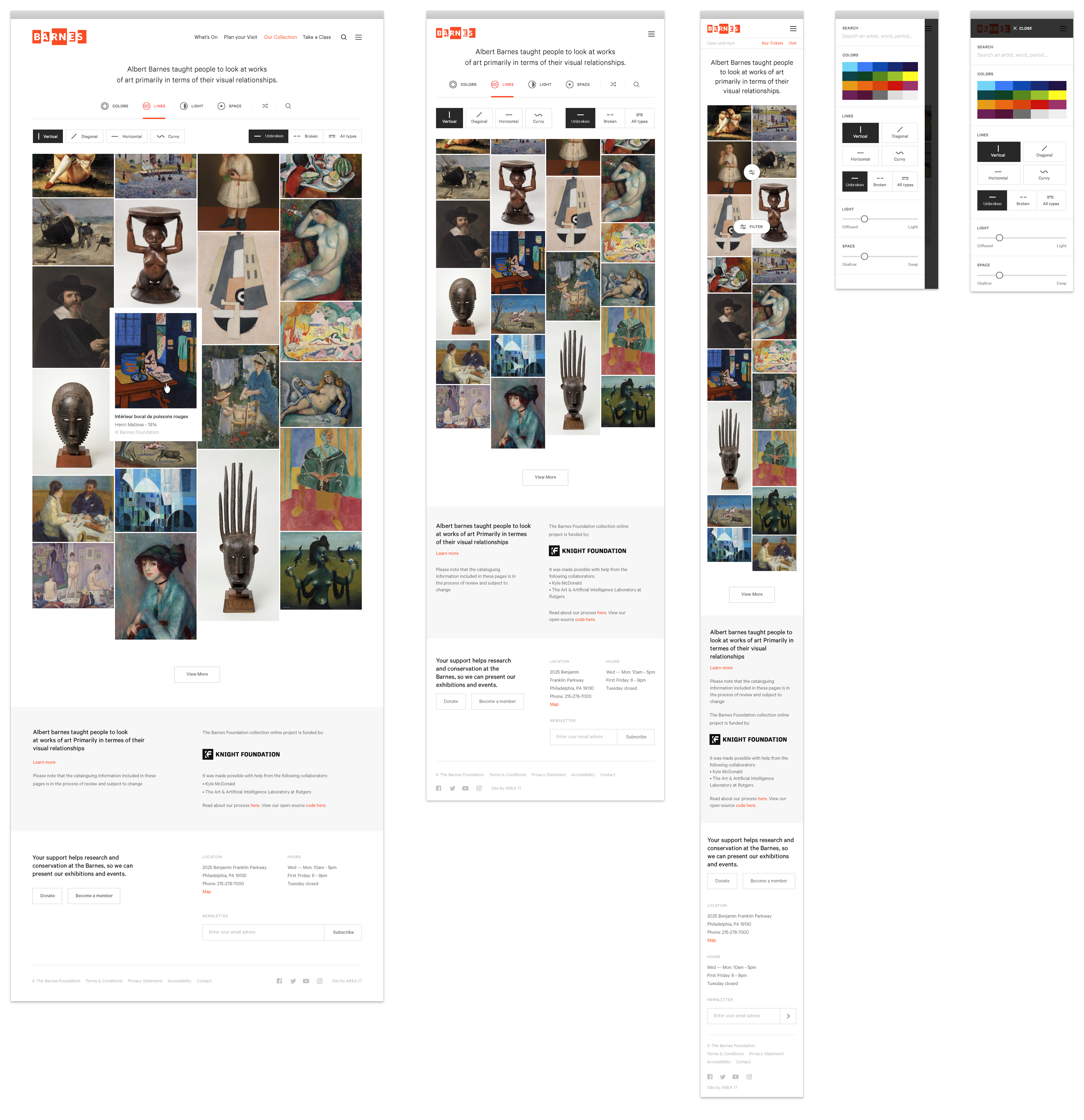
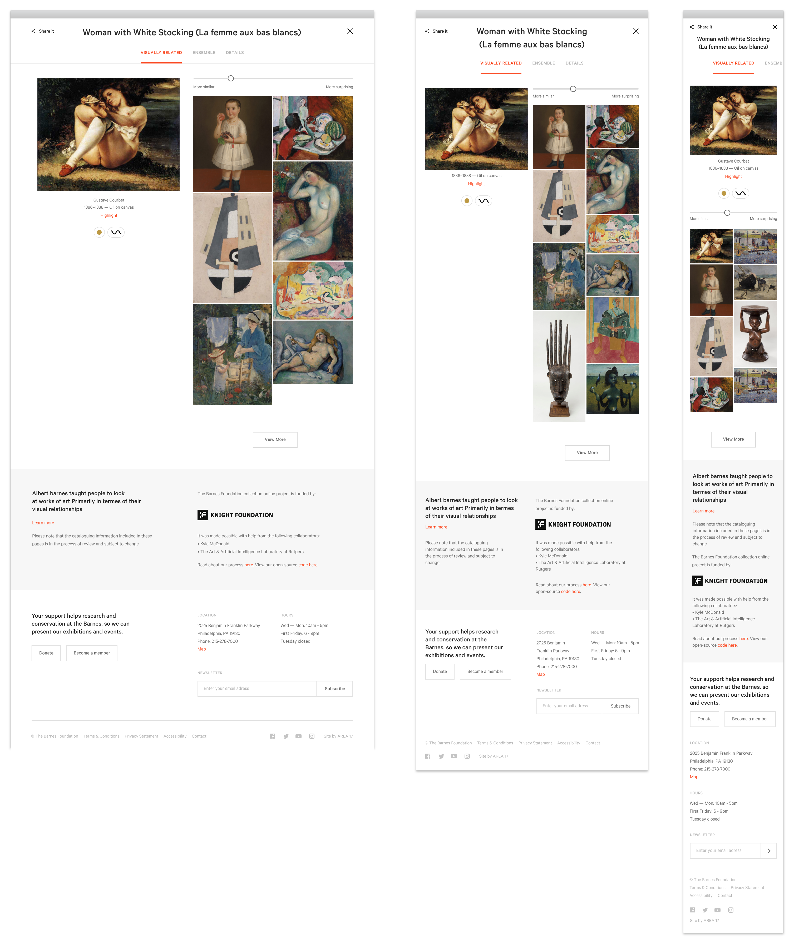
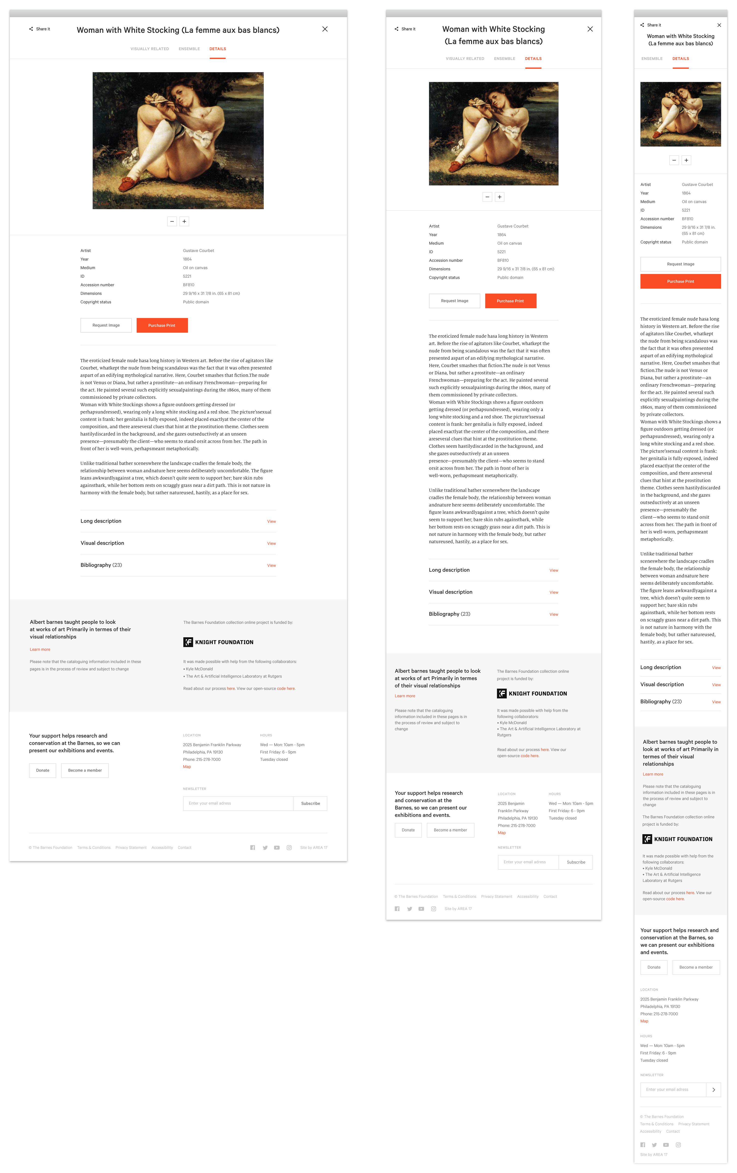
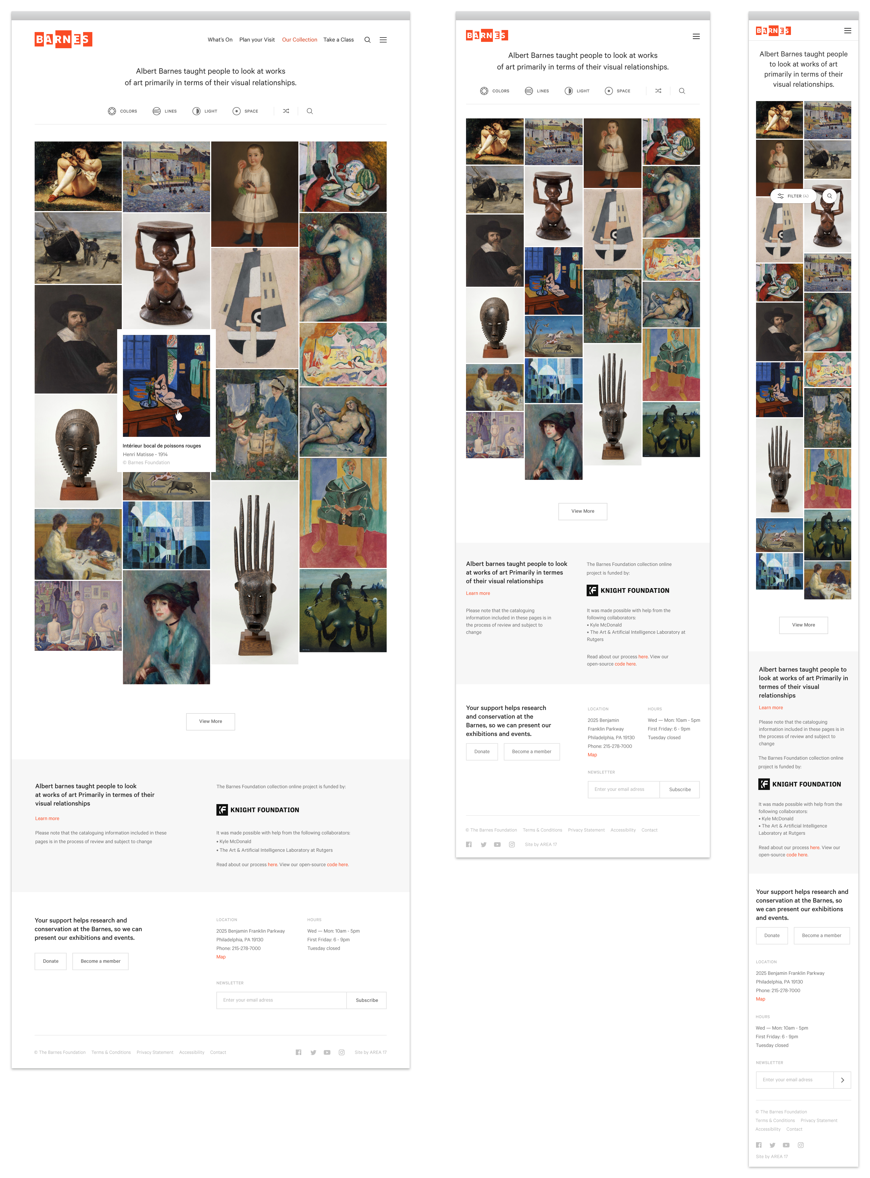
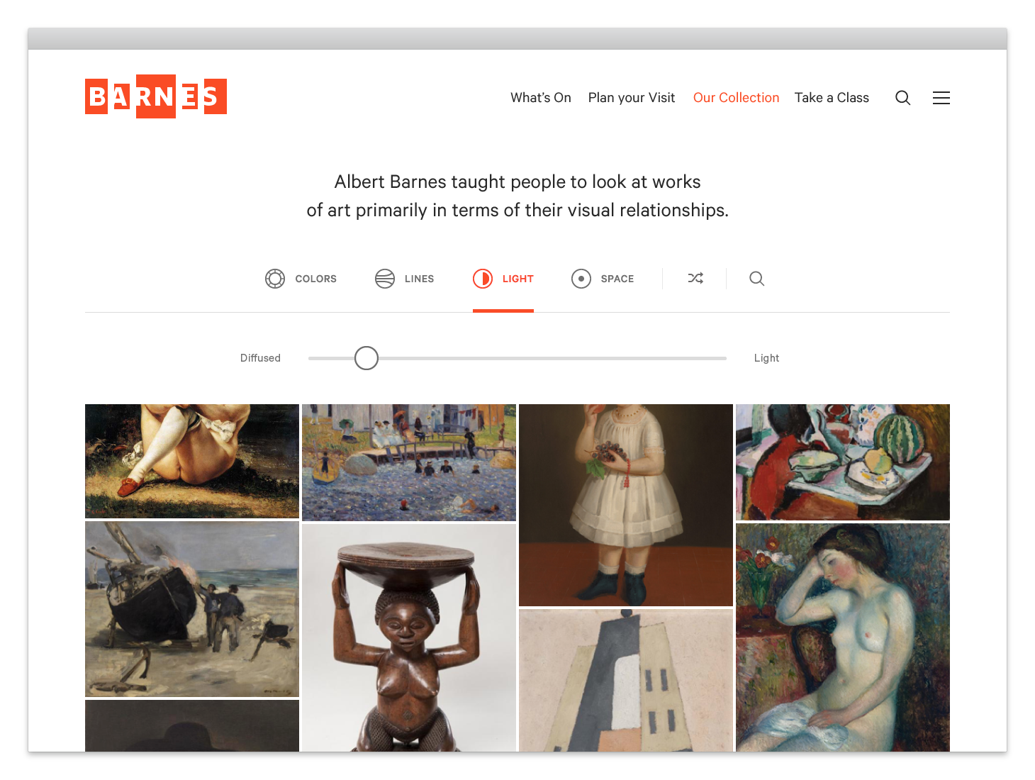

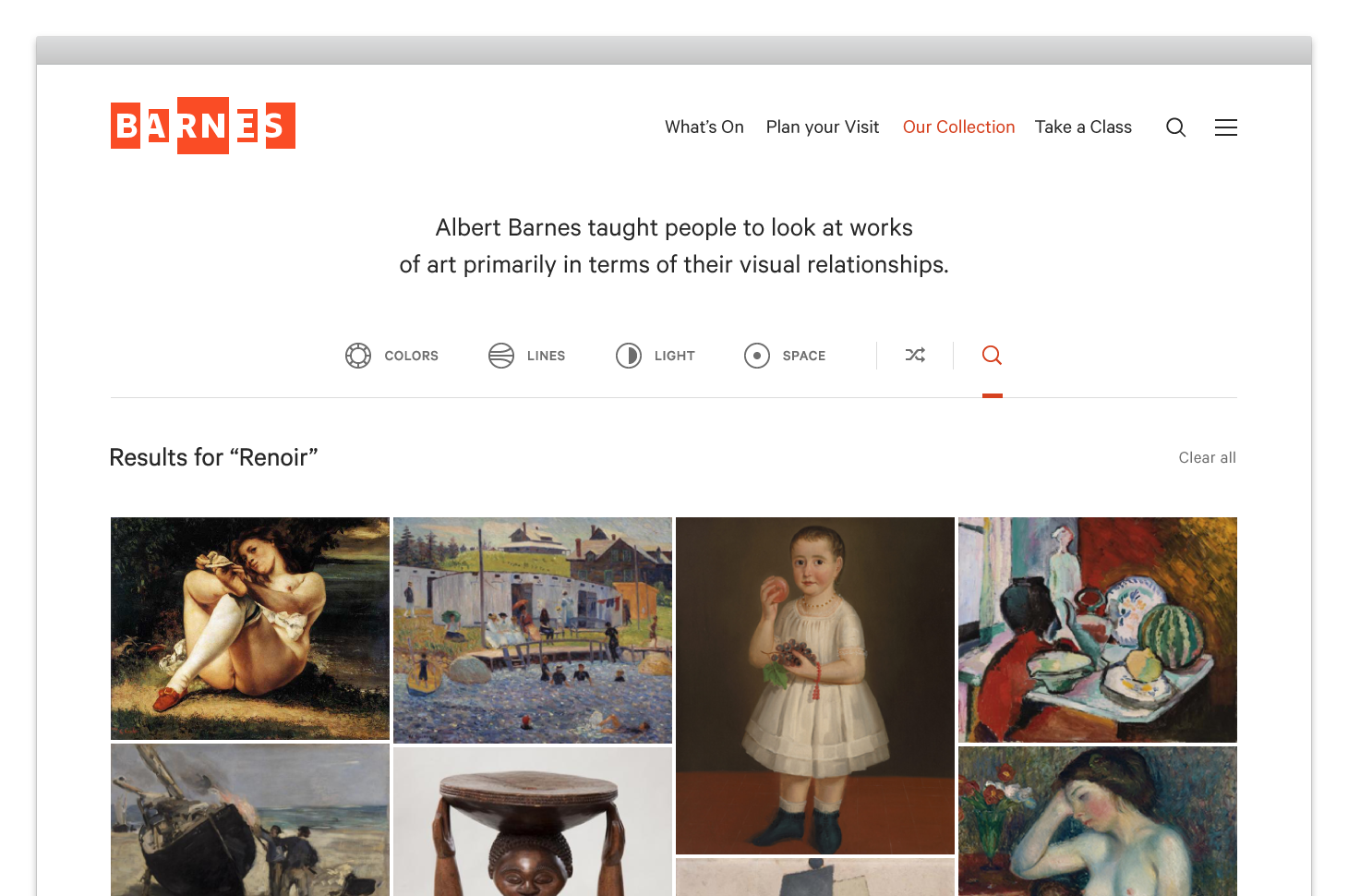
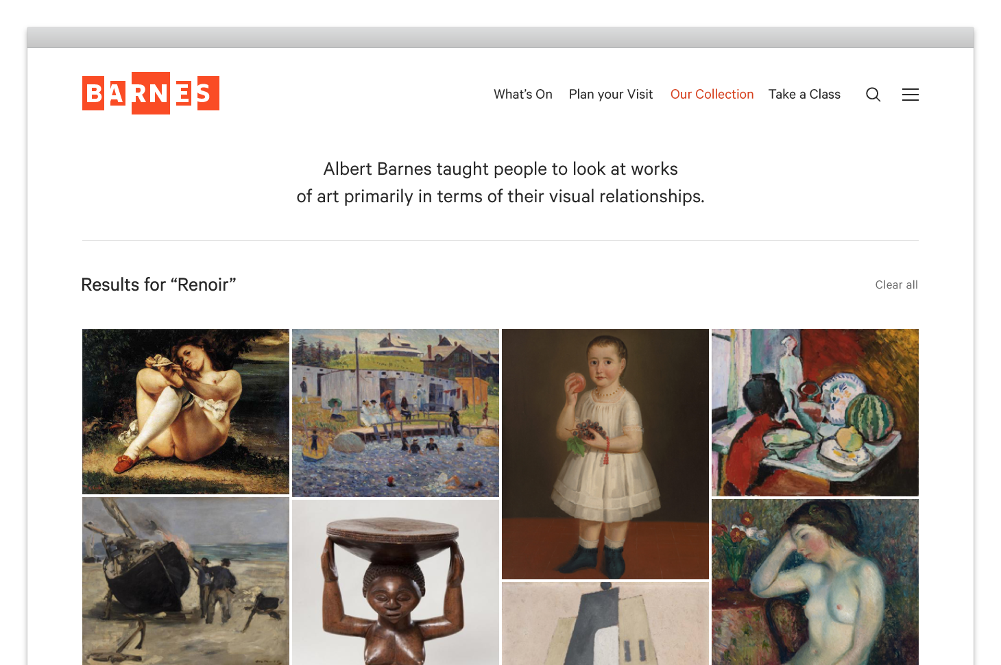
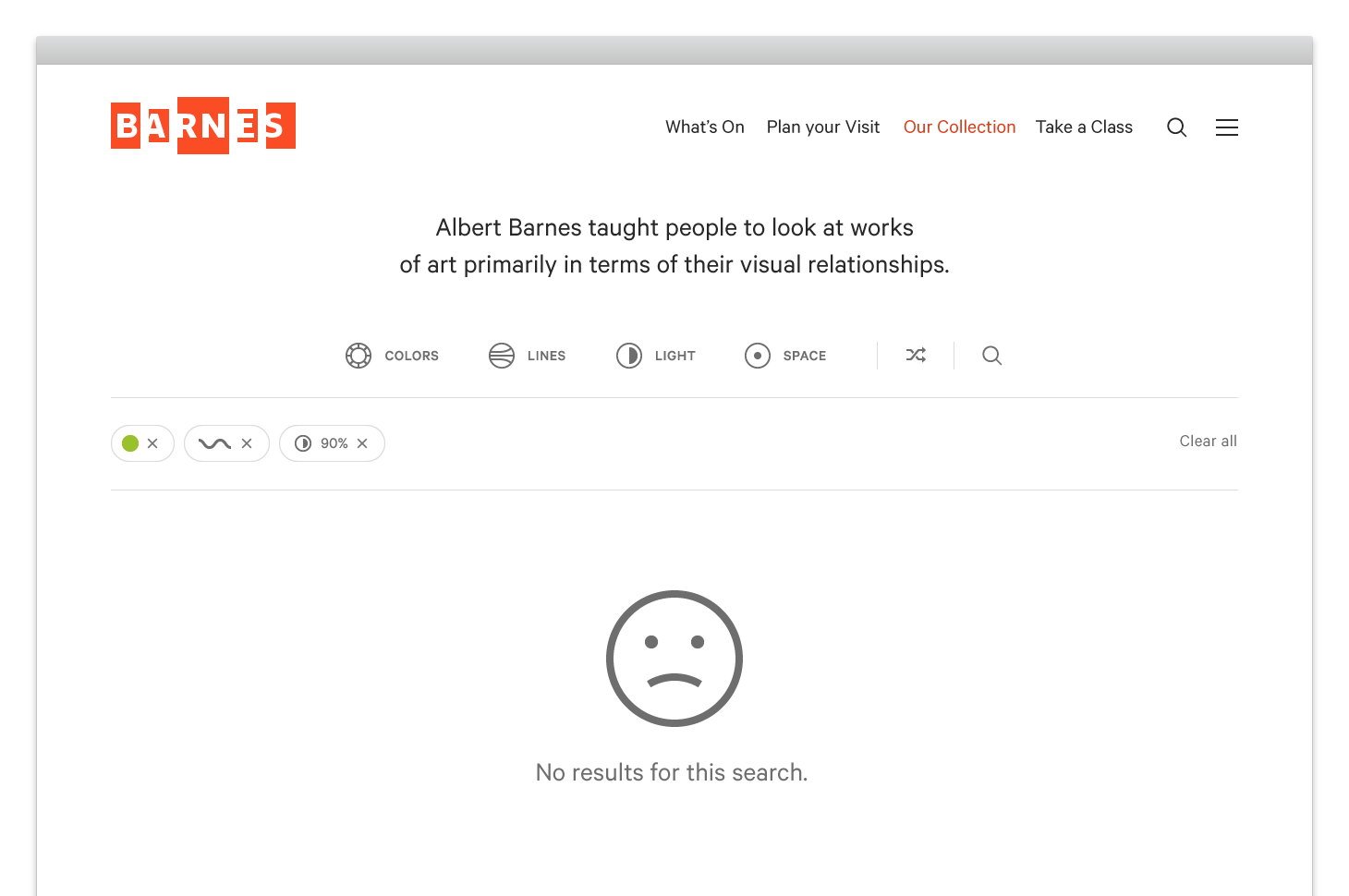
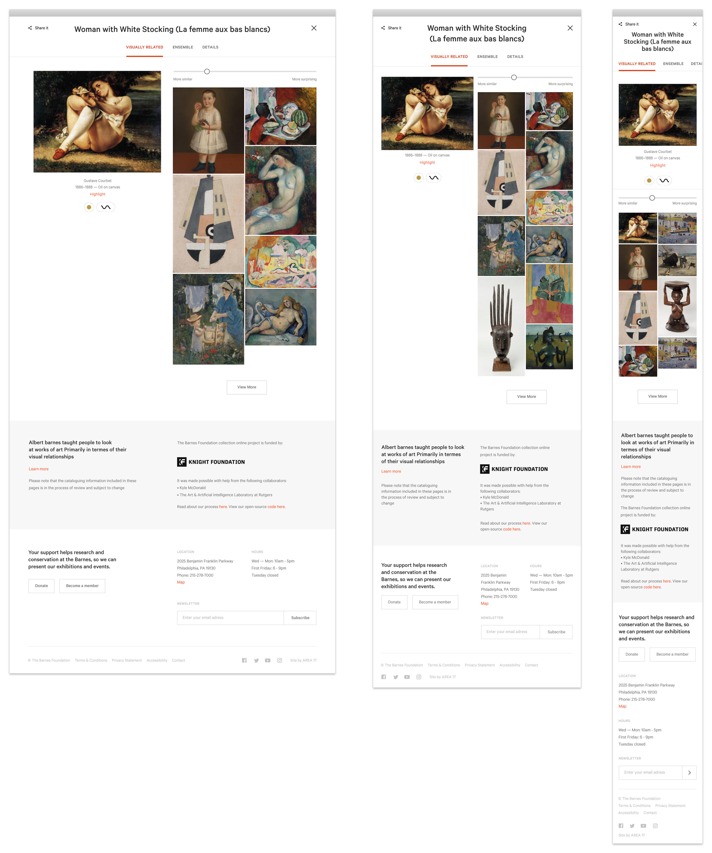
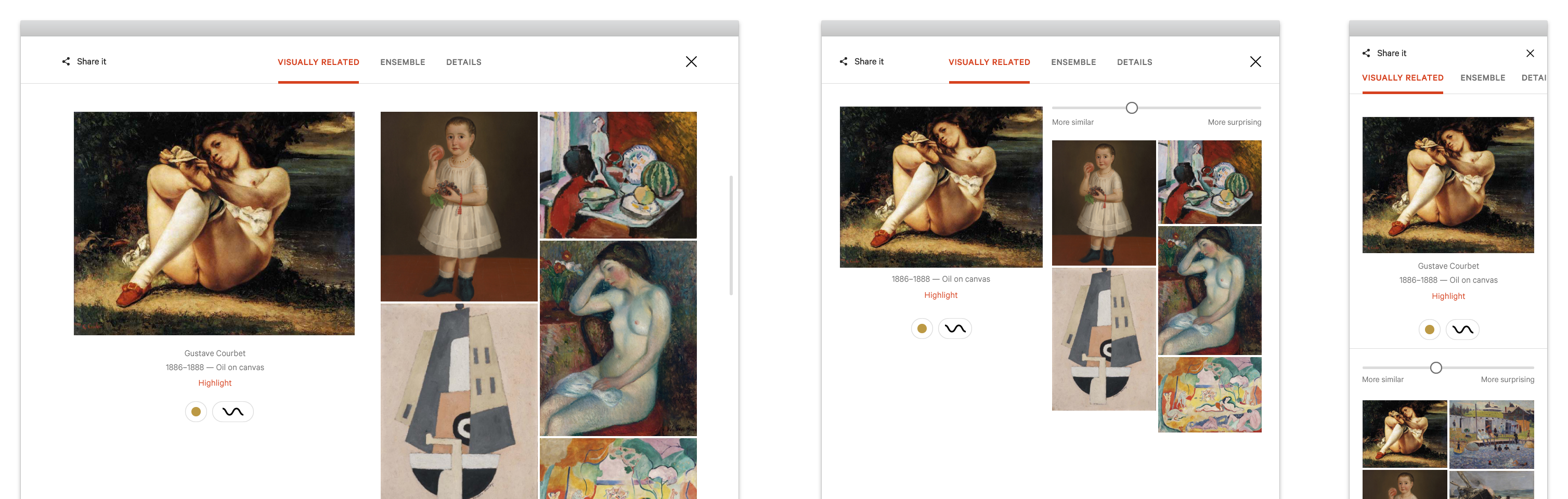
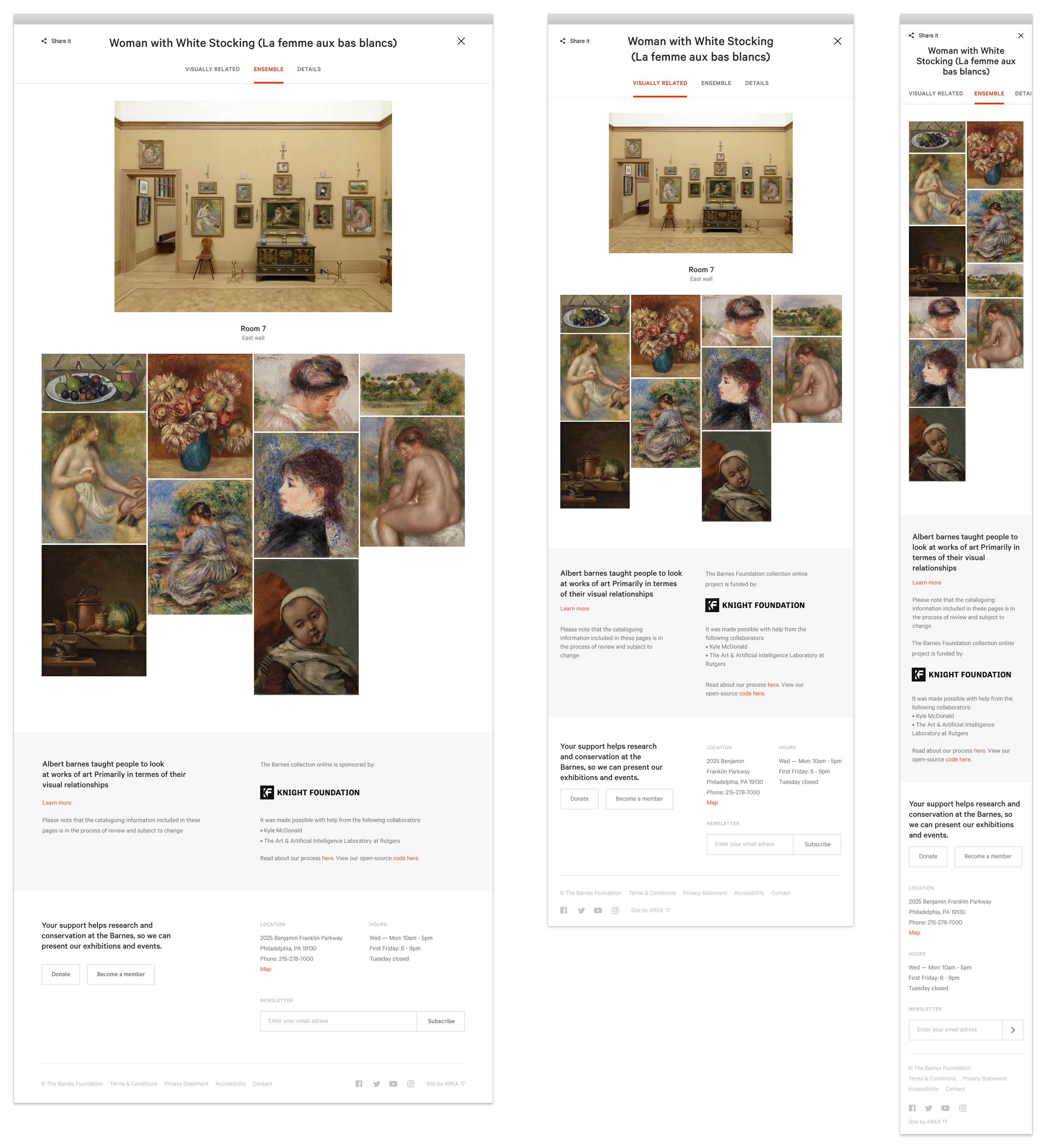
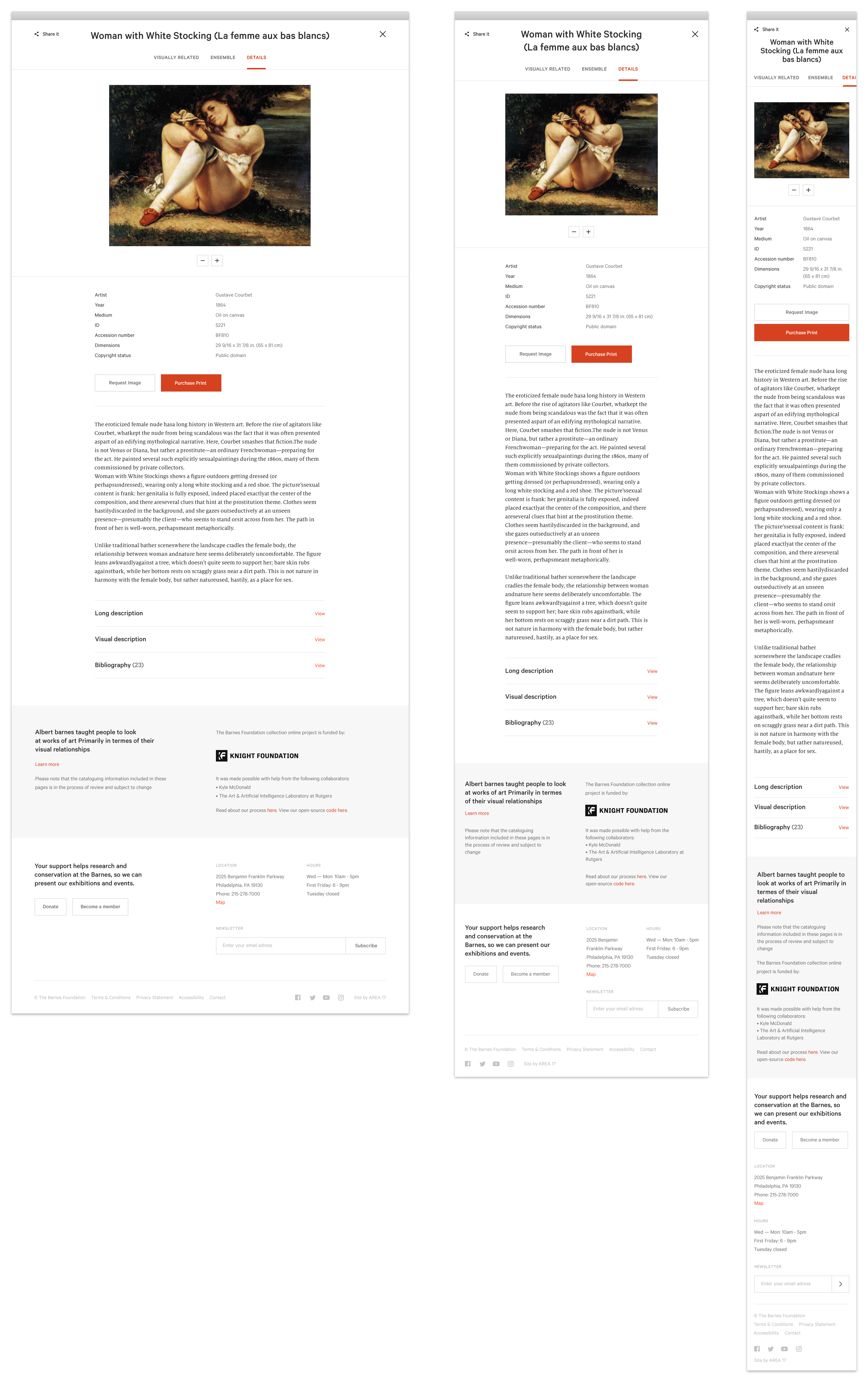
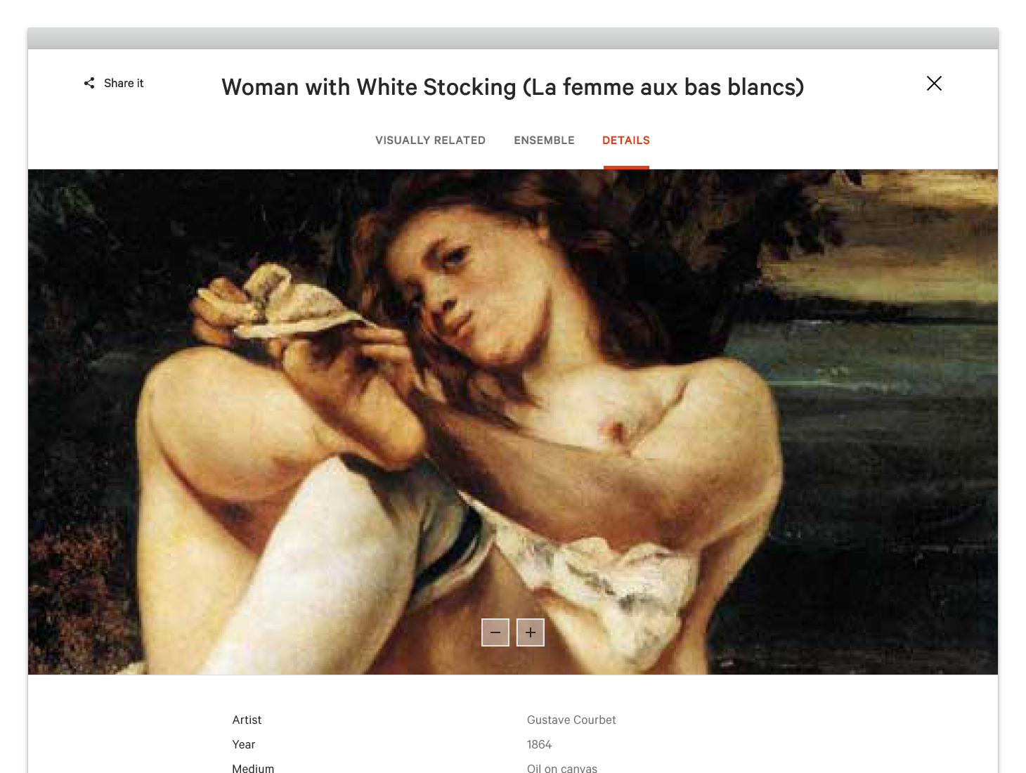
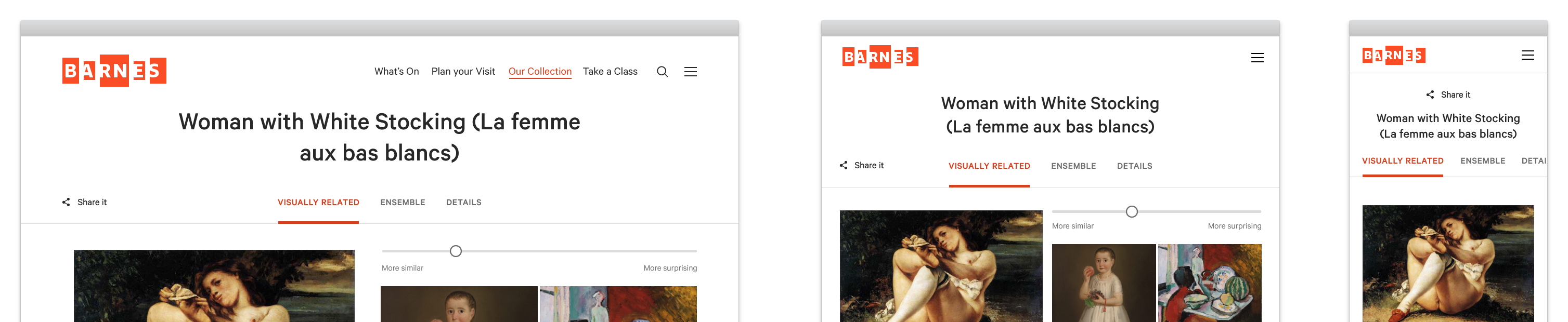
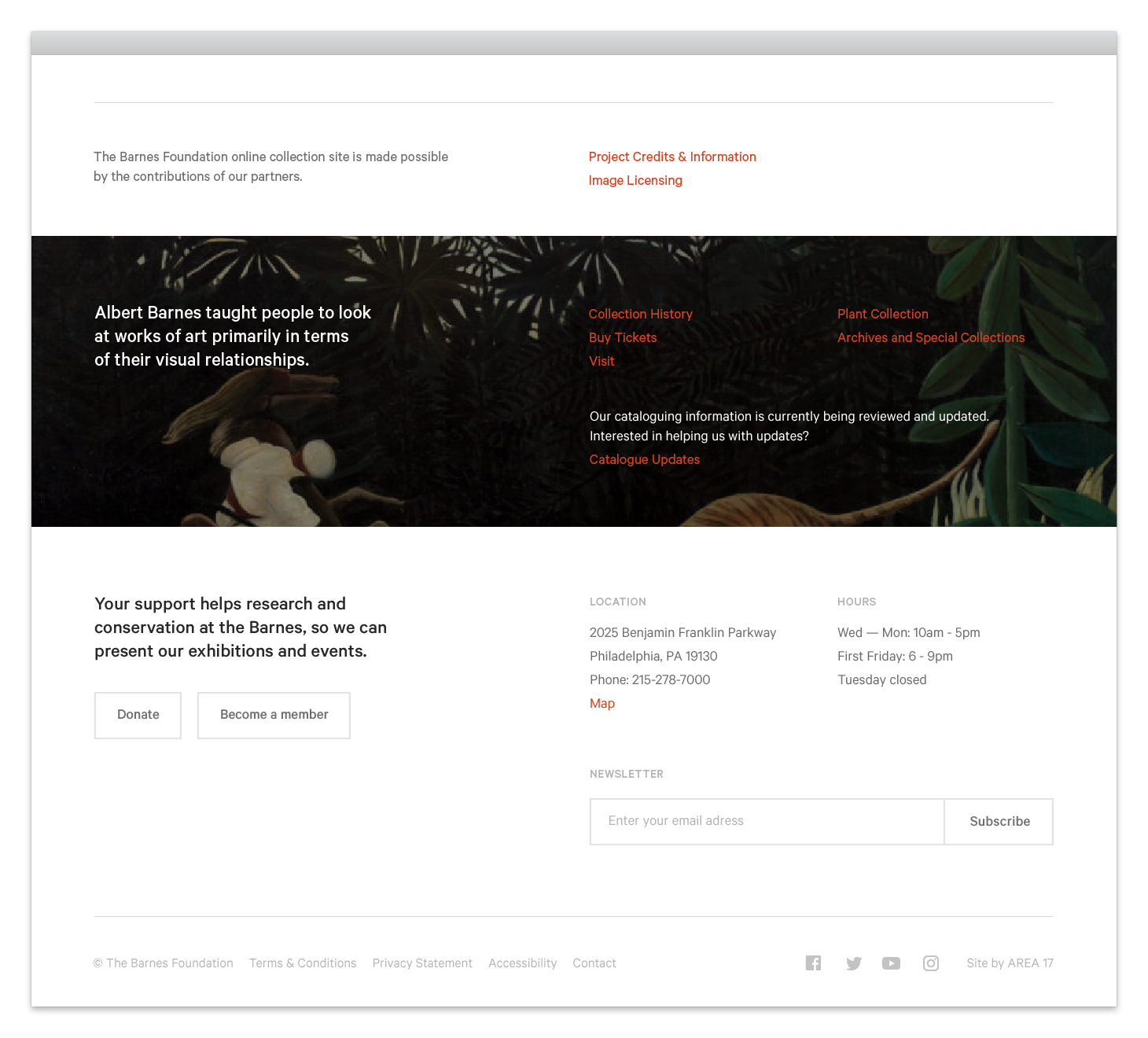
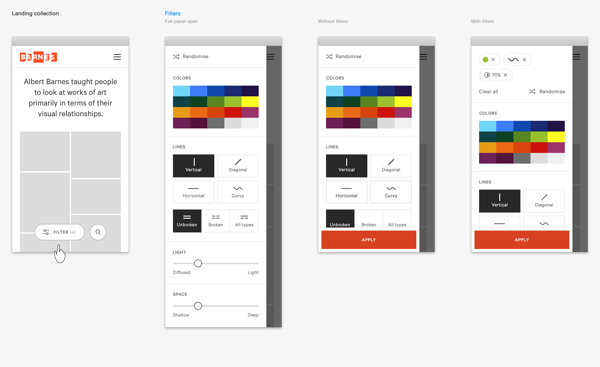
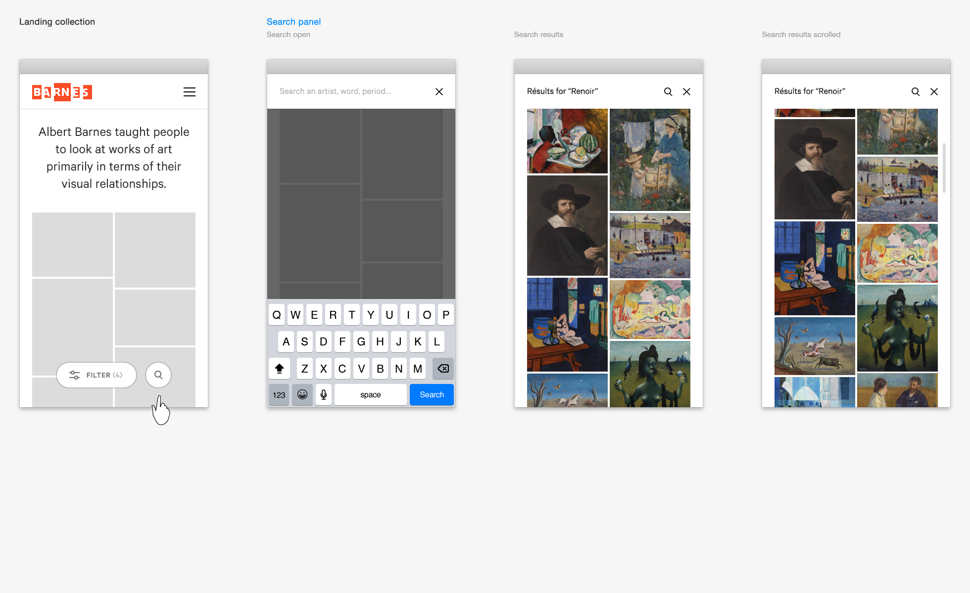
Specs


The Barnes website is designed to be constructed from many smaller components.
Like Lego, but for digital content.
It is a design-system rather than say, a traditional website design consisting of 100s carefully thought out pages which can't be changed less they become brittle and break. Instead we have lots of little components and you can structure the pages however you want.
What is a component?
The idea is if a little group of content could in theory appear on multiple pages or even in multiple places on the same page then it should be a component.
With these building blocks (or components) a developer can create their own pages and templates.
This Toolkit provides guidelines on how to do that.
Responsive by design:
Components are designed and built to work cross-device and cross-browser
As you can see from the picture above, the components come in 3 different sizes; type may be bigger or smaller depending on the size of the screen of the device. Spacing may also increase or decrease depending upon context of the device size.
In between these 3 sizes the design does it's best to fit. Sometimes this means a component won't quite work perfectly on a certain screen size but that's okay. The system tries cater to the majority then do its best for the minority.
Where is the other content?
Along with the components you will also need the structural HTML and all the assets too.
Header/Footer files:
The base HTML e.g. the
<html><head><body>tags can be found in the Structure component further down.